Role
UX Designer
Tools
Figma
Miro
Maze
Photoshop
Service
UI+UX
Time
April 2024- June 2024
The project
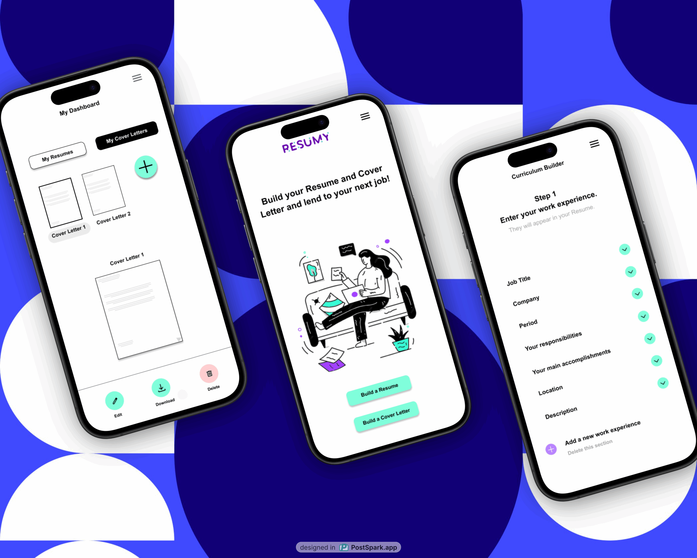
Resumy is dedicated job search support tool for women that provides Resume and Cover Letter builder features along with valuable resources like interview advices. It’s designed to help women to (re-)enter the job market and overcome the employment disparity between male and female workforce.
The background
The EU employment rate for men of working age was 80.0 % in 2022, exceeding that of women (69.3 %) by 10.7 percentage points. (European Commission data, 2022).
Given these occupational circumstances, I am interested in creating a digital product (desktop and mobile app) aiming help women to overcome this common issue.
The research I conducted for the UX project would help me get data on frequent challenges, needs, expectations and feelings of women when looking for a job. My goal is to design an online search job tool that can reflect the real needs of female job seekers.
🎯 The goal
🚩The problem
Design a platform that help women job seekers to get prepared for starting a new role such such as impactful Resumes and Cover Letters building features and career coaching resources.
Women job seekers re-entering the workforce sometimes are disoriented when taking up their careers. They need a powerful and user-friendly digital tool to communicate their personal brand and value their skills.
🎙️Responsibilities
👩🏻💻 My role
Conducting interviews, paper and digital wireframing, low and high-fidelity prototyping, conducting usability studies, accounting for accessibility, and iterating on designs.
UX designer designing the mobile website
from conception to delivery.
Understanding the User
User research/ Personas /Problem statements/ User journey maps
User research: summary
I conducted interviews and created empathy maps to understand the users’ needs. A primary user group identified through research included adults women who looked or are looking for a job online. This user group revealed that their primary challenge when seeking jobs online was the intense competition they perceived while navigating job boards. Additionally, they felt unprepared in terms of personal brand building, which led to a sense of having low chances to stand out in a highly demanding job market.
User research: pain points
Competition
Career Breaks
Time away from the workforce can lead to a loss of confidence in professional abilities.
Industries evolve, and returnees may find that the landscape of their field has changed significantly during their absence.
Lack of time
Career Change
It can be time-consuming to tailor resume and cover letter for each job application in a way that is relevant to the job.
Skills may become outdated during a break, making it difficult to compete with current candidates.

Problem statement
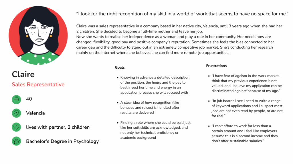
Claire is a sales representative getting back to work who needs a job search support tool because she wants to boost her job research.
User journey map
Persona: Claire
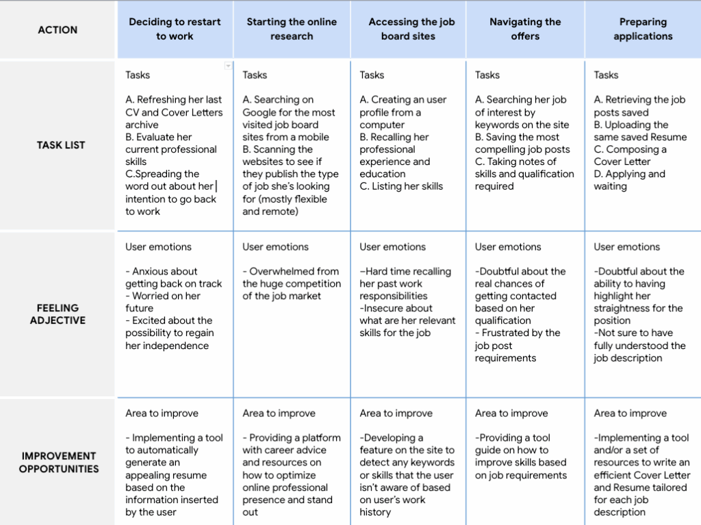
Mapping Claire’s User Maps showed what path a user re-entering the workforce would follow when sending job application online after a career break.
Starting the design
User flow/ IA Sitemap/ Paper wireframes/ Digital wireframes/Low-Fidelity prototype/ Usabilities studies
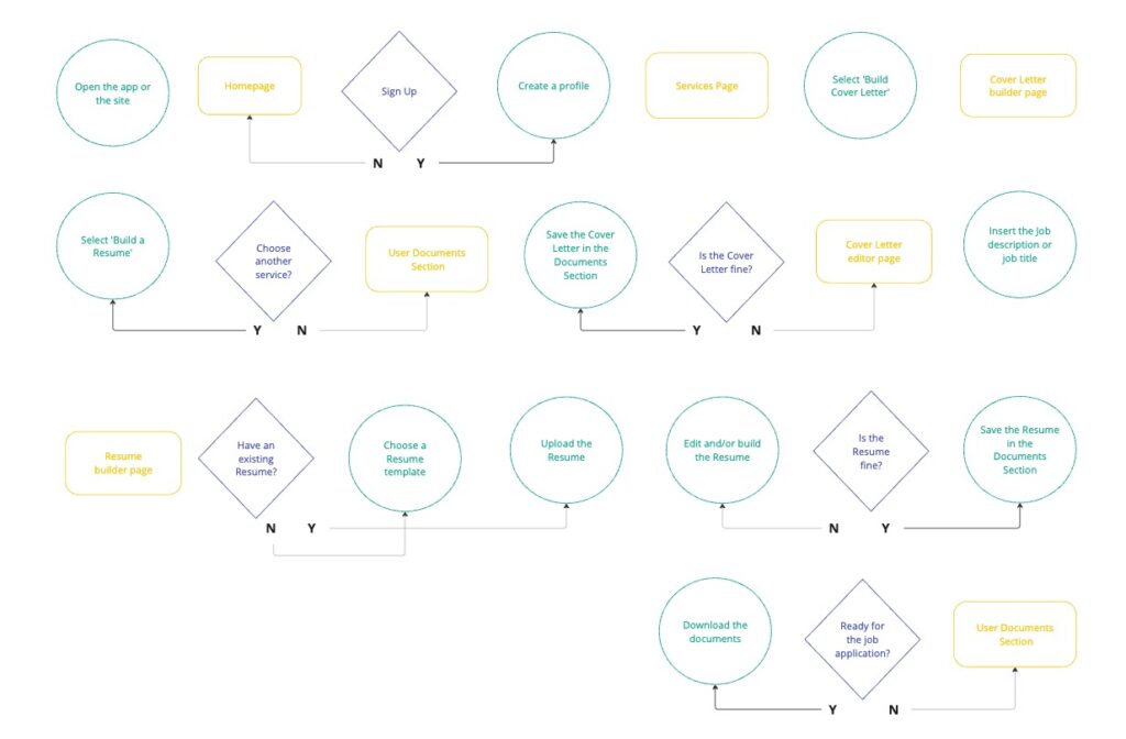
User flow
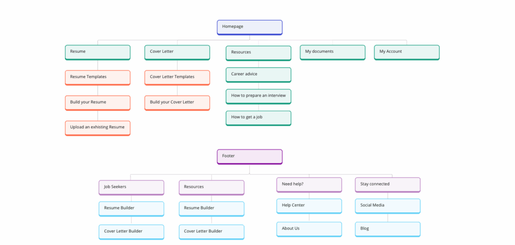
Information Architecture
By structuring content around user needs and behaviors, I designed an IA that ensures users can easily access the most relevant information on Resumy, enhancing accessibility during the resume-building process.
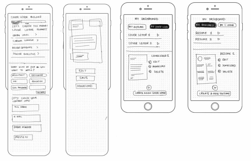
Paper wireframes
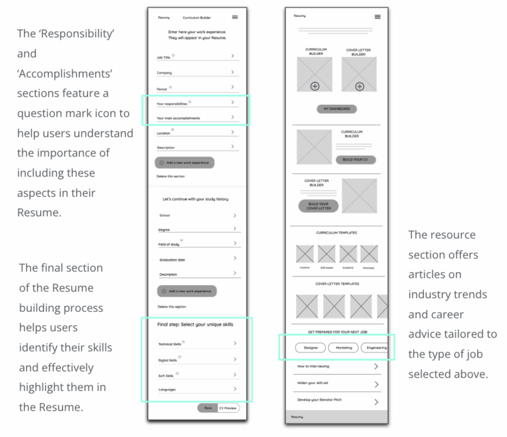
Drawings representing the resume building flow of mobile website helped include easily users’ pain points in the following digital wireframes. Sketches emphasize the smoothness of the process and the presence of step-by-step guide that assists the user throughout each stage.
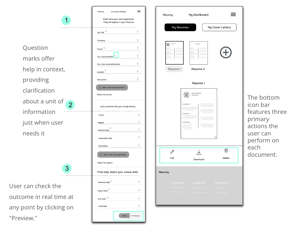
Digital wireframes
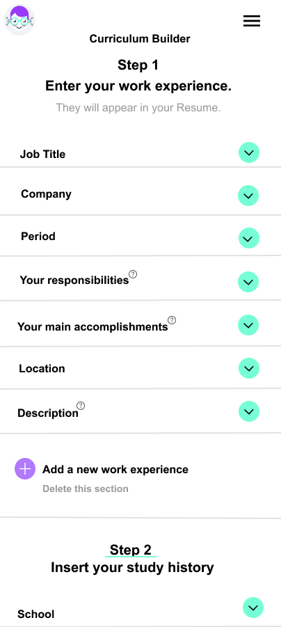
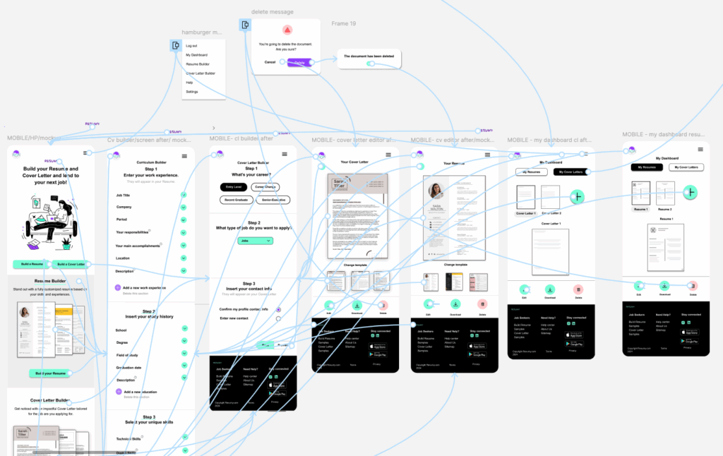
A step-by-step guide, divided into three sections, clearly outlines the path for the user to follow. The entire process is customizable, allowing the user to have control on what to insert in the Resume. The Dashboard page let the user to retrieve saved document and perform different actions on them.
Low-fidelity prototype
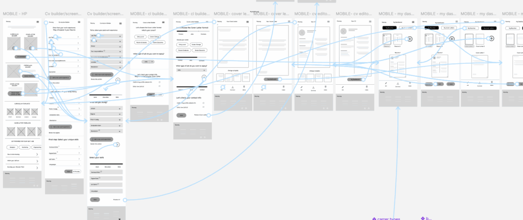
Using the completed set of digital wireframes, I created a low-fidelity prototype. The primary user flow I connected was creating and editing a Resume and a Cover Letter by using the builder and the editor features so the prototype could be used in a usability study.
Affinity map
To understand users’ needs and wants I conducted unmoderated Usabilities studies on the lo-fi prototype of Resumy with 6 potential Resumy users. I collected all the feedback and observations received and organised them into an affinity map. Then, based on their content, I grouped the main feedback into 3 themes of functionality: Navigation, Usability and Features.
Usability studies findings
Findings from the first study helped guide the designs from wireframes to mockups. The second study used a high-fidelity prototype and revealed what aspects of the mockups needed refining.
Round 1 findings
1
The progression bar wasn’t useful to guide user during the navigation
2
Users were confused on how to proceed in the Resume builder section
3
The Resume download feature was absent
Round 2 findings
1
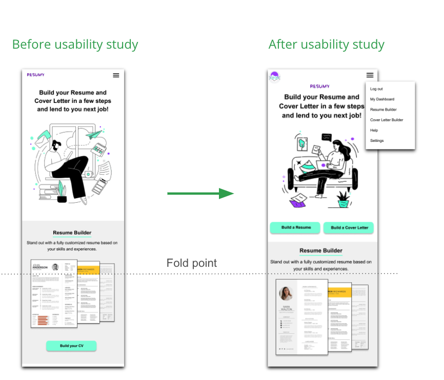
The first CTA was hard to identify as placed below the fold
2
Users were looking for a drop down menu with all the main features
3
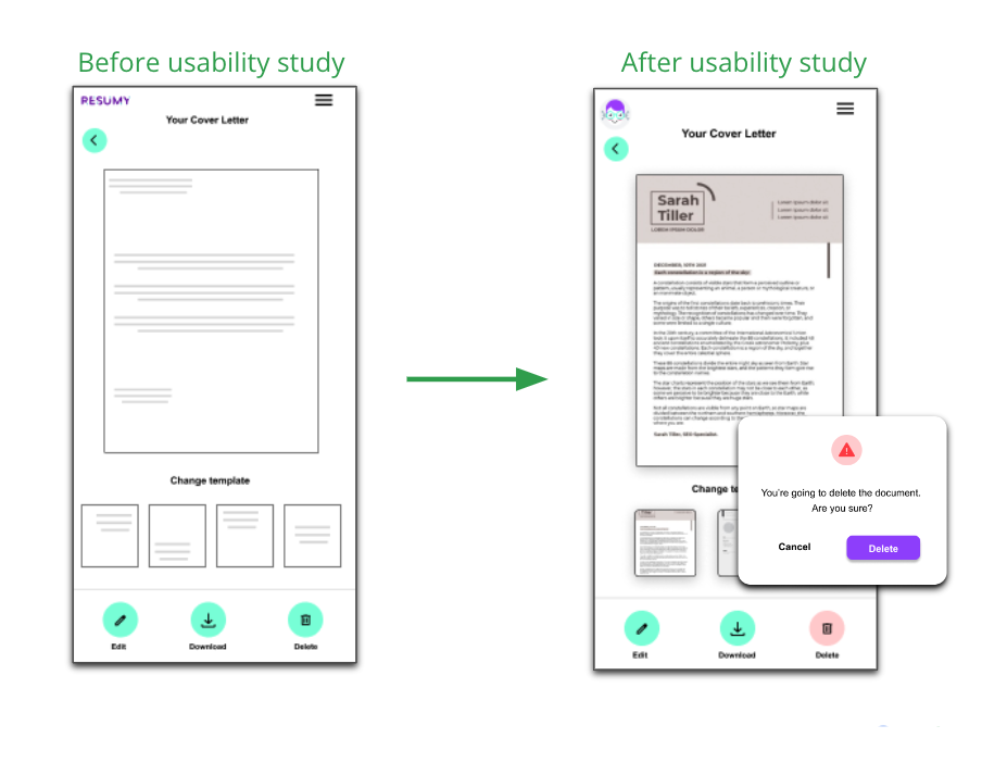
The delete button as a destructive action didn’t stand out in the icons bar
Refining the design
Mockups/ Hi-Fidelity prototype/ Accessibility
Mockups
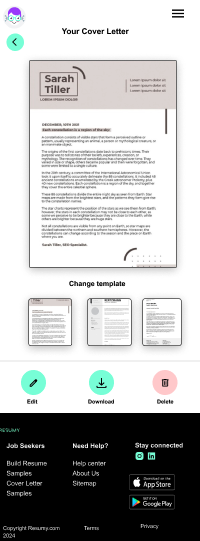
Accordingly to the usability studies, I worked on the bottom icon bars. The ‘Delete’ contained button color changing along with the confirmation snackbar make this destructive action more evident.
The second usability study revealed a navigation issue. Users didn’t immediately understand the main services of the website.
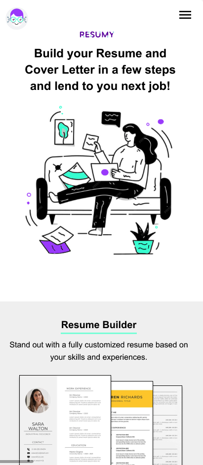
To make the CTA more prominent, I placed it also above the fold and added the main services to the hamburger menu. This approach aligns with user expectations, as they anticipate finding all services grouped together in the menu without needing to scroll down the entire homepage.
Iconography

UI Kit
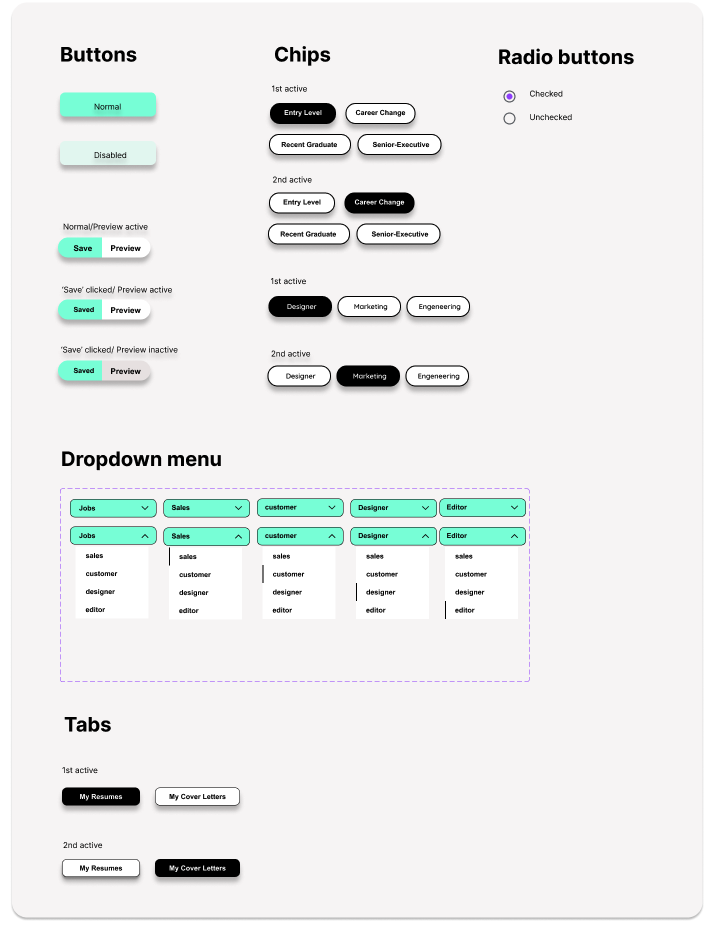
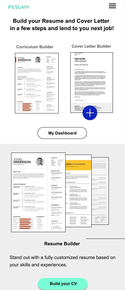
Low-Fi prototype
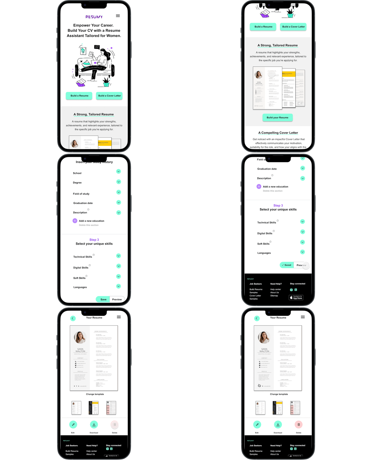
In the final hi-fi prototype, the main CTAs are positioned above the fold. The Resume builder page is divided into three sections, each separated by a divider. The title of each section clearly indicates the user’s current position in the process, guiding them through the entire resume-building journey.
Accessibility considerations
In the final hi-fi prototype, the main CTAs are positioned above the fold. The Resume builder page is divided into three sections, each separated by a divider. The title of each section clearly indicates the user’s current position in the process, guiding them through the entire resume-building journey.
1
Provided labels for each icon in the bottom navigation bar
2
High color contrast applied between background, text and UI elements
3
Used realistic images to help all users easier navigate the website
Going forward
Takeaways/ Next steps
Impact
What I learned:
Resume is a resume builder and Cover Letter assistant that guides the user through a step-by-step process to create these documents tailored to their specific profile. In addition to this, if offers career advice to get prepared to land a new job.
One quote from the usability test:
‘’I love the aesthetic of the website. It’s pretty easy navigate through the several features. The font and color scheme were comfortable for my eyes. I liked the fun graphics. And I was so excited about the idea of having an app build my resume.’’
When designing the Resumy mobile website, I gained a deeper appreciation for the importance of usability. I focused on several key aspects to ensure a smooth and user-friendly experience ranging from color contrast (legibility) to button functionality (size, space and responsiveness), and typography consistency (legibility on several devices).
Next steps
1
2
3
Develop an interactive progress bar that highlights each step the user completes during the building process. This feature will provide users with a clear visual representation of their progress and offer a more accurate estimation of the remaining time required to complete the process.
To enhance the usability of the bottom icon bar, make the Delete button more distinguishable by using additional design elements beyond just color. This could include adding some particular interaction or placing it in a distinct position to ensure it stands out clearly to users.
Consider including a quick tutorial for each step of the Resume building process. This will provide users with a clear understanding of all the website’s functionalities and ensure they can make the most of each feature effectively.
Thank you for watching!
Show your appreciation if you like the design!
