Role
UX Designer
Tools
Figma
Miro
Maze
FigmaJam
Service
UI+UX
Time
August- September 2025
Project overview
GreenLeaf Grocers is an eco-friendly supermarket chain struggling to attract and retain younger, tech-savvy customers (ages 25-40) interested in sustainable shopping. Their existing website is outdated, not mobile-responsive, and offers very limited functionality.
As a result, the business feels it’s losing potential customers to larger chain supermarkets with more advanced digital platforms.
Greenleaf Grocers’ goals
- Build a website: The business wants to create a
website that will enable them to engage and retain
their customers with more robust services. - Elevate sustainability: They hope to elevate their
sustainability initiatives and the eco-friendly aspects
of their products. - Establish a loyalty program: In addition, they hope
to increase customer retention and frequency by
establishing a loyalty system to track points or
rewards.
UX Design goal
As the client’s UX design team, my goal is to:
Design a new mobile app to help Greenleaf Grocers
expand their audience and develop a more loyal customer
base, all while staying true to their mission.
This mobile app should address the specific pain points
we’ve heard from customers and help them build new
behaviors to keep them engaged.
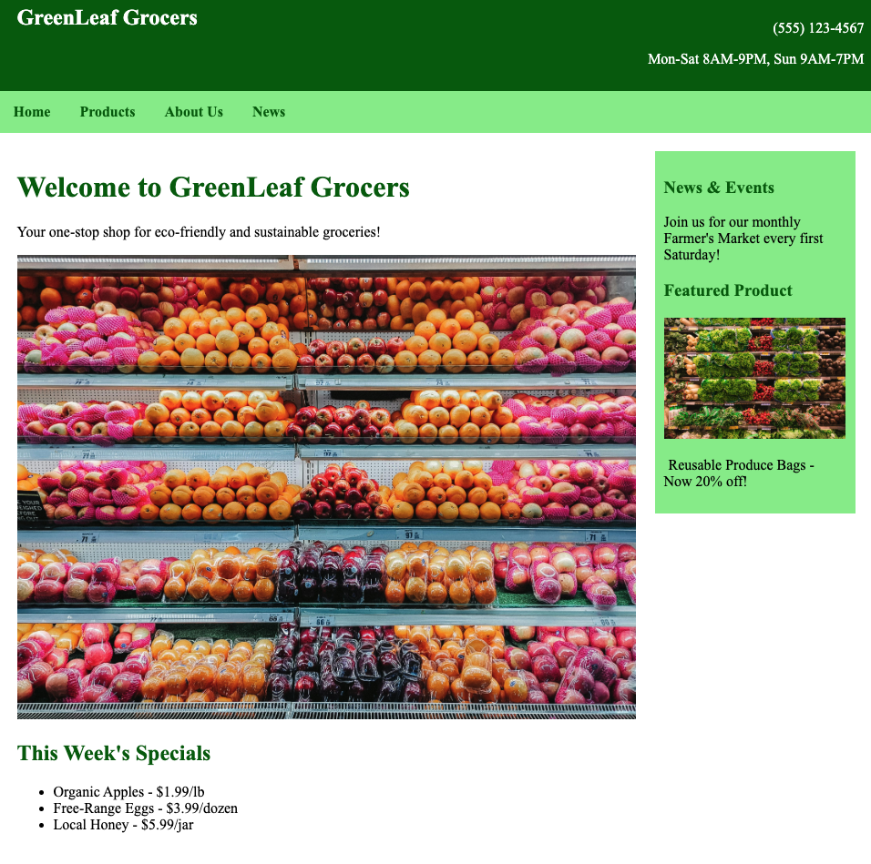
Current experience
Current experience
- Desktop-only experience, not mobile responsive
- Search at the top of the screen:
⚬ Must know exact product name, brand, or SKU - Product pages:
⚬ Price and sale price
▪ Current price not always matched with in-person prices
⚬ Name of brand
⚬ Name of product
⚬ Product description with highlighted keywords
⚬ Add to shopping list
▪ Only retains the information on the same session
- Shopping list page
⚬ Can export as a list - Weekly Flier
⚬ E-magazine of the in-store flier, no tappability or connection to the online catalog - Promotions
⚬ In-store loyalty program: Punch card, you get a punch when you meet a $50 shopping minimum,
and after 10 punches you get $10 off.
Customer insights- demographics
Younger with varied family structures
Greenleaf Grocers is targeting younger, primarily urban
customers aged 25-40.
Their family structures are varied across the board, but tend to skew single or married with children:
- Single: 30%
- Married, no children: 25%
- Married, with children: 35%
- Single parents: 10%
Smaller shopping cart on a high-frequency basis
Customers tend to have an average spend (per trip) of $40-80.
Revisitation tends to skew more frequent, likely because the grocery chain tends to be placed in places with more foot traffic:
- Once a week: 50%
- Twice a week: 30%
- Every two weeks: 15%
- Single parents: 10%
▬ Dietary preferences
▬ Product preferences
▬ Sustainability preferences
Greenleaf Grocers is targeting younger,
primarily urban customers aged 25-40.
Their family structures are varied across
the board, but tend to skew single or
married with children:
◗ Single: 30%
◗ Married, no children: 25%
◗ Married, with children: 35%
◗ Single parents: 10%
Customers tend to have an average spend
(per trip) of $40-80.
Revisitation tends to skew more frequent,
likely because the grocery chain tends to
be placed in places with more foot traffic:
◗ Once a week: 50%
◗ Twice a week: 30%
◗ Every two weeks: 15%
◗ Monthly: 5%
Greenleaf Grocers is targeting younger,
primarily urban customers aged 25-40.
Their family structures are varied across
the board, but tend to skew single or
married with children:
◗ Single: 30%
◗ Married, no children: 25%
◗ Married, with children: 35%
◗ Single parents: 10%
Customer Pain Points
1.
Not built for mobile
2.
Limited product info
3.
Desire for ordering and delivery
4.
Shopping insights (their purchase history, understand how their choices contribute to sustainability)
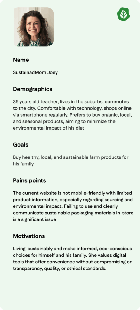
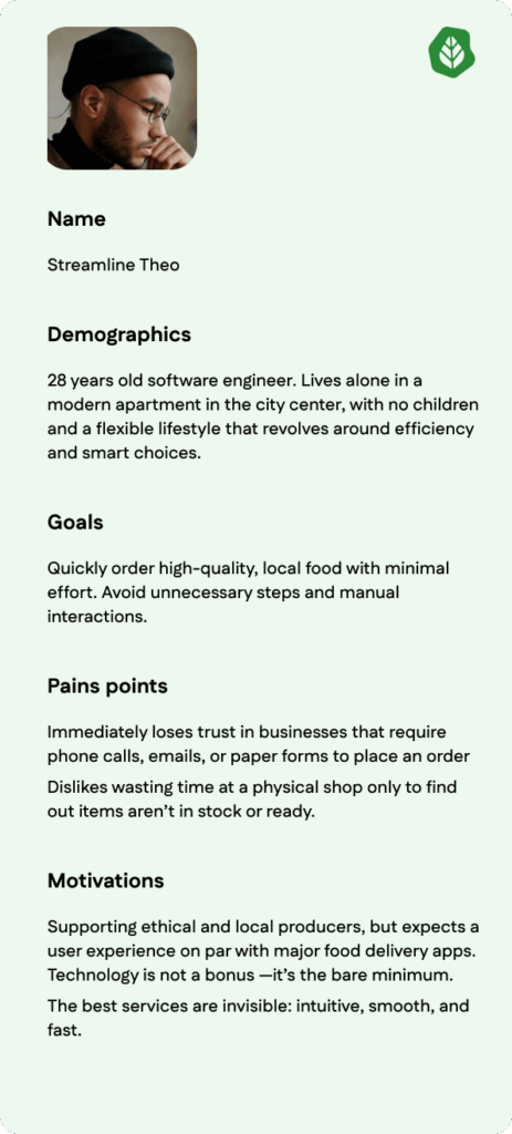
Personas
Define and Ideation
User Journey Map
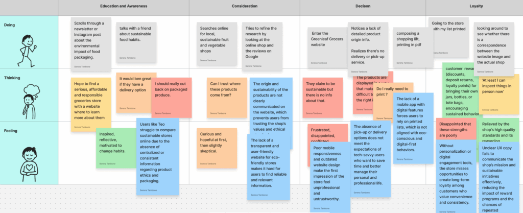
Within the User Journey Map, I included the users’ actions, thoughts, and feelings for each of the four identified phases: Education and Awareness, Consideration, Decision, and Loyalty.
I assigned a different color to all Doing, Thinking, and Feeling actions based on the severity of their impact on both the business objectives and the consumer goals of the store.
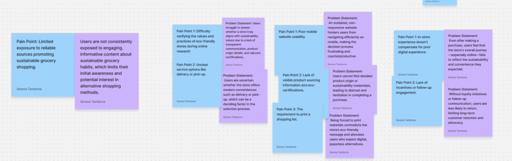
Each action was linked to its corresponding pain point, and for every pain point, I added a new note containing its problem statement.
I gathered all the notes containing the problem statements into a separate table and organized them by category.
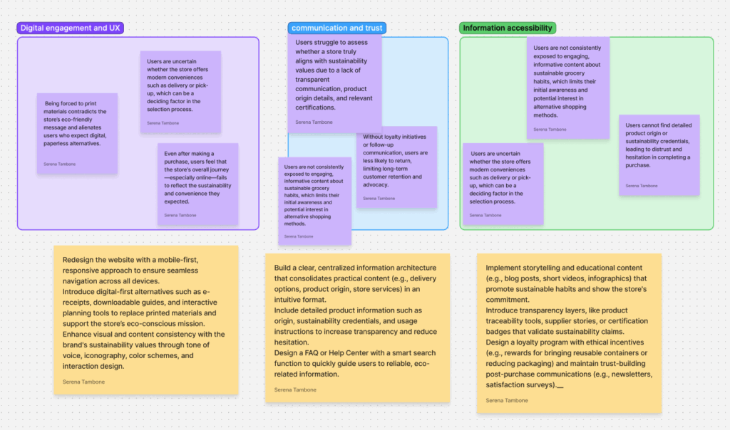
The categories identified were Digital Engagement and UX, Communication and Trust, and Information Accessibility.
For each note containing a problem statement, I added another note describing the related opportunities connected to that specific problem.
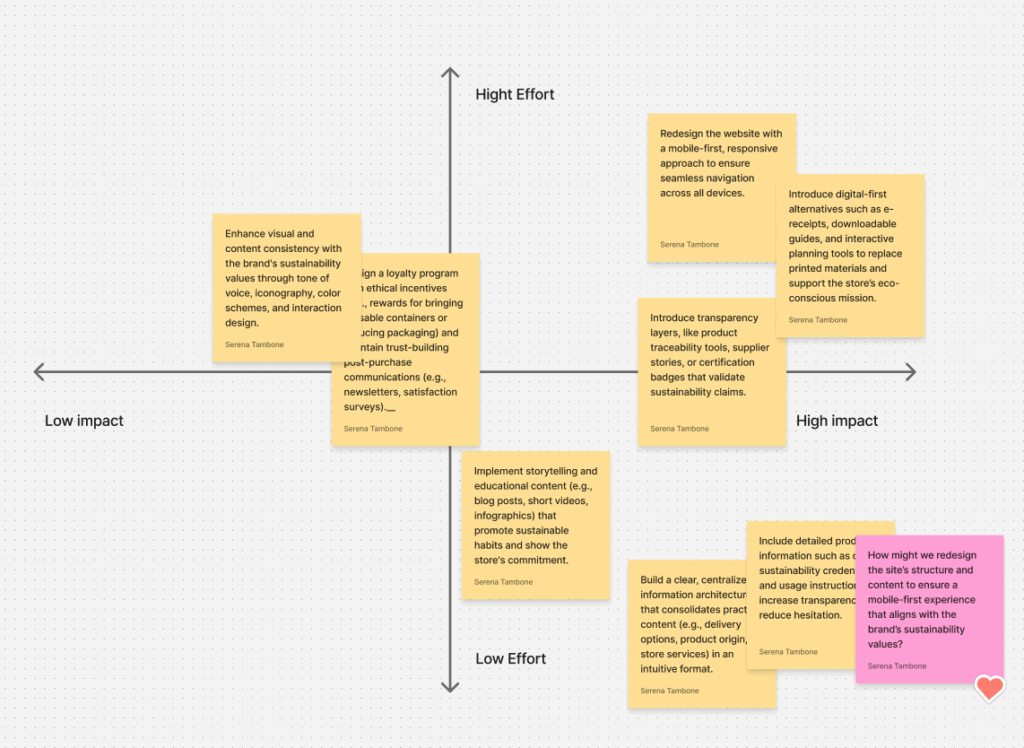
Then, I positioned these opportunities within an Impact–Effort Matrix.
In this matrix, I focused specifically on the High Impact, Low Effort quadrant, since it contains the opportunities that would generate the most significant impact on both business and consumer goals, while requiring minimal design effort. These, therefore, represent the most urgent improvements to be implemented on the website.
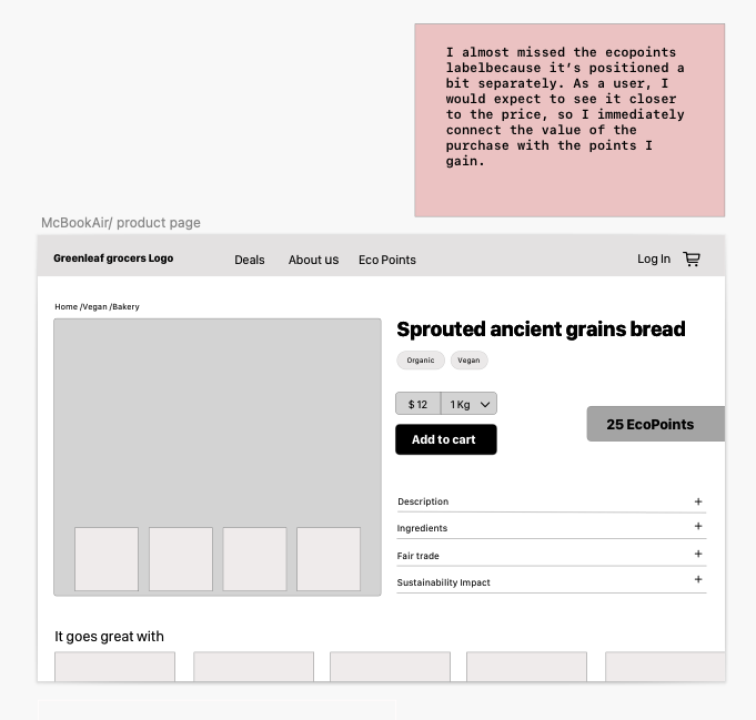
Afterward, I created a note for this quadrant that answered the “How might we…” question — a way of exploring possible, practical solutions to the opportunity highlighted in that area. I would prioritise the app implementation and a reconstruction of the ‘about us’ page. In addition to this, I would insert a clear product info for each item present in the store. That’s a strong design direction! Focusing on a UX writing study to ensure the language resonates with the target audience and then moving into wireframe designs for the website refresh directly addresses both the communication and usability pain points. This approach clearly balances user satisfaction with the business aim of reinforcing GreenLeaf Grocers’ eco-friendly mission.
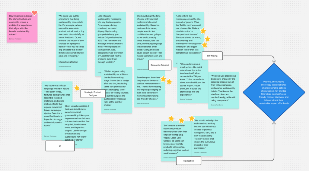
The idea outlined in the pink note inspired a series of possible design solutions.
These solutions were grouped into five categories: UI, Strategic Product Design, Research-Oriented, UX Writing, and Navigation.
Once I identified these categories, I focused on the solutions that, as a designer, I could implement more easily and that were most relevant to my role.
I marked the most feasible ideas with stars.
I determined that the changes I could personally implement were mainly related to UX Writing and Navigation.
In particular, I decided to focus on:
- Positive, encouraging macrocopy that celebrates small sustainable actions.
- Sticky Button Navigation and Top Feeder Chips to simplify eco-friendly product discovery and allow users to effortlessly track their sustainable impact.
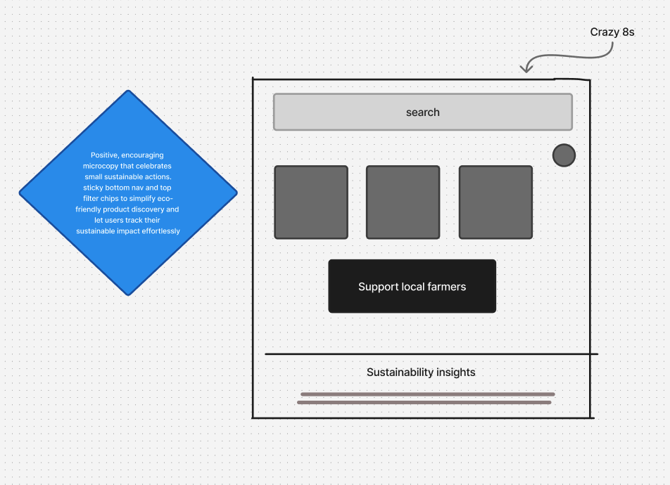
Based on this specific idea, I began developing creative methods to start the actual design phase, using the Crazy 8s technique.
Design
User flow
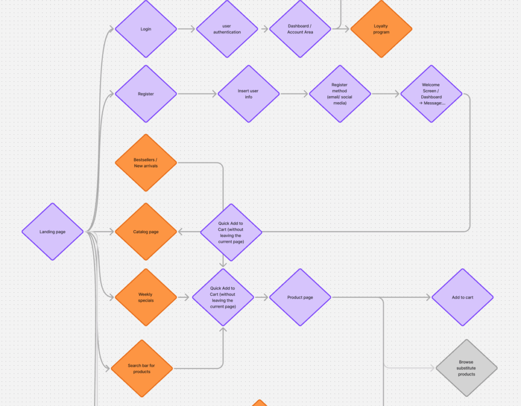
In designing the user flow, I mapped out the main paths users would take to accomplish their goals on the Greenleaf Grocers website. The user flow helps visualize how users move through different touchpoints — from entry to task completion — ensuring that each step feels intuitive, efficient, and aligned with their needs.
During this process, I identified both primary and secondary user goals.
The primary goals focus on essential actions that support a smooth shopping experience, such as creating an account, browsing and searching for products, ordering and managing deliveries, accessing sustainability information, and subscribing to the loyalty program.
The secondary goals represent complementary motivations that enhance engagement and retention, including comparing products, saving items for later, and exploring recipe ideas.
By structuring the user flow around these goals, the experience was designed to balance usability, efficiency, and user satisfaction across different stages of interaction.
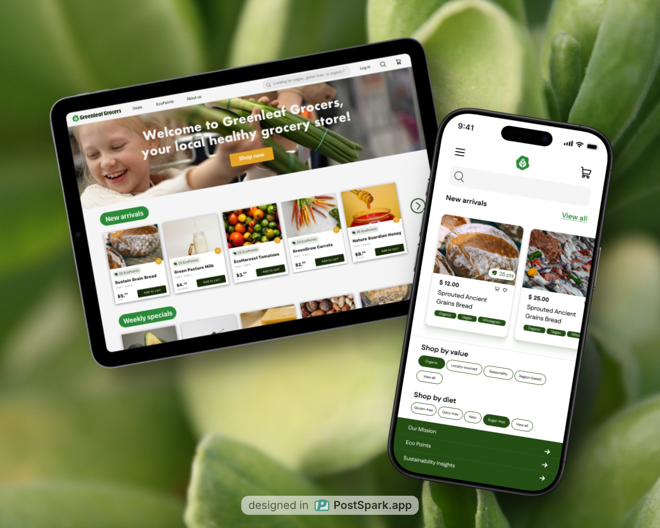
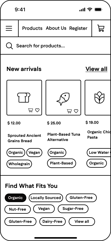
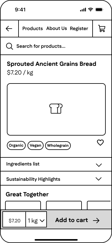
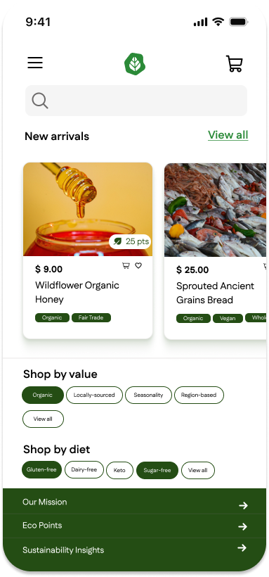
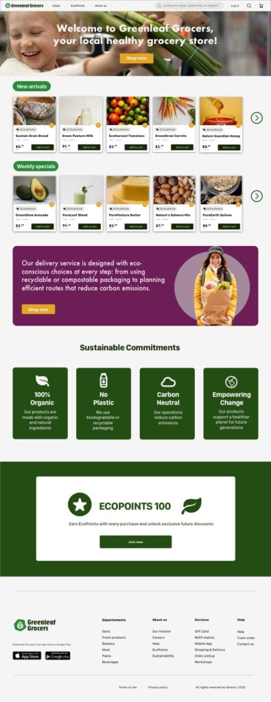
Wireframes – mobile
Landing
Product page
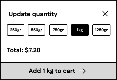
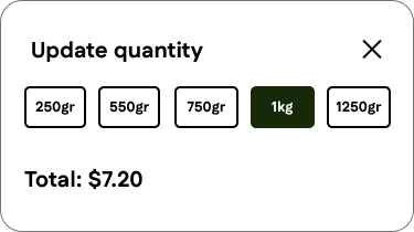
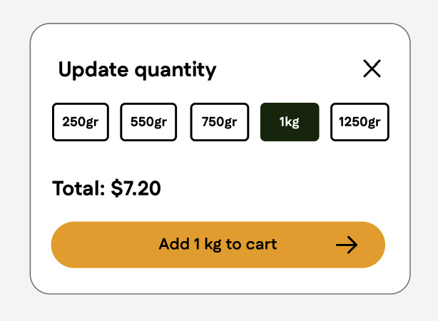
Update quantity
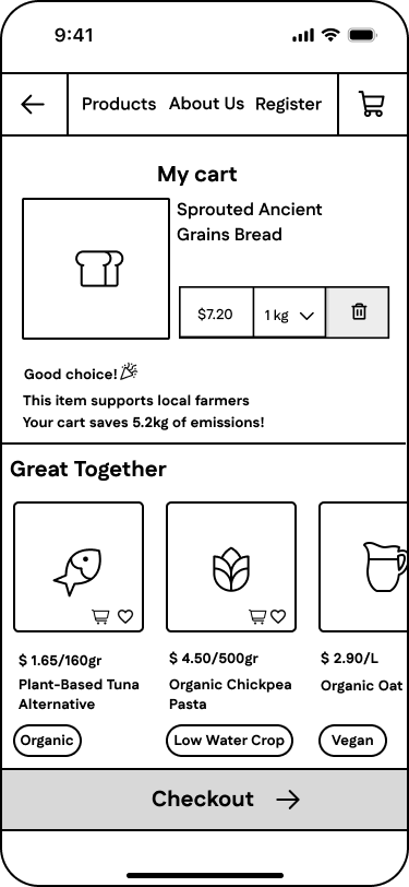
My cart
Wireframes iteration
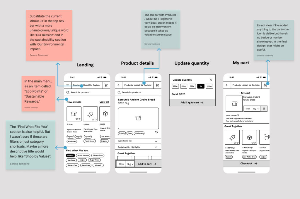
I then submitted the first wireframes for unmoderated remote usability testing, asking participants from my initial target audience to evaluate the navigation, Information Architecture, content clarity and labeling of the content presented in the wireframe.
Mockups
I integrated the feedback received from the initial wireframes into the creation of the mockups, refining both the layout and the overall user experience. These updated mockups were then submitted to additional rounds of unmoderated remote usability testing, which provided further insights and feedback on the design, helping to validate improvements and identify new areas for refinement.
During the usability testing sessions, I created a set of tasks for users and test participants to complete. These tasks were designed to evaluate the following aspects of the mock-up:
1. Product discovery and categorization – assessing how easily users could identify different product types (e.g., regular, sugar-free).
2. Cart management and interaction – evaluating the process of adding items to the cart and understanding the cart’s feedback.
3. EcoPoints visibility and motivation – assessing how clearly users could track EcoPoints while shopping.
4. Search and filtering usability – testing the effectiveness of the search bar and the filtering system for finding specific products.
5. Product information clarity – evaluating how easily users could access and understand sustainability-related product information.
6. Rewards system understanding – assessing whether users understood how to redeem EcoPoints.
7. Checkout flow and completion – evaluating the clarity, simplicity, and smoothness of the checkout process from start to finish.
Learning from Users: First Iteration
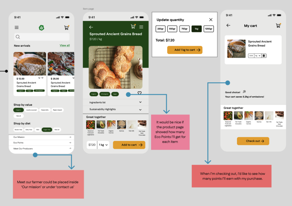
Insights
Lack of Visibility of the EcoPoints System
Users struggled to clearly see how many EcoPoints they were earning while shopping and during checkout. This indicates that the rewards system was not sufficiently integrated into the user flow and its value was not immediately visible.
Rewards Were Not Perceived as Motivating
Although the EcoPoints program existed, it was not experienced as a strong motivator. Users did not feel encouraged to actively engage with sustainable purchasing behaviors because rewards and impact were not clearly connected to their actions.
IA Was Not Intuitive
Some content, such as the “Meet Our Farmer” section, was not located where users expected. This revealed that certain labels and navigation items were unclear, and that the overall structure of information did not fully align with users’ mental models.
Design Actions Based on Insights
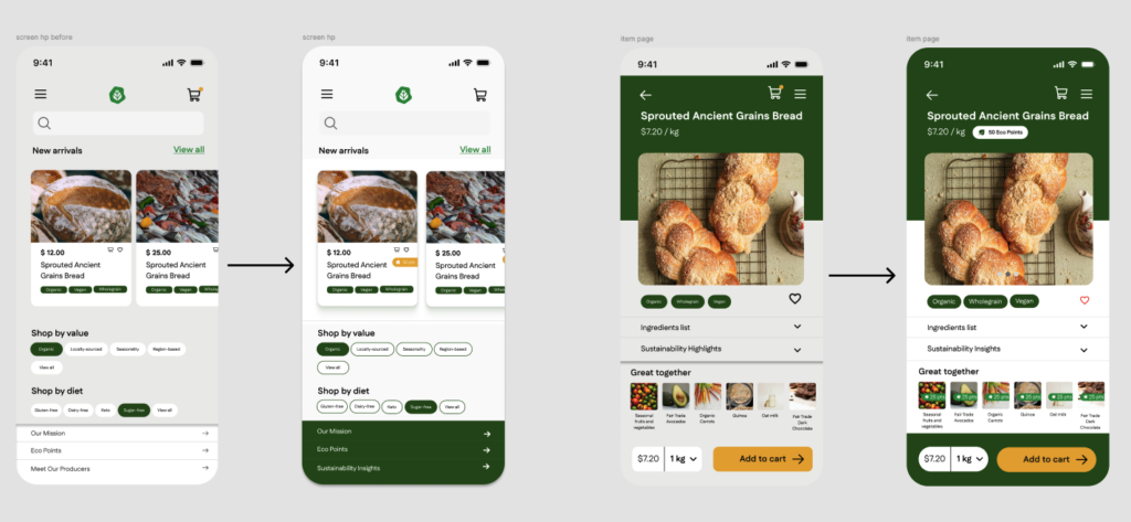
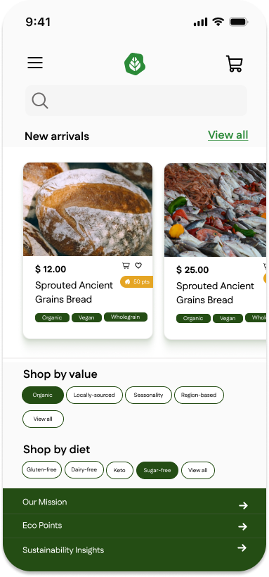
Make EcoPoints Visible Across the Journey
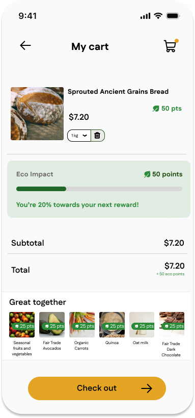
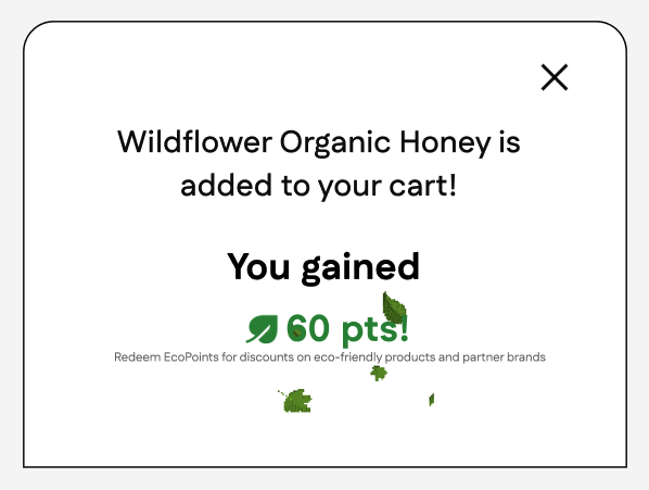
I integrated EcoPoints into key moments of the user journey by displaying how many points each product earns directly on the product page. During checkout, users can now see a summary of the total EcoPoints they will receive, reinforcing the reward system and increasing transparency.
Strengthen Motivation Through Feedback and Rewards
To make sustainability rewards more engaging, I clarified the relationship between user actions and earned rewards. EcoPoints are now presented as immediate positive feedback, helping users feel that their sustainable choices create real and visible impact.
Improve IA and Labeling
I reorganized the navigation by moving “Meet Our Farmer” under clearer sections such as “Our Mission” or “Contact Us”. Additionally, I revised labels like “About Us” to “Our Mission” and “Sustainability” to “Our Environmental Impact” to improve clarity and align with user expectations.
Prototype
Evolving the Design: Second Iteration
I submitted the design as an interactive prototype to a second iteration cycle of usability testing, from which I collected the feedback shown in the notes below. I then translated this feedback into actionable insights and defined design actions based on each insight to further improve the usability and clarity of the interface.
Insights
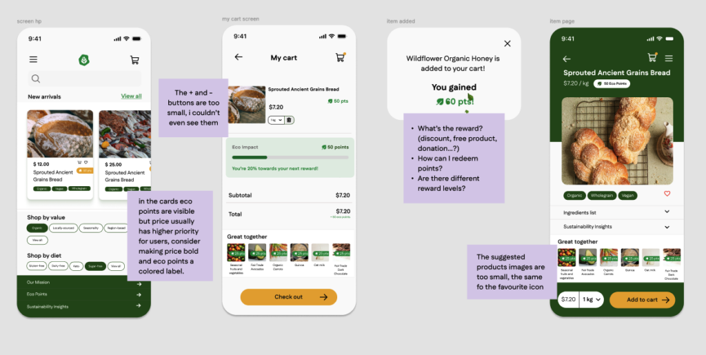
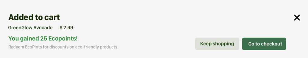
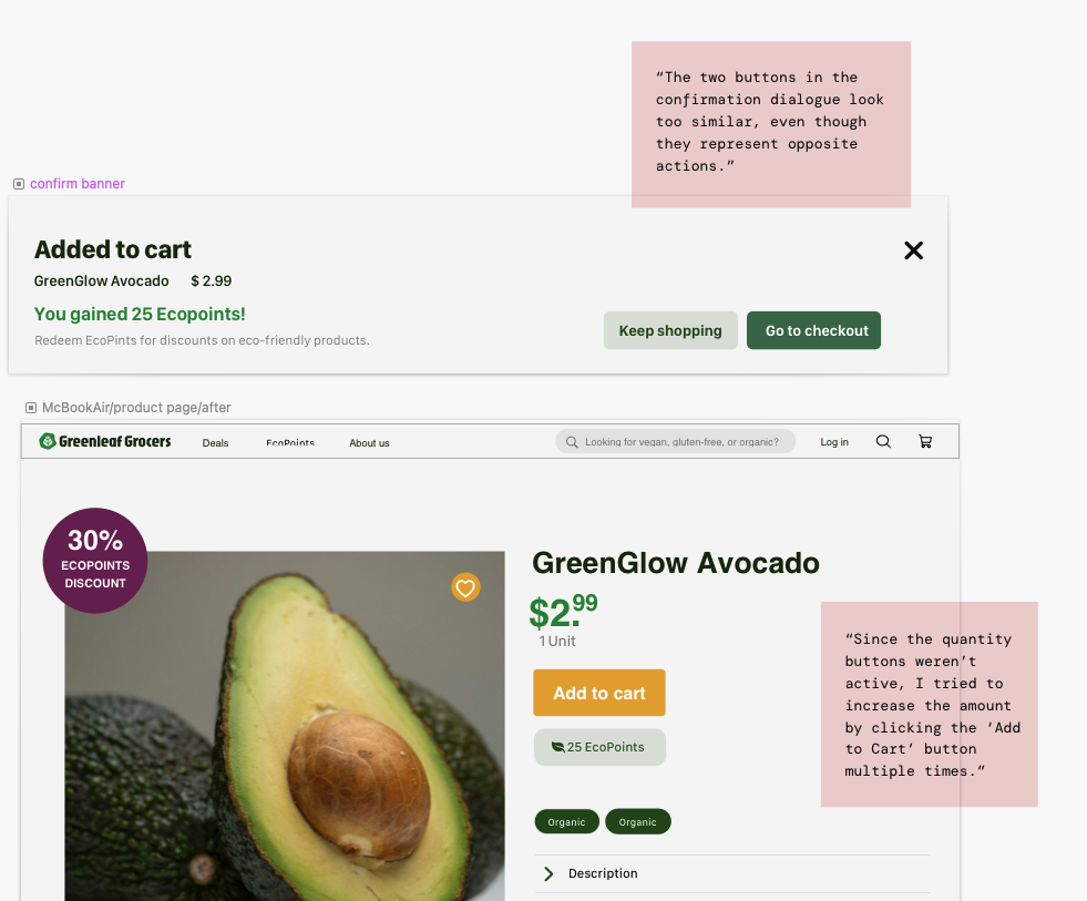
Improve Cart Feedback and System Status Visibility
To ensure users clearly understand when an item has been added to the cart, I introduced a visual confirmation system using a small orange dot on the cart icon. This micro-feedback reassures users that their action was successful without interrupting the shopping flow.
Clarify Favorite State Through Visual Affordance
Suggested product images and the favorite icon were perceived as too small, making it difficult for users to quickly scan products or recognize interactive options, which impacts both engagement and discoverability.
Visual Hierarchy Does Not Reflect User Priorities
Some content, such as the “Meet Our Farmer” section, was not located where users expected. This revealed that certain labels and navigation items were unclear, and that the overall structure of information did not fully align with users’ mental models.
Design Actions Based on Insights
Enhance Filter Interaction and Visibility
I implemented filter chips on the home page to allow users to browse products by value or dietary preference. Chips function as toggle filters: tapping once applies the filter and updates results in real time, while tapping again removes it. This eliminates unnecessary complexity (such as an “X” button) and creates an intuitive, lightweight interaction.
Provide Clear Feedback When Adding Items to Cart
I introduced an add-to-cart confirmation modal that slides up from the bottom with a semi-transparent overlay. This animation reinforces action acknowledgment while keeping the user grounded in context, improving clarity and reducing uncertainty.
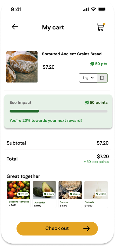
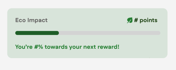
Visualize Eco Impact in Real Time
To increase engagement with the sustainability system, I added an Eco Impact Progress Bar in the cart view. The bar updates dynamically as items are added or removed, giving users immediate feedback on how close they are to their sustainability goal.


Wireframes – desktop
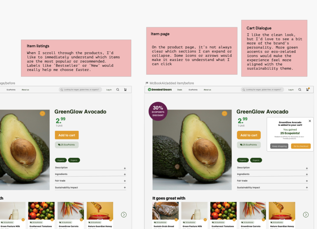
In this section, I present the UX design process for the desktop version of the product by showcasing the wireframes of three key screens: the Home Page, the Product Detail Page, and the Product Detail Page with the add-to-cart confirmation overlay. Each wireframe is shown together with the feedback collected during the first round of usability testing, highlighting how user input directly informed design decisions from the earliest stage.
Learning from Users: First Iteration
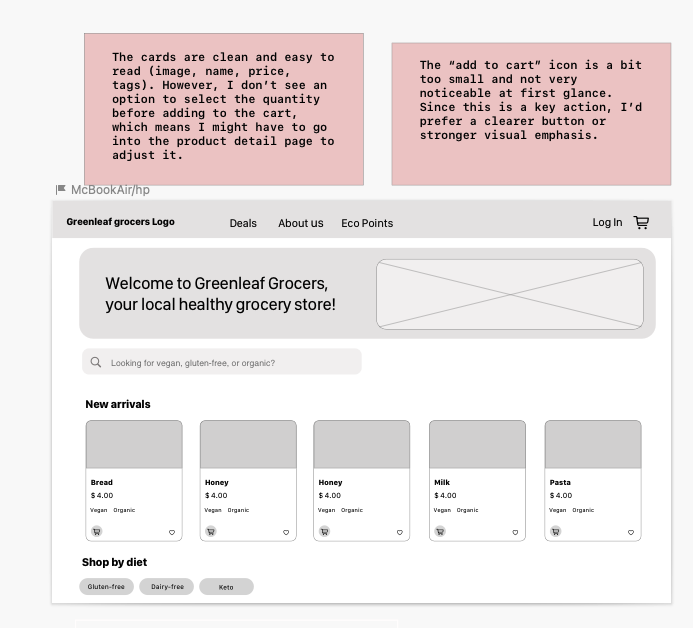
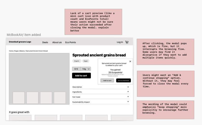
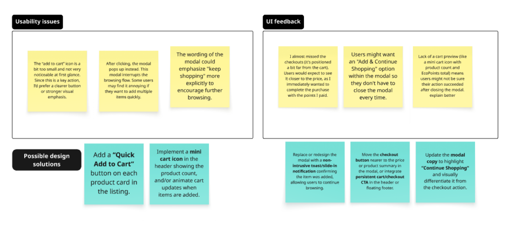
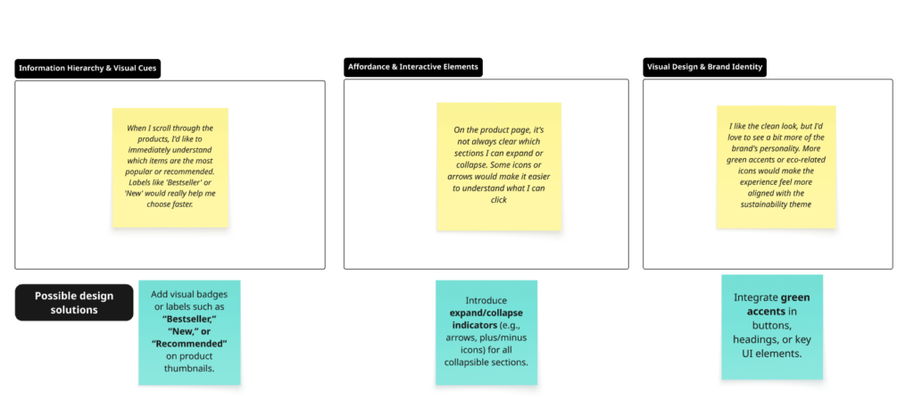
I grouped the feedback received on the first desktop wireframe of GreenLeaf Grocers into two categories: Usability Issues and UI Feedback. I then identified possible design solutions for each category.
Then I used this matrix to prioritize design solutions by balancing user impact and implementation effort. Even though not all quadrants were populated, the matrix helped visualize my decision-making and clarify how priorities were set.
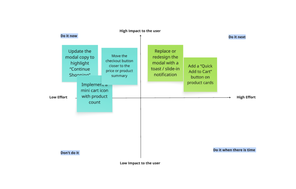
What I Learned from This Prioritization Phase
This prioritization phase helped me understand the importance of moving beyond collecting feedback and focusing instead on structured decision-making. Using the Impact–Effort matrix allowed me to shift from “what users say” to “what should be built first,” reinforcing the value of connecting user needs with realistic design constraints. I also learned that not every framework needs to be applied rigidly — even when not all quadrants are populated, the process still provides clarity and strengthens design rationale.
Design System: Mobile & Desktop
To ensure visual consistency and scalability across desktop and mobile experiences, I created a design system that reflects Green Leaf Grocers’ sustainable values while supporting accessibility and usability.
Design Foundations
This section presents the visual foundations that guide the overall look and feel of Green Leaf Grocers across both desktop and mobile platforms. These core elements remain consistent between devices to ensure brand recognition and visual coherence.
Key elements include:
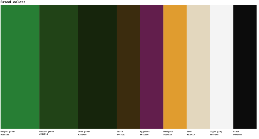
- Color palette: Primary and secondary colors chosen for accessibility and to highlight sustainable products.
- Typography: Hierarchical text styles for headings, body, captions, and buttons, optimized for readability on desktop and mobile.
- Iconography: Consistent icon set representing actions, product categories, and loyalty features.
- Spacing & layout rules: Grid system, margins, and padding guidelines to ensure consistent alignment and visual balance.
- Accessibility considerations: Accessibility was considered throughout the design system to ensure the experience is inclusive and usable across devices. Color choices were tested to maintain sufficient contrast between text, backgrounds, and interactive elements. Typography sizes and line spacing were optimized for readability, while interactive components were designed with clear visual feedback and adequate touch target sizes, particularly for mobile users. Consistent states and visual cues help users understand available actions and system responses (forse da sintetizzare)
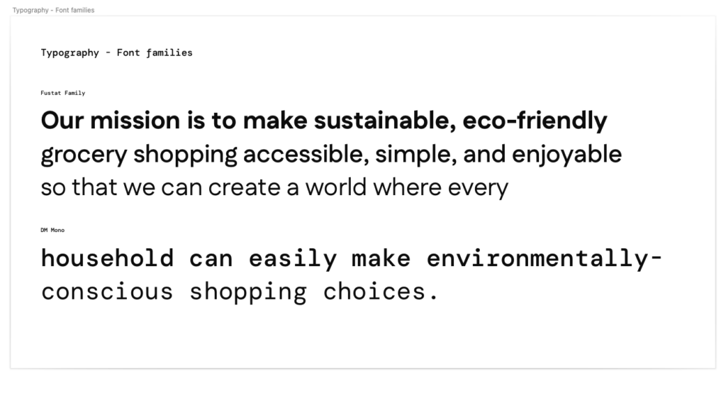
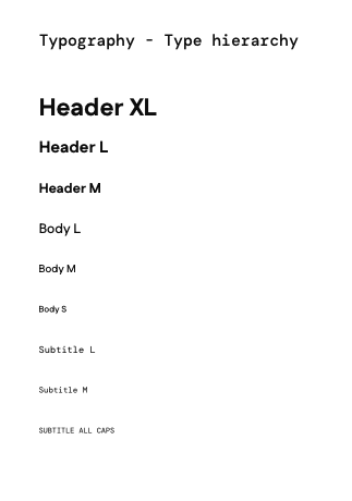
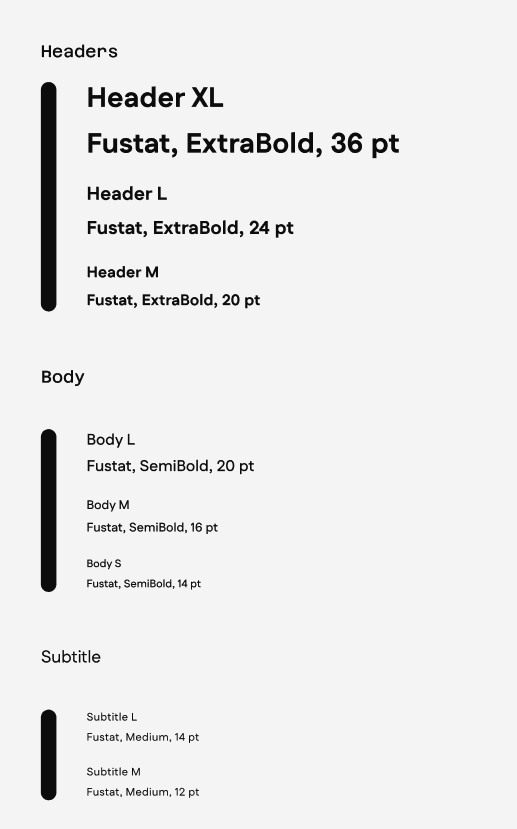
Typography
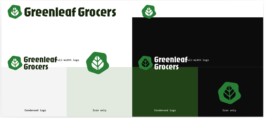
Logo
Color palette
Core Components Desktop (da veder se annuncciarli tuttiinsimee o elencarli uno per uno sotto)
This section focuses on the main interface elements that users interact with. While the core functionality remains consistent across platforms, certain components are adapted to fit the constraints and interaction patterns of mobile and desktop.
Products cards
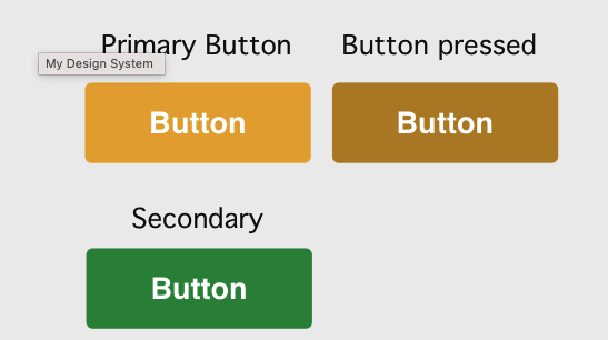
Buttons
EcoPoints components
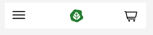
Nav bar


Core Components Mobile
Top Nav Bar
EcoPoint Progression Bar
Overlay Window
Modal Window
Products Card
Buttons
Typography
Schema corretto (da ripetere)
- Component name
- Purpose (a cosa serve)
- Usage & behavior (quando e come usarlo)
- States
- Do’s & Don’ts
- Accessibility considerations
non posso analizzare tutte le ocmponenti copiate sopra per cui mi limiero ad analizzare product cards, eco bar progression e forse le ovelray window per confermare l aggiunta al carrello (mobile e desktop)
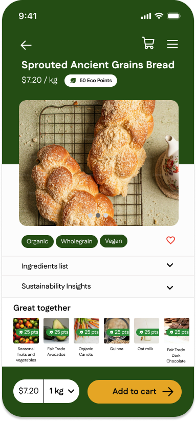
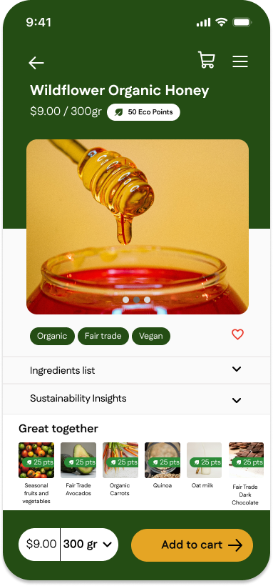
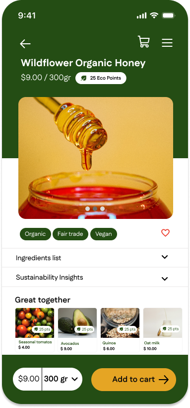
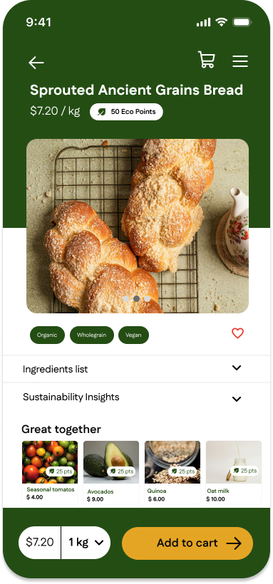
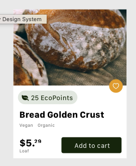
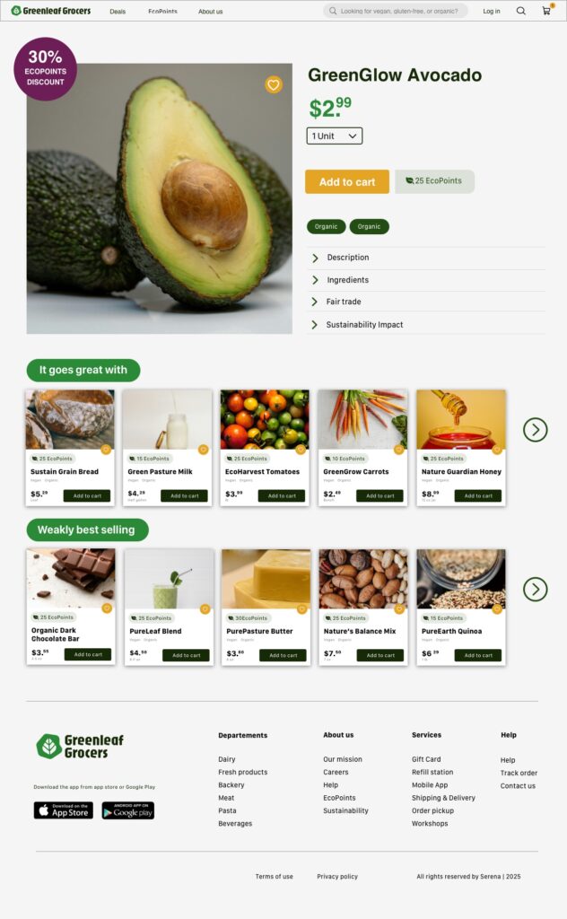
Product card
Purpose
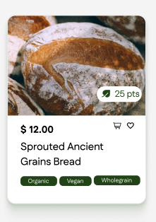
The product card is designed to provide users with a clear, at-a-glance overview of a product. It surfaces the most essential information needed to support quick decision-making, including the product name, price, associated Eco Points, product image, and primary actions.
Usage & behavior
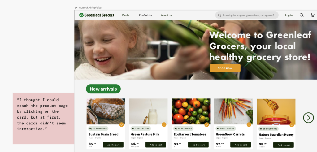
Product cards are used across product listing pages to allow users to browse, compare, and act on products efficiently. Cards are interactive elements and are visually elevated through subtle shadowing to signal clickability and affordance.
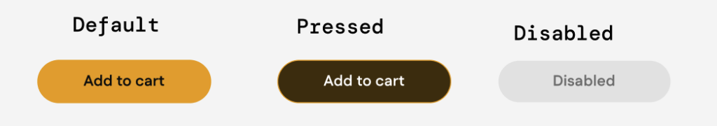
Tapping or clicking anywhere on the card navigates users to the product detail page, while primary and secondary actions remain directly accessible within the card. The “Add to cart” button is displayed in dark green when active, reinforcing its role as the primary call to action.
Visual hierarchy prioritises product imagery and pricing to support fast scanning.
Product cards follow consistent spacing, typography, and interaction patterns to reduce cognitive load.
Immediate visual feedback is provided after user actions, such as adding items to favorites or the cart.
States
“The Product Card component includes several interactive states to ensure visual feedback and accessibility. The Default state displays the standard layout. On desktop, the Hover state applies a subtle drop-shadow to the card container and a color shift to the ‘Add to cart’ button. For keyboard navigation, the Focus state triggers a high-contrast outer ring on the heart icon and buttons. Lastly, the Active state provides immediate tactile feedback upon clicking or tapping, ensuring the user recognizes the interaction.”
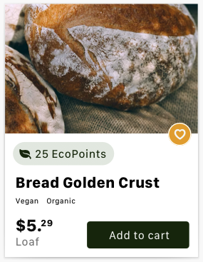
Do’s & Don’ts:
✅ Do
Display product image, name, price, EcoPoints, and category tags clearly.
Always include an “Add to Cart” shortcut button on the card so users can shop quickly without opening the detail page.
❌ Don’t
Don’t overload the card with unnecessary text (keep it simple and scannable).
Don’t hide essential actions like “Add to Cart” inside hover states only—make them visible by default.
Accessibility considerations: The product cards comply with WCAG (Level AA) standards by ensuring optimal color contrast through white text on dark green badges and a white stroke around the heart icon to prevent blending with the background image. The design features a clear text size hierarchy where titles and prices are dominant, while secondary labels like “Organic” or “Loaf” meet the minimum 12-14px threshold for legibility. Furthermore, touch targets have been optimized to a 44×44 pixel standard with increased spacing between the cart and heart icons to prevent misclicks on mobile devices, and a distinct focus state ring has been added to the heart icon to support keyboard navigation.
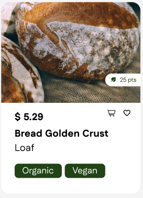
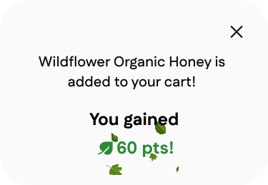
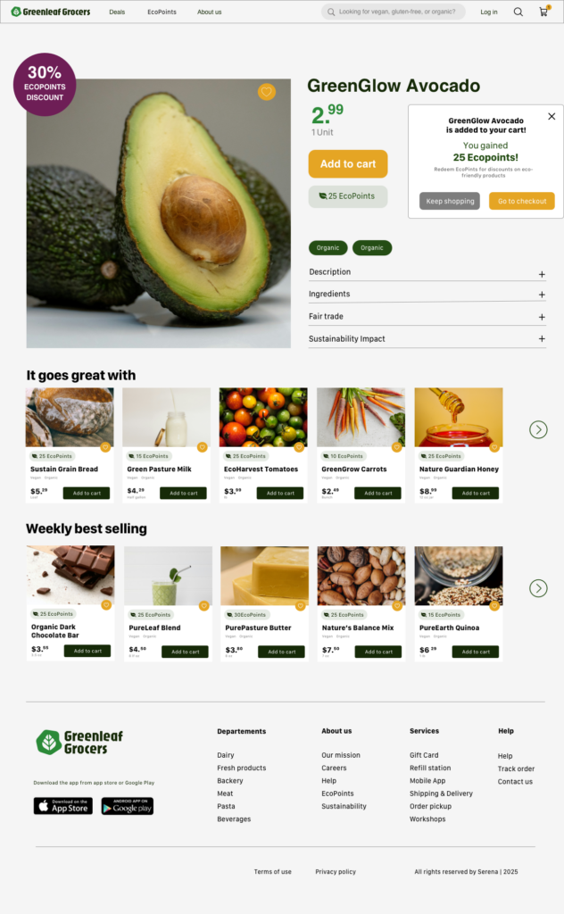
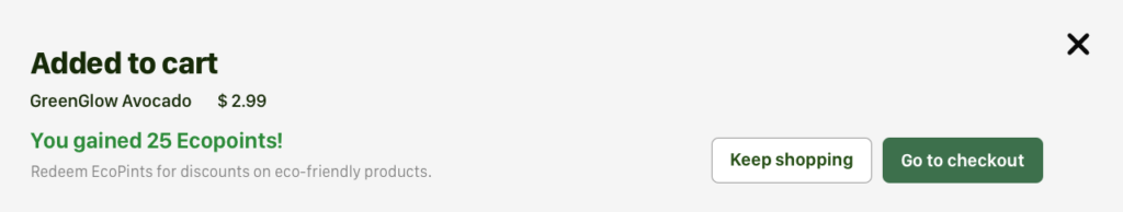
Overlay window
Purpose: The overlay window provides immediate confirmation that a product has been successfully added to the cart. Its purpose is to reassure users that their action was completed while reinforcing the value of the interaction by highlighting the Eco Points earned and briefly explaining their benefits. The overlay allows users to remain within their current browsing context without navigating away from the page.
Usage & Behavior
The overlay window is triggered immediately after a user adds a product to the cart and appears above the current page content. On desktop, it spans the full width of the viewport to ensure high visibility while maintaining awareness of the underlying page. On mobile, the overlay animates from the bottom of the screen and settles at mid-height, optimizing visibility and reachability within a smaller viewport.
States
Default: The overlay appears after the “Add to cart” action and displays confirmation text, earned Eco Points, and supporting information.
Active: The overlay remains visible while background content is visually de-emphasized, allowing users to focus on the feedback.
Dismissed: The overlay closes either automatically after a short delay or after the user clicks on the ‘X’ icon, returning users to their previous context.
Transition: Subtle entrance and exit animations communicate system feedback and support continuity.
Do’s and Don’ts
✅ Do: Use clear and concise language to confirm the successful action. Highlight Eco Points earned to reinforce motivation. Maintain consistent content hierarchy across desktop and mobile. Keep animations subtle and purposeful.
❌ Don’t: Block the interface longer than necessary. Overload the overlay with secondary actions or excessive information. Rely solely on animation without textual confirmation. Use inconsistent messaging or hierarchy between devices.the interaction.”
Accessibility considerations
The primary text (e.g., “Added to cart” or the product name) uses dark colors on light backgrounds, ensuring a high contrast ratio that facilitates reading for all users.
The action buttons (“Keep shopping”, “Go to checkout”) and the close command (X) are well-defined spatially, reducing the risk of accidental touch or click errors.
The most important information, such as the success of the operation and the value of the points earned, is visually emphasized compared to the secondary explanatory text.
EcoPoints progression bar
Purpose: The overlay window provides immediate confirmation that a product has been successfully added to the cart. Its purpose is to reassure users that their action was completed while reinforcing the value of the interaction by highlighting the Eco Points earned and briefly explaining their benefits. The overlay allows users to remain within their current browsing context without navigating away from the page.
Usage & Behavior
The overlay window is triggered immediately after a user adds a product to the cart and appears above the current page content. On desktop, it spans the full width of the viewport to ensure high visibility while maintaining awareness of the underlying page. On mobile, the overlay animates from the bottom of the screen and settles at mid-height, optimizing visibility and reachability within a smaller viewport.
States
Default: The overlay appears after the “Add to cart” action and displays confirmation text, earned Eco Points, and supporting information.
Active: The overlay remains visible while background content is visually de-emphasized, allowing users to focus on the feedback.
Dismissed: The overlay closes either automatically after a short delay or after the user clicks on the ‘X’ icon, returning users to their previous context.
Transition: Subtle entrance and exit animations communicate system feedback and support continuity.
Do’s and Don’ts
✅ Do: Use clear and concise language to confirm the successful action. Highlight Eco Points earned to reinforce motivation. Maintain consistent content hierarchy across desktop and mobile. Keep animations subtle and purposeful.
❌ Don’t: Block the interface longer than necessary. Overload the overlay with secondary actions or excessive information. Rely solely on animation without textual confirmation. Use inconsistent messaging or hierarchy between devices.the interaction.”
Accessibility considerations
The primary text (e.g., “Added to cart” or the product name) uses dark colors on light backgrounds, ensuring a high contrast ratio that facilitates reading for all users.
The action buttons (“Keep shopping”, “Go to checkout”) and the close command (X) are well-defined spatially, reducing the risk of accidental touch or click errors.
The most important information, such as the success of the operation and the value of the points earned, is visually emphasized compared to the secondary explanatory text.
Design System Documentation / Guidelines
This section describes the behavioral rules, interactions, and guidelines for using the components. It ensures that both designers and developers can implement the interface consistently and that interactions are predictable and user-friendly.
Key documentation highlights:
- Interaction behavior:
- Incrementing/decrementing product quantities updates the cart badge in real time.
- Hover, focus, and disabled states clearly indicate interactivity.
- Consistency rules:
- Components must maintain visual and functional consistency across desktop and mobile.
- Buttons, inputs, and cards follow the same spacing and padding guidelines.
- Accessibility considerations:
- Contrast ratios meet WCAG standards.
- Interactive elements are easily tappable on mobile devices.
- Usage notes:
- Primary CTAs should always be visually prominent.
- Secondary CTAs should not compete with main actions.
4️⃣ Esempio di applicazione (caricare un cieo con una mininterazione?)
Collega il design system ai mockup:
- “This design system was then applied to build high-fidelity screens…”
- Mostra 1 screen + highlight dei componenti usati
Questo chiude il cerchio: sistema → interfaccia.
Design System Documentation – Do & Don’ts
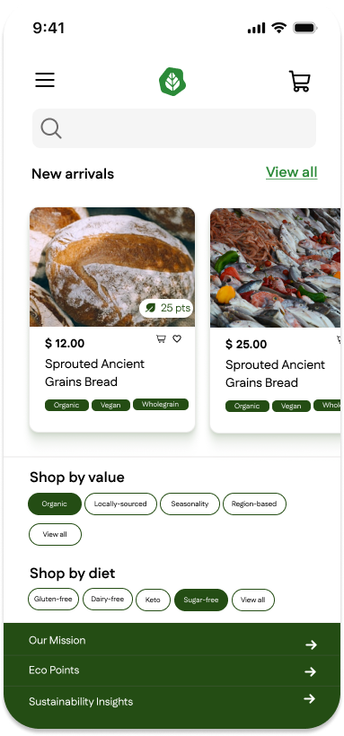
Cards (Product Listing)
Do ✅
Display product image, name, price, EcoPoints, and category tags clearly.
Always include an “Add to Cart” shortcut button on the card so users can shop quickly without opening the detail page.
Keep the card size consistent to maintain a clean grid layout.
Ensure horizontal scrolling reveals only 5 products at a time, with navigation arrows for continuity.
Don’t ❌
Don’t overload the card with unnecessary text (keep it simple and scannable).
Don’t hide essential actions like “Add to Cart” inside hover states only—make them visible by default.
Don’t allow cards to resize differently (inconsistent UI breaks hierarchy).
Horizontal Scroll (New Arrivals & Weekly Specials)
Do ✅
Use arrow buttons (left/right) to guide users when more products are available.
Ensure smooth scrolling animation with consistent speed.
Provide visual feedback when the user reaches the end of the scroll.
Don’t ❌
Don’t enable infinite scroll here (users need clear sections).
Don’t allow partial card cuts (only full cards should be visible per frame).
Don’t hide arrows—if no more products are available, gray them out instead.
EcoPoints Section
Do ✅
Make the “Join Now” button prominent and link it to the EcoPoints page (same as navigation bar entry).
Explain clearly how EcoPoints work, both in the homepage banner and the dedicated page.
Use a consistent EcoPoints badge (icon + number) across cards and detail pages.
Don’t ❌
Don’t use vague wording—always specify how EcoPoints can be earned and redeemed.
Don’t place “Join Now” in a hidden area; it should be highly visible.
Add to Cart Interaction (Homepage & Product Detail)
Do ✅
Show a confirmation toast/modal when a product is added to the cart (with EcoPoints earned).
Always provide two clear options: “Keep shopping” and “Go to checkout”.
Make the cart icon in the navbar update instantly with the number of products.
Don’t ❌
Don’t block the user’s browsing flow with a full-screen modal.
Don’t force the user to go to checkout immediately after adding a product.
Don’t hide the EcoPoints reward info—show it at the moment of interaction.
Product Detail Page
Do ✅
Highlight the product image, price, EcoPoints, and tags (organic, vegan, etc.) clearly.
Use expandable sections for Description, Ingredients, Fair Trade, Sustainability Impact.
Suggest complementary products in a horizontal scroll under “It goes great with”.
Don’t ❌
Don’t overload the top section with too many details—leave secondary info in expandable accordions.
Don’t make “Add to Cart” less visible than secondary actions.
Don’t forget to show related products (cross-selling).
Confirmation Dialog (Add to Cart)
Do ✅
Display the confirmation dialog immediately after the user clicks Add to Cart.
Use a slide-in animation from the right edge to make the dialog noticeable without blocking the main content.
Clearly show the product name, EcoPoints earned, and two options: Keep Shopping and Go to Checkout.
Ensure the dialog auto-dismisses after a short period (e.g., 4–6 seconds) if the user does not interact.
Allow the user to manually close the dialog with an “X” button.
Don’t ❌
Don’t use a full-screen modal that interrupts browsing.
Don’t require the user to take action to continue shopping (the dialog should not block navigation).
Don’t animate the dialog too slowly—transitions should feel quick and responsive.
Don’t hide critical actions (checkout, continue shopping) inside secondary menus.
Design System Documentation
1. Introduction
Our design system provides a set of reusable components, guidelines, and patterns that ensure consistency, accessibility, and efficiency across all our digital products.
Think of it as a toolbox: each component is a tool designed to solve a specific problem. By using these tools, we create interfaces that are visually harmonious and easy to use.
2. Principles
The system is guided by the following principles:
- Clarity – Every component should communicate its purpose clearly.
- Consistency – Components look and behave the same across products.
- Accessibility – Everyone can use our products, regardless of ability.
- Efficiency – Components save time for designers and developers by being reusable and well-documented.
3. Components
3.1 Filter Chips
What are filter chips?
Filter chips are small, rounded buttons used to filter or categorize content. They allow users to quickly narrow down options based on selected values, such as “Organic,” “Vegan,” or “Gluten-free.”
When to use them:
- When users need to filter or refine a list of items (e.g., products, articles).
- When you want to provide a quick, scannable set of categories.
- When multiple filters can be selected at once.
When not to use them:
- When the list of options is very long (use a dropdown or sidebar instead).
- When users should only choose one option (use radio buttons or tabs).
Anatomy of a filter chip:
- Container – A pill-shaped background that holds the label.
- Label – Text describing the filter (e.g., “Organic”).
- State indicator – Visual change when the chip is selected (e.g., background color and text color).
- Optional icon – A checkmark or close icon to reinforce selection state.
States:
- Default – Light background, dark text.
- Hover/Focus – Slightly darker background or outline to indicate interactivity.
- Selected – Stronger background color with white text for contrast.
Design guidelines:
- Use pill-shaped chips for a softer, more harmonious look.
- Ensure enough padding for readability and touch accessibility.
- Use animation (e.g., color transition) to make state changes feel natural.
- Maintain color contrast for accessibility compliance (WCAG AA minimum).
Example:
Default chip → Organic
Selected chip → Organic (green background, white text, subtle shadow)
3.2 Typography
- Use clear, legible fonts such as Fustat
- Keep labels short and direct.
- Font size should be consistent across chips (recommended: 14px–16px).
3.3 Colors
- Neutral background for inactive chips (light gray or soft neutral).
- Primary brand color for selected chips (e.g., green for Organic).
- Maintain at least 4.5:1 contrast ratio between text and background.
4. Usage Best Practices
- Keep the number of visible chips manageable (avoid overwhelming the user).
- Group chips logically (e.g., by diet, by value).
- Use “View all” for categories with many filters.
- Test chips on mobile and desktop to ensure they are easy to tap or click.
5. Accessibility Guidelines
- Ensure each chip is keyboard accessible (can be focused with Tab, activated with Enter/Space).
- Provide clear labels for screen readers (e.g., “Filter by Organic”).
- Maintain strong color contrast between text and background.
6. Do’s and Don’ts
✅ Do use chips for simple, scannable filter options.vv
✅ Do make sure selected chips stand out clearly.
✅ Do use consistent shapes and padding.
❌ Don’t overload the user with too many chips at once.
❌ Don’t rely only on color to indicate selection (use icons or bold text as well).
❌ Don’t use chips for navigation between pages—use tabs instead.
7. Versioning & Feedback
This design system is a living document. Components may evolve as our products and user needs grow.
- Always check the latest version before implementation.
- Share feedback with the design team if something is unclear or missing.
#
Struttura finale consigliata (pulita e forte)
Design System
Design Foundations
Color Palette
Typography
Iconography
Spacing & Layout Rules
Accessibility Considerations
Core Components
Filter Chips
Product Cards
Quantity Selector
EcoPoints Progression Bar (se centrale per il progetto)
Design System Documentation / Guidelines
Interaction Rules
Consistency Principles
Cross-Device Behavior
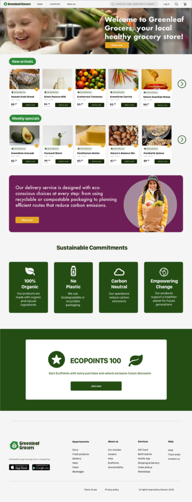
Mockups – desktop
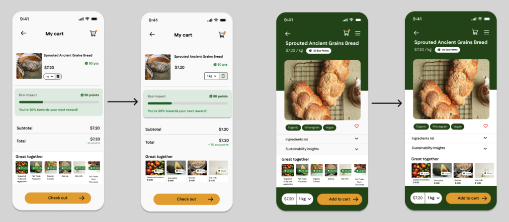
The feedback collected during the first round of usability testing on the wireframes was directly integrated into the mockups. The improvements focused on usability, visual hierarchy, and clarity of information. The figures below present the updated mockups, which will be used for the second iteration cycle of usability testing to further validate design decisions and gather new insights.
Design Solutions adopted
1. Linked the cart icon directly to the cart screen to streamline navigation and reduce friction in the shopping flow..
2. Added a ‘Continue Shopping’ button in the modal dialog to provide users with a clear option to return to browsing after adding an item to the cart.
3. Enhanced the EcoPoints label helps users easily recognize rewards and incentives, reinforcing engagement with the sustainability features of the platform.

Evolving the Design: Second Iteration
In the second round of usability testing, we focused on the mockups. This session produced the insights and observations summarized in the image below:
Due to the number of feedback items received and their overall effectiveness, I immediately translated these feedback points into possible design solutions.
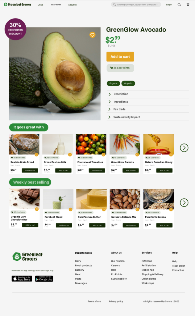
Design Solutions Adopted
1. Placed category titles (“It goes great with” and “Weekly best-selling”) inside colored rectangles to make it clearer that they are two distinct product categories.
2. Add-to-Cart Confirmation Dialogue updated with green tones, consistent with the site’s branding. Removed grey “Keep Shopping” button (grey suggested “inactive”). Kept “Go to Checkout” as the main CTA, with a secondary but active “Keep Shopping” option. Applied different fonts to emphasize hierarchy of information.
3. Product Information Sections replaced plus (+) icons with forward arrows to make it clearer that sections (Description, Ingredients, Fair Trade, Sustainability Impact) are expandable.
Interactive Prototype: Second Iteration
The next step consisted of submitting the interactive prototype—not just the mockup—to usability testing.
During the usability test, I defined several test objectives, specifically: to evaluate ease of navigation, the clarity of the checkout process, and overall user satisfaction.
The tasks I asked users to complete were three:
1. Find and add a product to the cart and then proceed to checkout;
2. Find a specific product;
3. Find information about the product.
The images below show the feedback collected from the usability test of the interactive prototype, which will be used to refine its final version.
Design Solutions Adopted
1. Improved Clickability
I made the product cards on the homepage appear more clearly clickable by adding a shadow effect to them.
2.Quantity Controls Added
I added quantity controls on the product detail page, allowing users to adjust the number of items before adding them to the cart.
3.CTA Visual Hierarchy
I made the secondary call to action less visually prominent and less competitive with the main “Go to Checkout” button by changing its color.
Final Prototype
Outcome
This project focused on redesigning the desktop and mobile experience of Green Leaf Grocers, a sustainable grocery store, with the goal of modernizing an outdated desktop-only interface and creating a more accessible, engaging, and eco-conscious digital experience. The business objectives were to better communicate the brand’s sustainability values, highlight the eco-friendly nature of the products, and introduce a loyalty program aimed at increasing customer retention and attracting new users.
Starting from the needs of Green Leaf Grocers’ existing customers, I mapped the user journey to identify key pain points, unmet needs, and opportunities where design solutions could add value. Based on these insights, I reimagined the EcoPoints loyalty system to better motivate users and encourage continued engagement across both desktop and mobile experiences.
Through multiple rounds of iteration, I tested mockups and interactive prototypes with users from the target audience. The feedback collected during usability testing informed continuous improvements to the information architecture, visual hierarchy, and navigation clarity, resulting in a more streamlined and user-friendly experience. These iterations helped ensure that sustainability messaging, loyalty features, and core shopping flows were easy to understand and accessible across devices.
Overall, this project strengthened my ability to balance business goals, user needs, and sustainability values within a cohesive UX strategy, while reinforcing the importance of user-centered iteration and testing in delivering meaningful design outcomes.
Next steps
The next steps for this project would focus on further refining and expanding the product to better align with a real-world implementation. This includes developing additional screens and flows, strengthening the design system to ensure visual and interaction consistency, and enhancing the interactive prototypes with more advanced states and micro-interactions to more closely reflect the final product. Another important area of improvement would be UX writing: refining sustainability-related copy to better match users’ expectations and information needs, supported by future usability tests focused on content clarity, tone, and trustworthiness.