Role
UX Designer
Tools
Figma
Miro
Maze
Photoshop
Service
UI+UX
Time
January- May 2023
Project overview
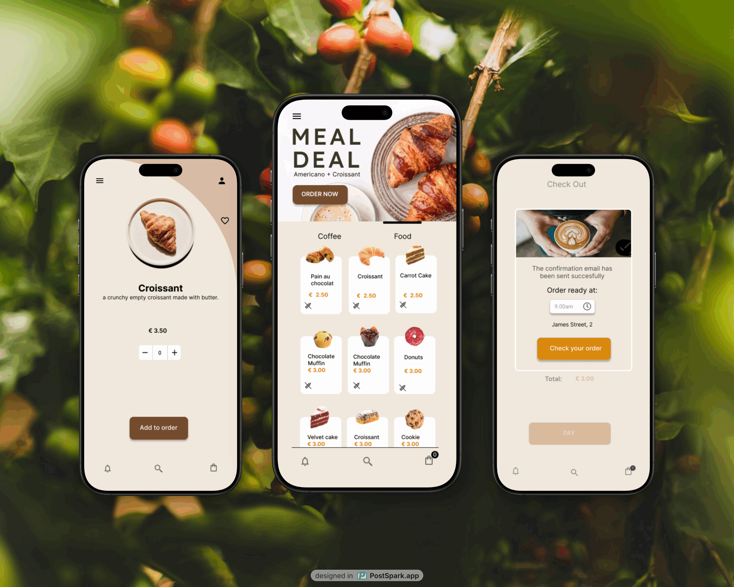
The Coffee House is a local independent coffee shop based in the city center of Dublin. The app intends to reach customers who usually consume coffee and pastry products before going to work, during their break/lunchtime, or at the end of the day on their way home.
The whole design process was focused on making the user experience seamless and efficient, while also ensuring the app catered to the specific needs of the target audience, individuals with specific dietary requirements such as gluten-free and vegan options.
The Product
The Goal
The Coffee House is a local independent coffee shop based in the city center of Dublin aiming to reach people usually willing to consume good coffee or gluten-free donuts before going to work, during their break/lunchtime, or at the end of the day on their way home
Design an app for The Coffee House that reflects customers’ needs by offering a differentiated menu with gluten-free and vegan options, implementing a seamless in-store pickup system, and creating compelling visuals for meal deals to effectively promote the store’s special offers.
The User Problem
The Business Problem
Workers need a quick service to choose and buy online coffee and food with affordable prices and specific nutritional components.
The Coffee House in Dublin aims to expand its customer base and build loyalty among existing customers. To achieve this, they need to promote their new menu, which caters to various dietary needs, streamline the online ordering process for quick and easy coffee pick-up, and engage customers by leveraging their curiosity with daily special offers.

Understanding the User
User research: summary
I conducted interviews and created empathy maps to understand the users’ needs. A primary user group identified through research was working adults who are used to ordering food and drink online.
This user group revealed that the main issue while ordering online was the scarcity of gluten-free or vegan options on the menu and the lack of convenient daily offers that can incentivize the use of the app. In general, a difficult checkout process and an unclear order confirmation flow discourage users from using the app.
Based on the comprehensive user research and feedback, I implemented changes in the app design to streamline the ordering process and make it more intuitive. The adjustments included prominent display of meal deals, clear indication of allergens and food preferences, and an enhanced pick-up time selection process.
User research: pain points

Financial
Working adults want to eat according to their diet without renouncing convenience.

Product
Lack of allergen and intolerance info hinders informed user choices.

Process
A not intuitive purchase process confuses and makes completing the order difficult.

Trust
A food platform with poor communication lowers user confidence.
User Journey Map
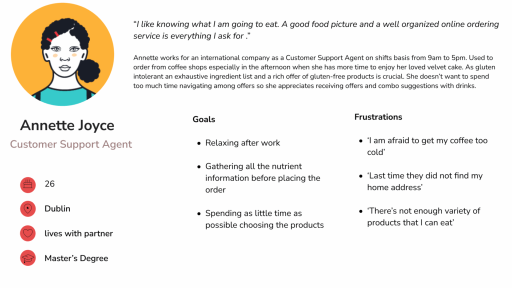
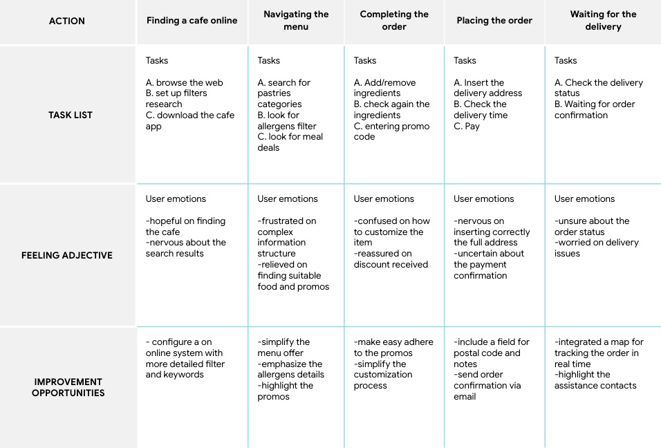
Annette Joyce’s User Maps showed what path a user would follow to order a coffee online according to particular food needs and usability expectations.
Goal: Easily and quickly ordering pastries respecting her food needs and receiving meal deals

Starting the Design
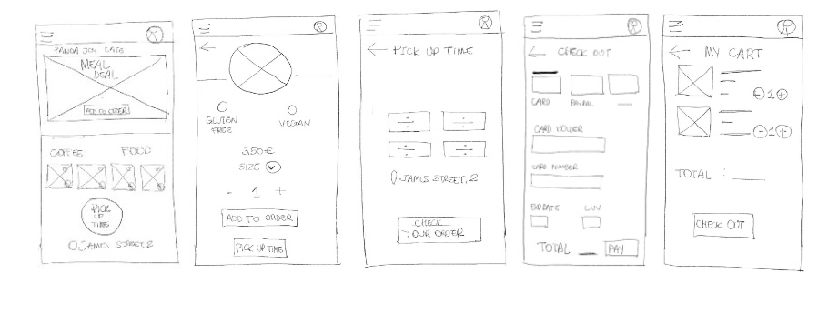
Paper Wireframes
Drawings representing the purchase flow of the app helped include easily users’ pain points in the following digital wireframes. Sketches emphasize the smoothness of the process and the presence of meal deals and allergen components on the menu.
Digital Wireframes
Realistic images and relative icons and symbols indicating the main food characteristics help users save time, avoid frustration, and trust the app.
One of the main findings from users regarded a trust issue in online services. I made sure to base screen designs on reliability and update order communications.
Users’ feedback pointed that is not always easy to get online offers. Moreover, most people appreciate having the option to speed up the ordering process by selecting products directly from the homepage.
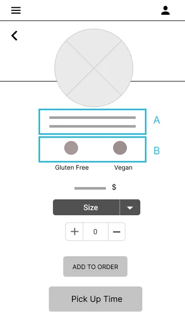
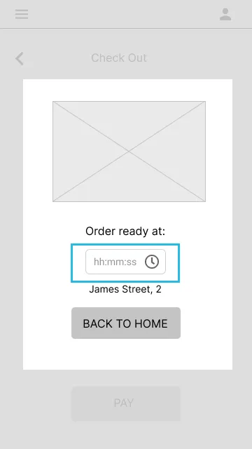
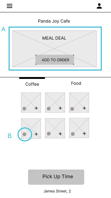
A
A product description and a list of ingredients under the item picture inform the user about any possible allergens issues.
B
Allergens and vegan options are indicated with an icon and a brief description to help immediately recognize the main nutritional components of the product.
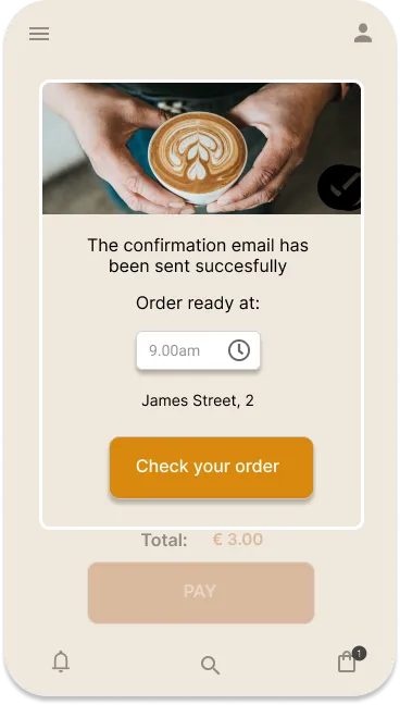
The confirmation page outlining the pickup time and the coffee house address serves as a reminder of the main order info.
A
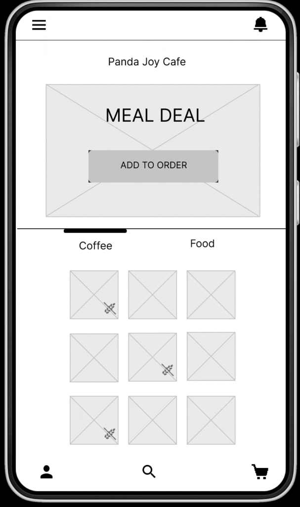
Highlighting the Meal Deal ad by positioning it on the upper part of the home page
B
The food icons in each product card inform the user about the different vegan and/or gluten-free options available on the menu
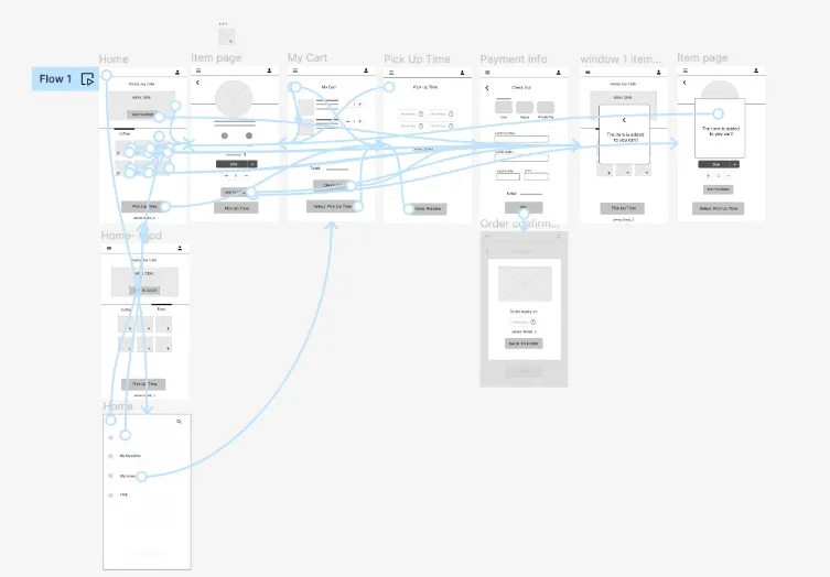
Low-fidelity prototype
Usability study: findings
Round 1: fundings

Users want to quickly identify gluten-free productsWorking adults want to eat according to their diet without renouncing convenience.

The user wants to get an order confirmation email

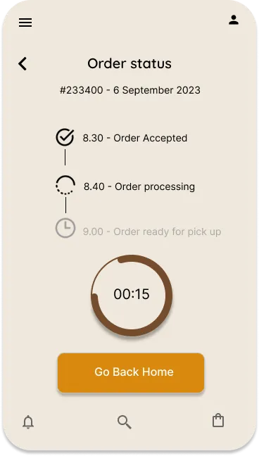
Users wants to easily track the order status
Round 2: fundings

The Meal Deal ad is still not appealing to the users

The Pick Up screen is still confusing

It’s not possible to know what is included in the Meal Deal

Refining the Design
Mockups
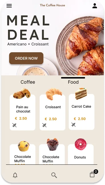
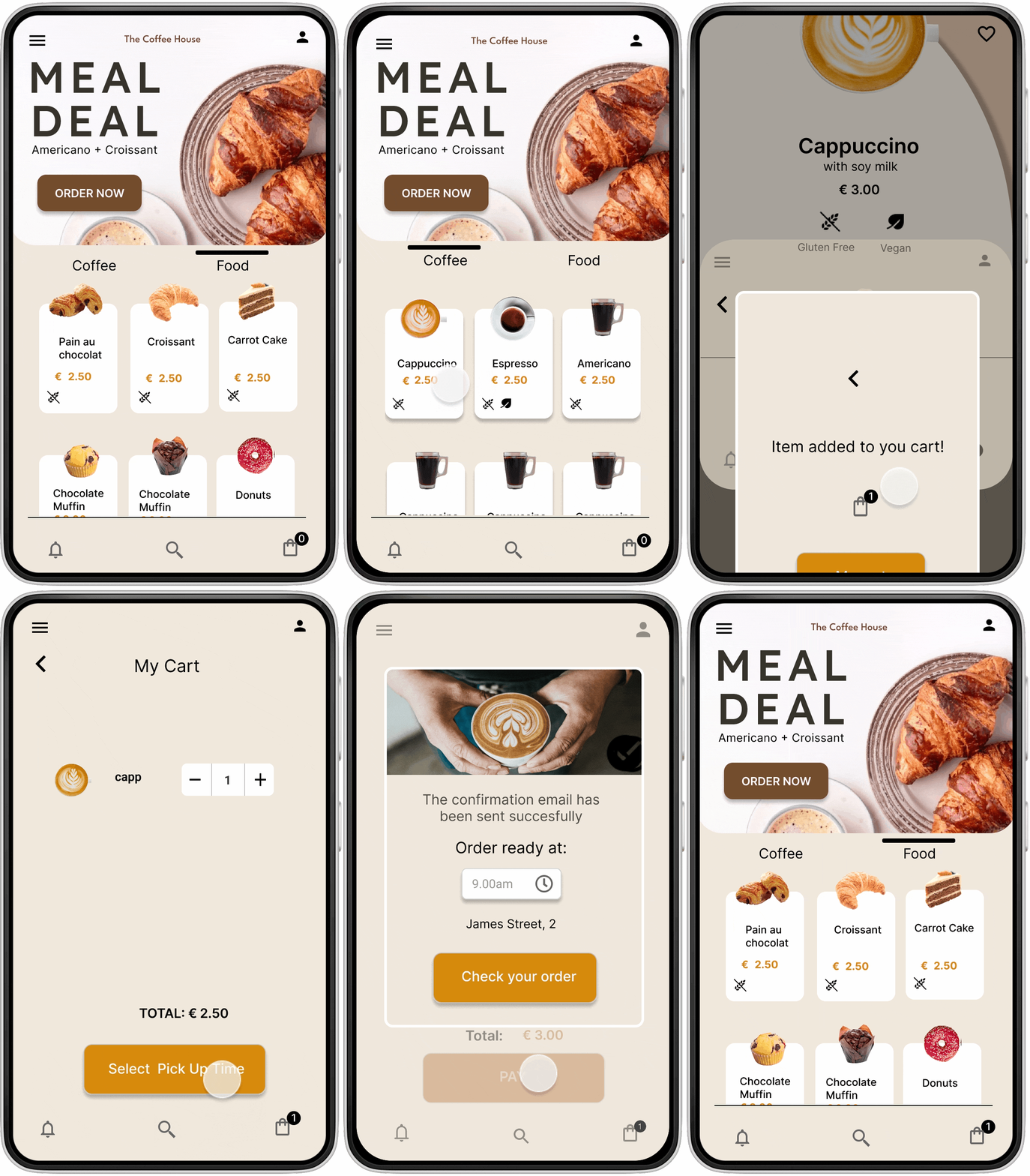
After the usability studies, I emphasized the Meal Deal ad, added a brief description of the offer, and inserted the price and more appealing images to make the deal more visible for the user while navigating the menu of the Coffee House.
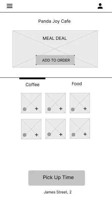
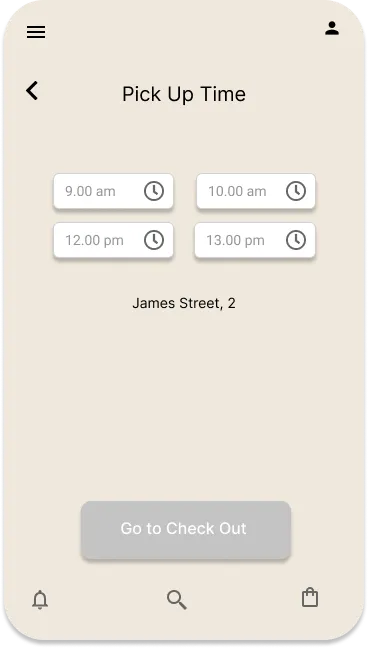
The second usability study revealed frustration with the Pick Up Time screen. It was not clear to the user how to select and confirm the pickup time before proceeding with the order.
To smooth this flow, I added two following steps:

Selecting and confirming the pick-up time

The confirmation screen
BEFORE USABILITY TEST
There is no way for the user to understand if the pickup time has been correctly selected. Moreover, even if the user doesn’t select any time, the Checkout button is still active and makes it possible to go to the Checkout screen.
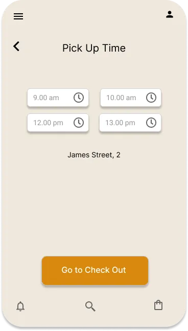
AFTER USABILITY TEST (PICKUP TIME FLOW)
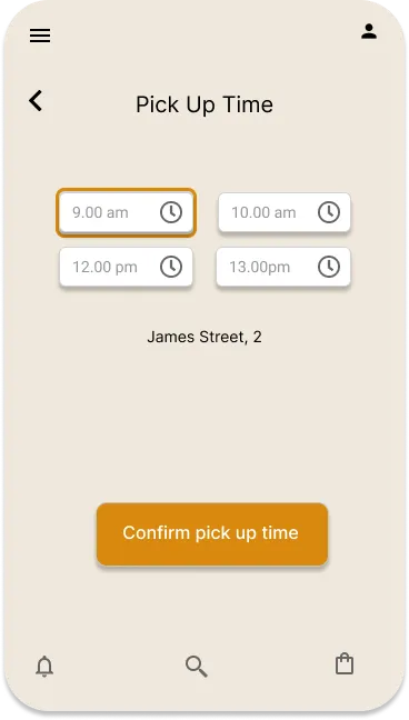
The pickup time is revisited.

The Checkout button remains inactive (greyed out) if no time has been selected above. This will prevent the user from proceeding with the order without completing all the necessary steps

Once the time has been selected it’s possible to confirm it by clicking on the relative button

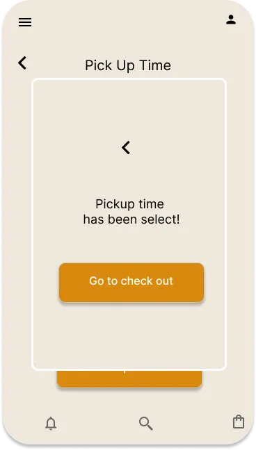
The user is informed about the success of the operation and can now go to the Checkout screen
1
2
3
The second usability study highlighted the user’s need to check the order status. The Back To Home button was replaced with the Check Your Order button that leads to the screen that informs about the order phases timely.
Before
After
High-Fidelity Prototype
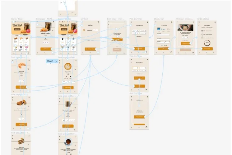
The final high-fidelity shows a more prominent Meal Deal ad on the home page and a clearer pick-up time flow where the user is asked to select a time before completing the order. Moreover, I added an Order Status screen to inform the user about the order processing.
Accessibility Considerations

Provided access to users who are vision impaired through adding alt text to images for screen readers

Added text to the allergens and vegan product icons to help users easily distinguish among different items.

Used product captions and realistic images to help all users easier navigate the menu.

Going forward
Impact
What I learned
The app helps users to order their favorite coffee quicker, find gluten-free products easier, take advantage of the daily promo, and optimize their time with the pick-up service.
While designing the Coffee House app I learned that user feedback is an essential part of the process. It’s important to keep at the center what the users’ needs the app wants to satisfy.
One quote from the usability test:
‘’It seems pretty functional. I enjoy navigating the app to order some gluten-free patisserie. The tracking order screen is a great feature especially when you have a busy day and need to schedule your time in advance!’’
Next steps

Conduct another round of usability studies to validate whether the pain points users experienced have been effectively addressed.

Develop a more detailed prototype that lets users have a more complete user experience with the app (like implementing the My Favorites feature)

Improve the accessibility of the app to make it more inclusive
Get in touch!
Thank you for watching!


