
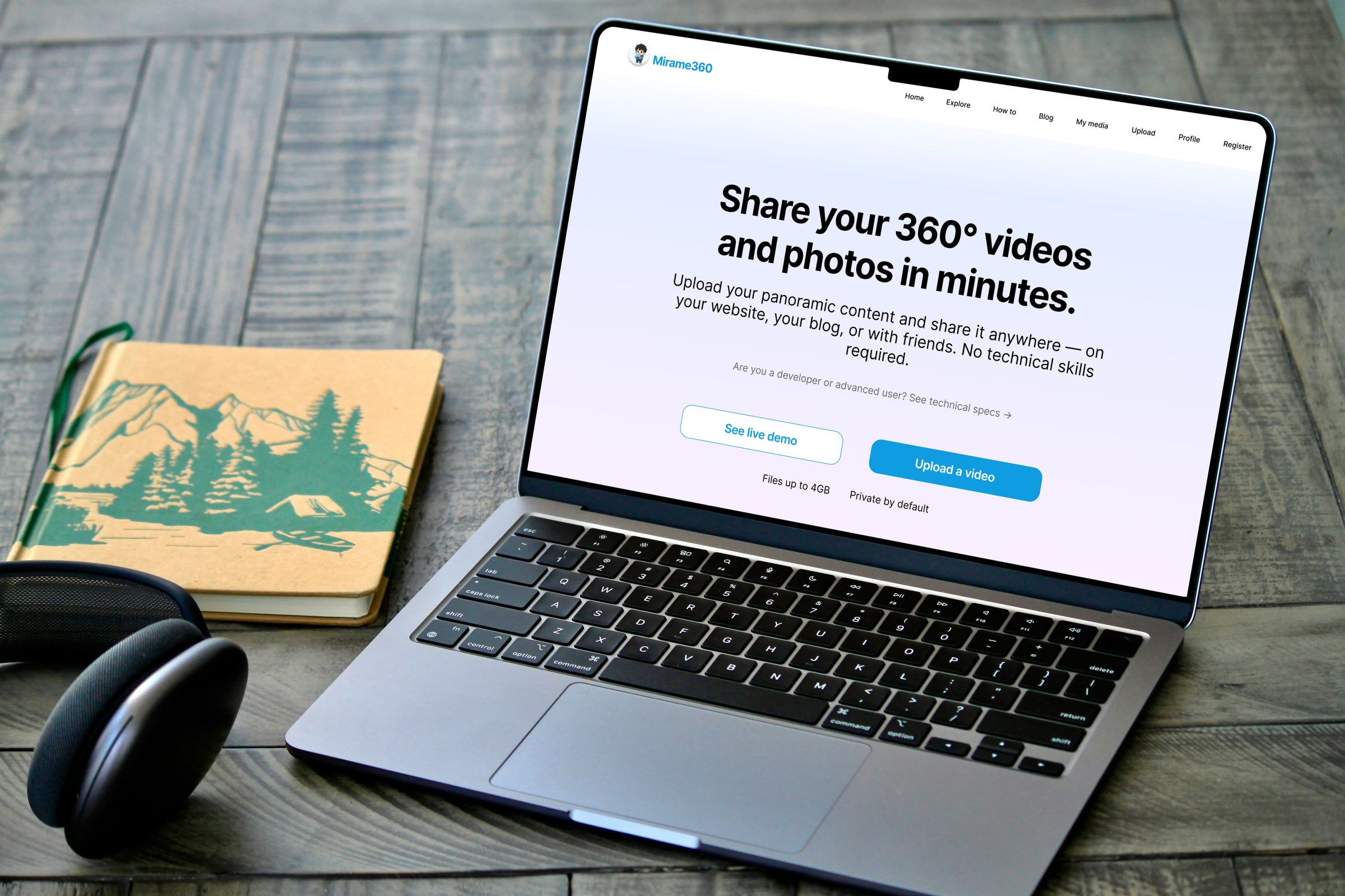
UX audit, user research and wireframe redesign for a 360° media SaaS platform — bridging the distance between technical complexity and human simplicity.
Role
UX Designer
Tools
Figma
Figjam
Maze
Photoshop
Service
UX+UI
Time
July – August 2026
Project Overview
Mirame360 is a web-based SaaS platform that allows users to upload, convert and share 360° photos and videos — making immersive media accessible across websites, blogs and social platforms without technical setup.
This project was conducted as a freelance UX engagement with the platform founder. Starting from a heuristic audit of the existing interface, the work expanded into a full UX research and redesign process — including user interviews, affinity mapping, persona development, user journey mapping and wireframing across eight key screens.
The project was completed over approximately six weeks, working alongside the founder as the primary stakeholder. All design decisions were validated through a remote unmoderated usability test conducted with real users matching the target persona profile.
Throughout this project, AI was integrated as a strategic collaborator at three key stages of the UX process.
Designing Faster. Thinking Deeper. AI-assisted process.
During the Heuristic Audit, Claude was used to generate an initial list of usability issues based on Nielsen’s 10 heuristics — a first pass that was then validated and expanded through direct observation of the live product. This reduced the initial analysis time significantly while maintaining methodological rigour.
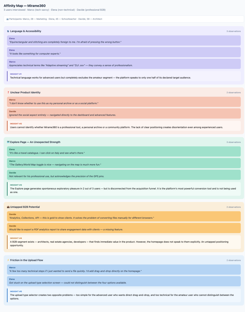
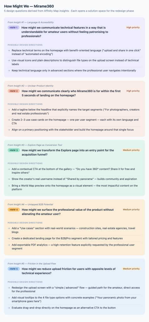
During the Synthesis phase, Claude supported the construction of the Affinity Map by identifying recurring thematic clusters across the three user interview transcripts. The resulting five clusters — language accessibility, product identity, the Explore page opportunity, B2B potential and upload friction — were validated and interpreted by the designer before informing the How Might We questions.
During the Persona development phase, Claude was used to translate and refine the persona content into professional English — ensuring consistency of tone across the full case study while preserving the insight and intent behind each profile.
In all cases, AI accelerated time-consuming tasks without replacing the designer’s judgment. Every output was reviewed, challenged and adapted before being used to inform design decisions.
The Business Goal
The UX Design Goal
Mirame360 is an early-stage SaaS platform for uploading, converting and sharing 360° media. At the time of this project, the platform had a small but growing user base — and the founder’s primary objective was clear: increase the number of registered users and the volume of media uploaded to the platform.
The challenge was not the product itself, which offered genuine technical value, but its ability to attract and retain users beyond the niche of developers and advanced photographers.
The UX goal was to lower the barrier to entry for non-technical users — without compromising the experience of professional ones.
Through a heuristic audit, user interviews and usability testing, the project identified three core friction points: technical language that alienated amateur users, an unclear onboarding flow that prevented first-time visitors from understanding the product’s value, and privacy controls that created anxiety rather than trust.
The redesign focused on making Mirame360 feel approachable from the very first interaction — so that Emma, our non-technical persona, could upload and share her first 360° video independently, without asking for help.

Discovery
Stakeholder Brief
Analysis
Heuristic Audit

Research
Users interview
Design
Prototype
Validation
Usability Test
Stakeholder Interview
Known Pain Points — Stakeholder Perspective
- Low user numbers — the founder identified acquisition as the primary challenge. The platform was not converting enough visitors into registered users.
- Privacy concerns — users expressed hesitation around uploading personal content, creating a barrier to conversion.
- Processing wait time — the encoding process, necessary for large 360° files, was generating frustration and drop-off during the upload experience.
These insights shaped the focus of the subsequent heuristic audit and user research phases — ensuring that every design decision remained anchored to real business and user needs.
Heuristic Audit
What Was Broken Before We Started
Before speaking to any users, I conducted an expert review of the live Mirame360 platform based on Nielsen’s 10 Usability Heuristics. This allowed me to identify structural and communicative issues independently — providing an objective baseline before user research began.
AI was used to generate an initial findings list, which was then validated and expanded through direct interaction with the product. Findings were rated by severity using an adapted version of Nielsen’s Severity Rating Scale — evaluating each issue against three criteria: frequency, impact on task completion and persistence across the user journey.
Findings
Heuristic: Visibility of System Status
🔴 Severity 5/5
Problem: The processing page displays the message “the preview will appear automatically” but does not auto-refresh. Users must manually reload the page or wait for an email notification to know their video is ready.
Impact: Creates anxiety and breaks trust — the system makes a promise it does not keep.
Solution: Added a static reassurance message — You can close this tab — we’ll email you as soon as your video is ready.” Removed the auto-refresh promise from the UI copy.
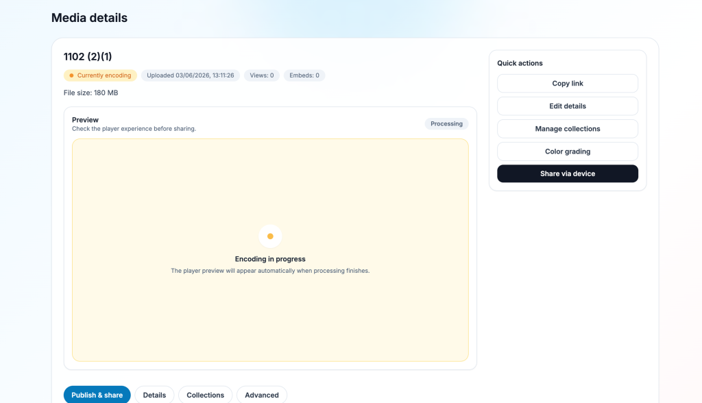
Processing page with “encoding in progress” message
Heuristic: Match Between System and the Real World
🟠 Severity 4/5
Problem: The processing page displays the message “the preview will appear automatically” but does not auto-refresh. Users must manually reload the page or wait for an email notification to know their video is ready.
Impact: Creates anxiety and breaks trust — the system makes a promise it does not keep.
Solution: Added a static reassurance message — “You can close this tab — we’ll email you as soon as your video is ready.” Removed the auto-refresh promise from the UI copy.
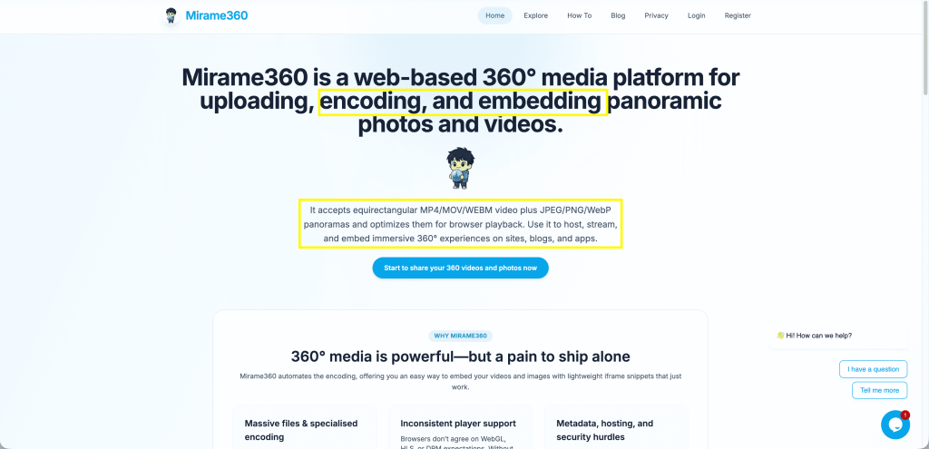
Homepage hero with technical terminology highlighted
Heuristic: Error prevention + Help and Documentation
🟠 Severity 4/5
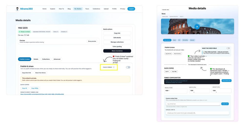
Problem: The explanation of the “Public Embed” toggle is hidden behind a “?” tooltip. Users concerned about privacy never find it — they either avoid the feature entirely or activate it without understanding the consequences.
Impact: Reinforces privacy anxiety identified by the stakeholder as a key conversion barrier.
Solution: Added a permanent inline text below the toggle Your video is private — only you can see it. Turn this on when you’re ready to share publicly.
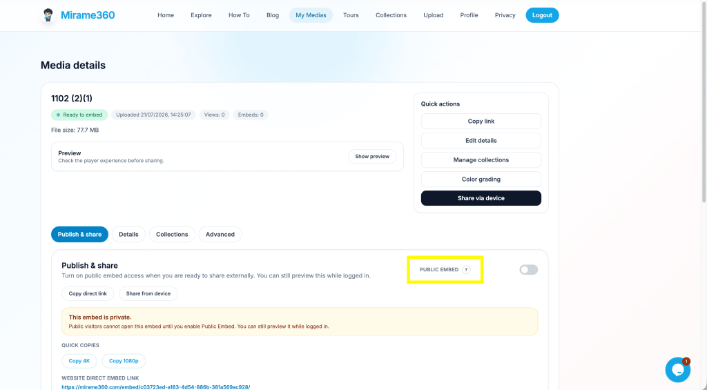
Public Embed toggle with tooltip closed
Heuristic: Consistency and Standards
🟡 Severity 3/5
Problem: Quick Actions on the right panel duplicate tab labels below — “Edit details” mirrors the “Details” tab, “Manage collections” mirrors “Collections” — with slightly different labels, suggesting different functions where there are none.
Impact: Users are unsure which path to follow for the same action.
Solution: Removed duplicate tabs. Quick Actions retained for immediate post-preview actions. Tabs simplified to unique content only.
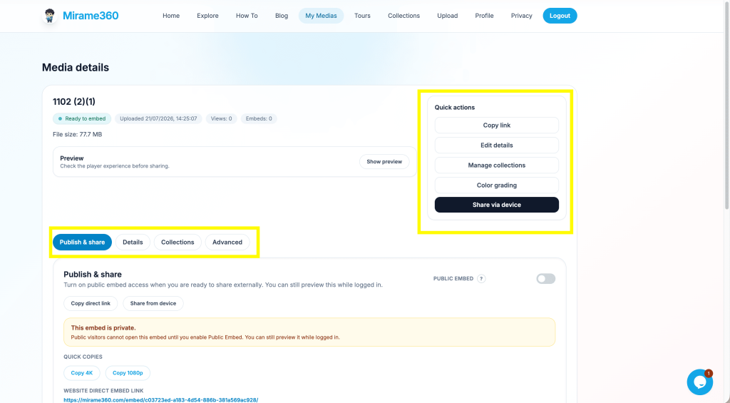
Media Details page showing duplicated controls
Heuristic: Error Prevention
🔴 Severity 5/5
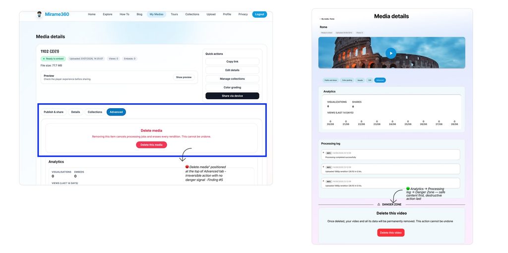
Problem: The irreversible “Delete media” action is placed at the top of the “Advanced” tab — above Analytics and Processing Log — with no visual separation or danger signal.
Impact: A user exploring the interface could accidentally delete their content with no warning.
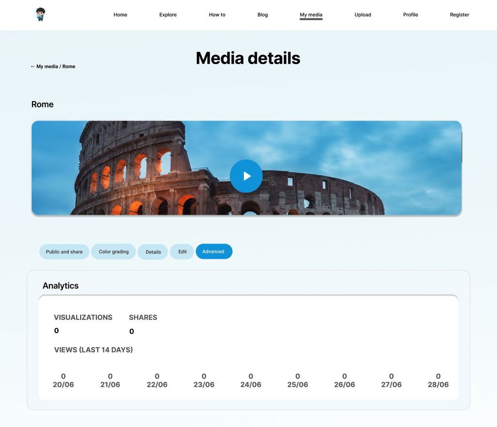
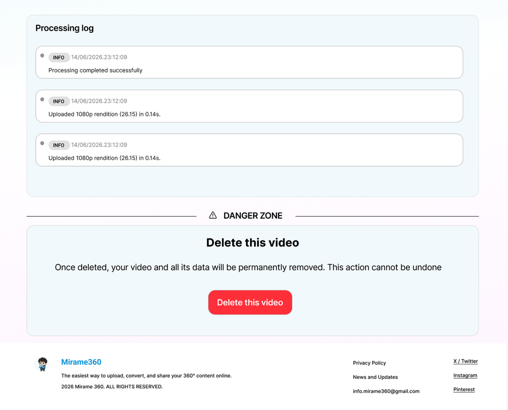
Solution: Moved Delete to the bottom of the Advanced tab, separated by a clearly labelled “Danger zone” divider. Rewrote copy to plain language — “This action cannot be undone.”
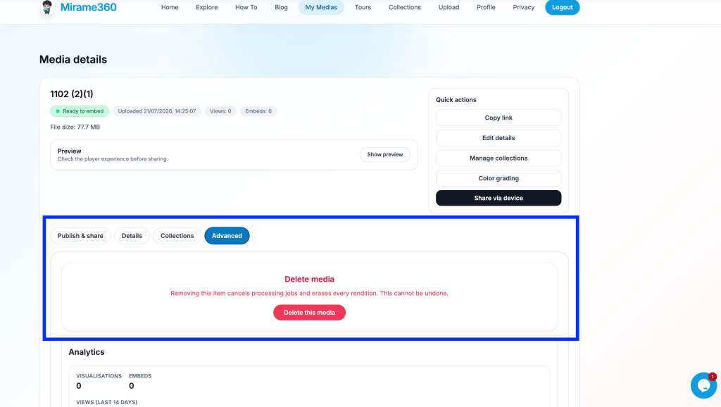
Advanced tab with Delete at the top
Heuristic: Recognition Rather Than Recall + Missed Opportunity
🟡 Severity 3/5
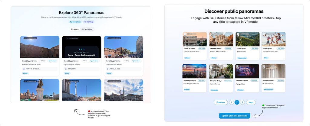
Problem: The Explore page displays inspiring 360° content but is disconnected from the acquisition funnel. Creator cards show “Shared by panorama” instead of real usernames, and there is no call to action inviting visitors to upload their own content.
Impact: Visitors are inspired but have no trigger to convert.
Solution: Replaced generic label with real creator usernames. Added conversion CTA at the bottom of the gallery — “Do you have 360° content? Share it for free.”
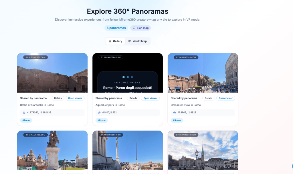
Explore page with “Shared by panorama” labels and no CTA
Heuristic: Error prevention + Help and Documentation
🟠 Severity 4/5
Problem: The explanation of the “Public Embed” toggle is hidden behind a “?” tooltip. Users concerned about privacy never find it — they either avoid the feature entirely or activate it without understanding the consequences.
Impact: Reinforces privacy anxiety identified by the stakeholder as a key conversion barrier.
Solution: Added a permanent inline text below the toggle — “Your video is private — only you can see it. Turn this on when you’re ready to share publicly.”
Public Embed toggle with tooltip closed
Heuristic: Visibility of System Status + CTA
🟠 Severity 4/5
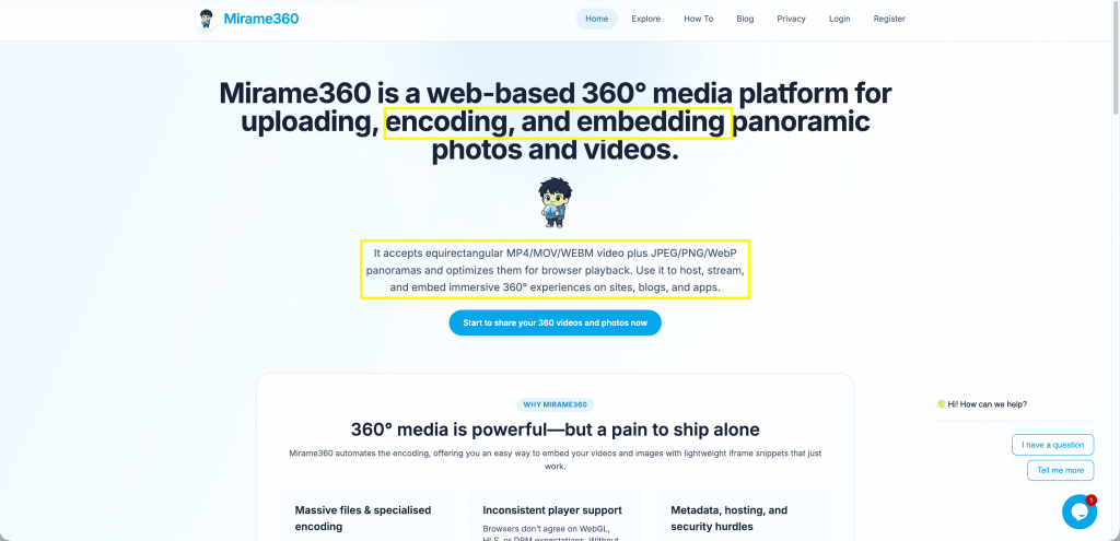
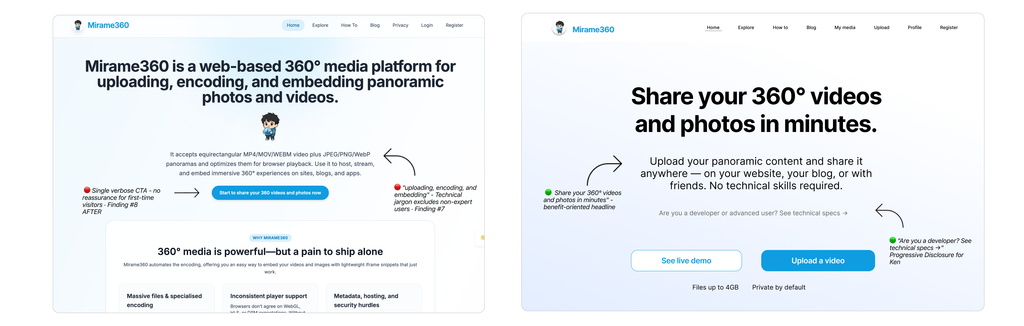
Problem: The primary CTA for non-logged users — “Start to share your 360 videos and photos now” — is verbose, offers no incentive and gives no indication of cost or effort required.
Impact: Low conversion rate from visitor to registered user.
Solution: Replaced with “Upload your first video →” for logged users and “Start for free. Share your first 360° today.” as the closing CTA — short, benefit-oriented and reassuring.
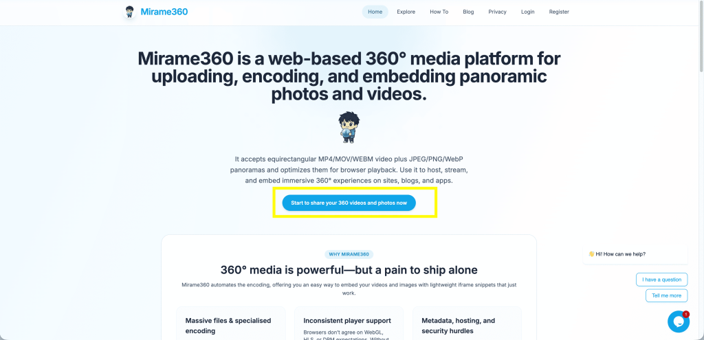
Homepage CTA button
Heuristic: Aesthetic and Minimalistic Design
🟡 Severity 3/5
Problem: Social proof — user testimonials or usage numbers — exists on the homepage but is positioned too far below the fold. First-time visitors leave before reaching it.
Impact: Trust is not established at the critical first impression moment.
Solution: Recommended moving social proof above the fold or integrating it into the hero section.
Homepage scroll depth showing social proof position
Heuristic: Aesthetic and Minimalistic Design
⚪ Severity 2/5
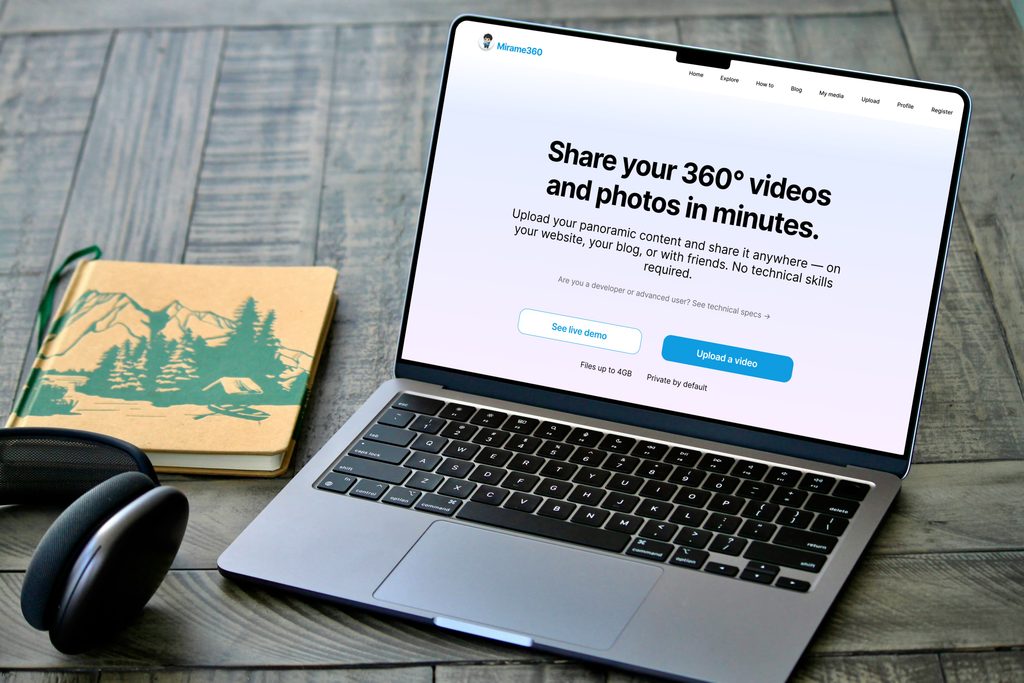
Problem: The animated mascot character occupies prime visual real estate in the homepage hero — between the headline and the CTA — without communicating any product value.
Impact: Wastes strategic space that could show the actual product experience.
Solution: Recommended replacing the mascot with a live 360° player preview — showing the product in action at first glance.
📸
Homepage hero with mascot
User Research
Understanding Real Users
Following the heuristic audit, I conducted qualitative research with real users to validate the findings and uncover behavioural patterns that expert analysis alone cannot reveal.
3 user interviews were conducted remotely, each lasting approximately 25 minutes. Participants were selected to represent the two ends of the target spectrum — non-technical amateur users and professional B2B users.

Interview Structure
Each interview followed a three-block structure:
Block 1 — Context (5 min)
Understanding the participant’s existing habits around photography, video sharing and digital tools.
Block 2 — Site Navigation (15 min)
Participants were asked to navigate the live Mirame360 platform while thinking aloud — completing three tasks without moderator assistance.
Block 3 — Debrief (5 min)
Open questions to capture overall impressions, frustrations and motivations.
Participants
Marco, 28 — Marketing professional
Tech-savvy action cam user. Comfortable with digital tools. Represents the intermediate user segment.
Elena, 45 — Schoolteacher
Amateur photographer using her smartphone. No technical background. Primary representative of the EasyPeasy Emma persona.
Davide, 58 — Architect
Professional 360° photographer using a Ricoh Theta for client documentation and virtual tours. Primary representative of the Work Smarter Not Harder Ken persona.
Affinity Map
Data from the 3 user interviews was synthesised with AI support to identify recurring patterns across participants with opposing profiles. The thematic clustering process revealed 5 key areas of intervention, validated by the convergence of independent observations across all three sessions.
How might we
From each insight, a design question emerges — the How Might We transforms a problem into an open solution space. It is the bridge between research and design.
Personas
Two personas were derived from three user interviews, representing the two primary segments identified during research — the non-technical amateur user and the professional B2B user

“If I can’t figure it out in two minutes, it’s not for me.”
Name
Easy Peasy Emma
Demographics
40 years old, accountant. Lives with her husband and a 14-year-old son. Frequently joins travel groups and documents her adventures through photos and videos taken with her smartphone. Uses technology for basic work functions and social media.
Tech level ●●○○○
Goals
To document her travels and share them with family and friends via WhatsApp — quickly and independently, without having to ask her son for help.
Pain Points
Feels intimidated by technical terminology in photography and video tools. Assumes that quality always comes with complexity. Finds privacy policies confusing and hard to trust.
Motivations
Wants to be self-sufficient in uploading and converting her 360° videos. Values digital tools that feel reassuring and straightforward — she will commit to a platform only if it feels approachable from the very first interaction.
Behaviour & Tools
WhatsApp, Facebook, Canva. Comfortable with guided, visual interfaces. Avoids anything that requires reading a manual.

“I don’t need more features. I need one tool that actually works.”
Name
Work Smarter NotHarder Ken
Demographics
51 years old, civil engineer and advanced photographer. Lives with his partner. Uses his Ricoh Theta camera daily for work, always looking for tools that improve his professional workflow and save time.
Tech level ●●●●○
Goals
To document and communicate the progress of construction sites to clients in a professional, efficient, and visually compelling way. Considers clear visual communication a crucial part of his work.
Pain Points
Currently relies on 2-3 different tools to upload and share videos — a fragmented workflow that often results in failed uploads or lost files. Needs to upload multiple videos simultaneously and keep them organized by client. Lacks an exportable analytics report to share engagement data with clients directly.
Motivations
Efficiency is everything. He needs a single professional platform that handles upload, organization, and sharing — eliminating the friction of switching between tools. Managing multiple clients at once means every minute saved matters.
Behaviour & Tools
AutoCAD, BIM software, Google Drive, WeTransfer, Dropbox. Already familiar with visual documentation tools for construction sites. Values clean dashboards with exportable data and reliable file management.
User Journey Map
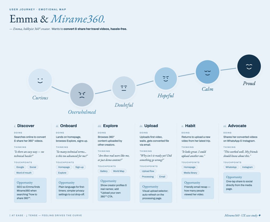
Emma’s journey was mapped across six phases — from first discovery to word-of-mouth advocacy. The emotional curve reveals a critical drop at onboarding, driven by technical language and privacy anxiety, followed by a gradual recovery once the product delivers on its promise. I chose to map only Emma’s journey, as she represents the highest acquisition risk — the user most likely to drop off before converting.
Design
From Lo-Fi to Hi-Fi
With research complete and pain points clearly mapped, I moved into the design phase — translating each finding into a targeted wireframe solution.
I redesigned 8 screens, each addressing one or more of the audit findings. Every layout decision is traceable back to a specific user insight or heuristic violation.
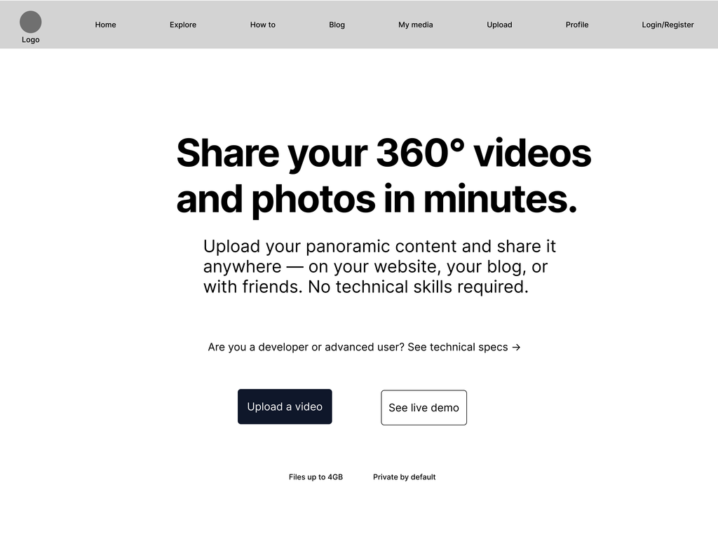
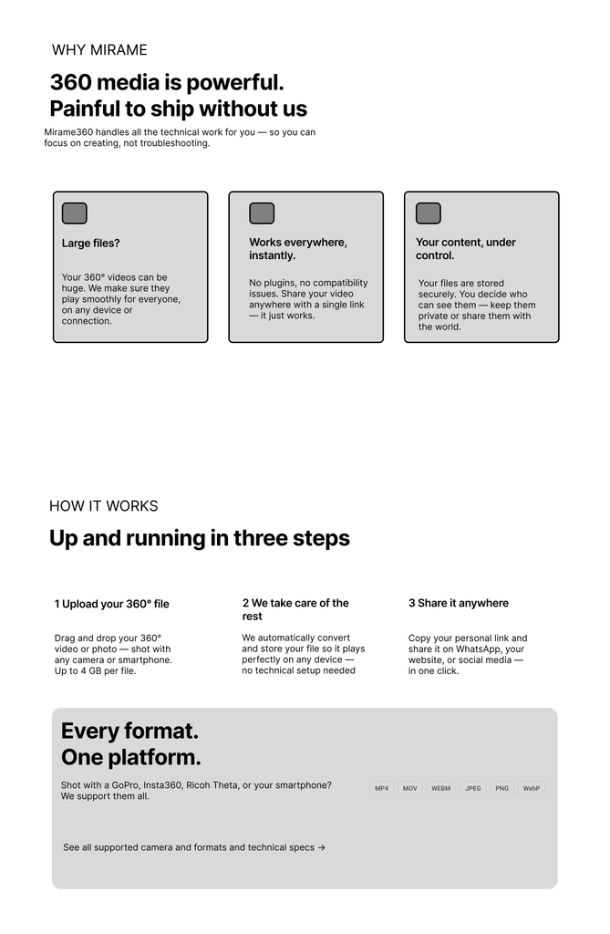
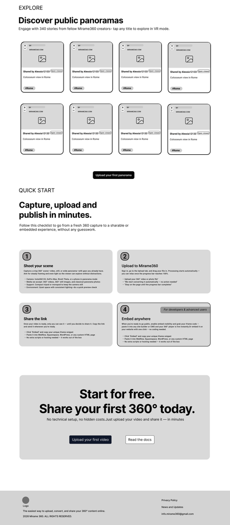
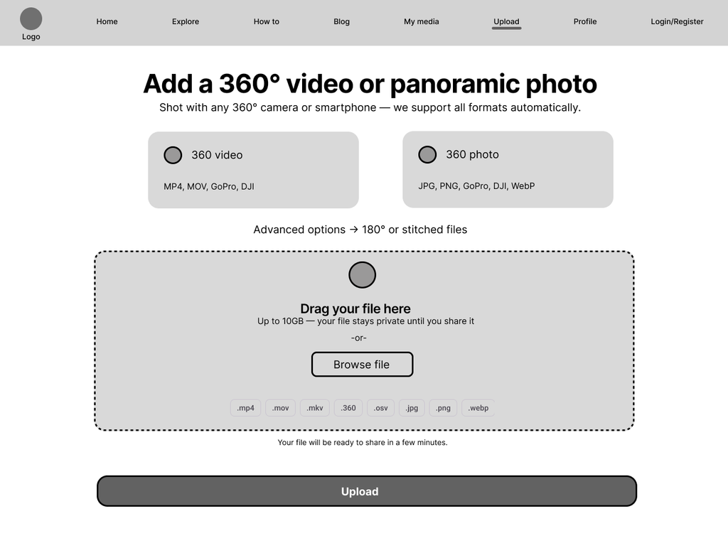
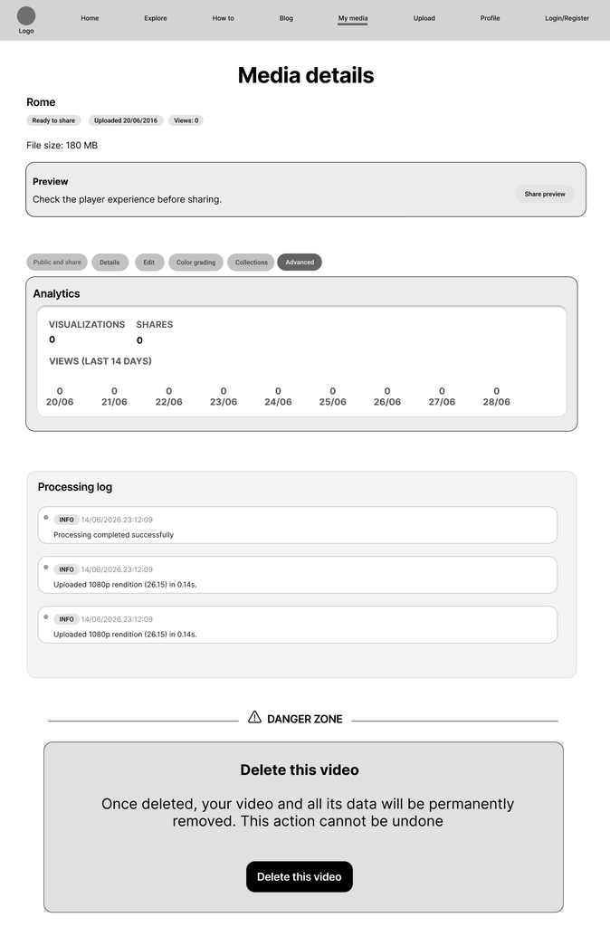
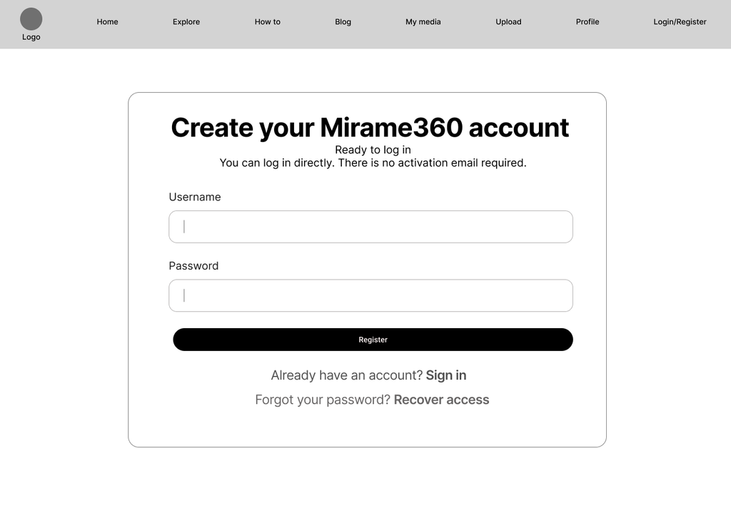
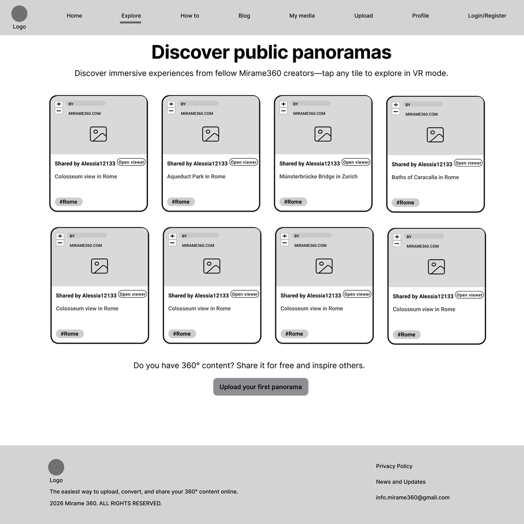
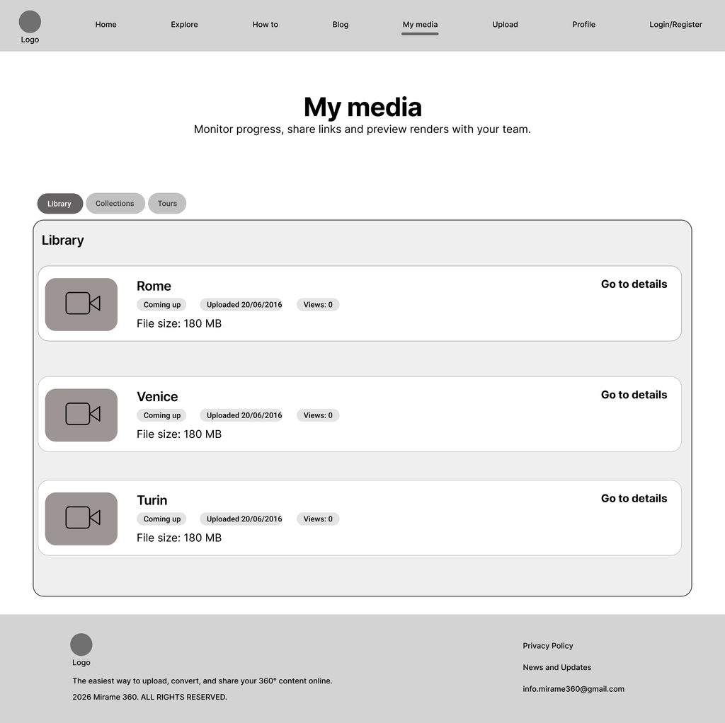
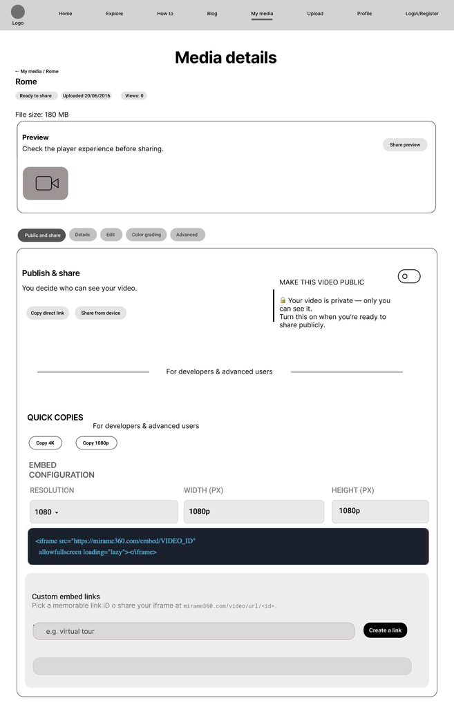
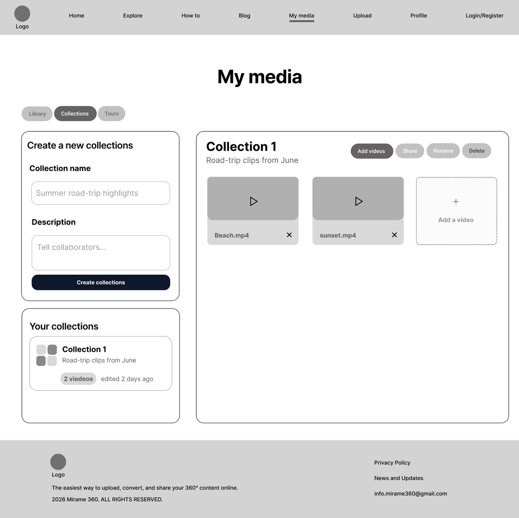
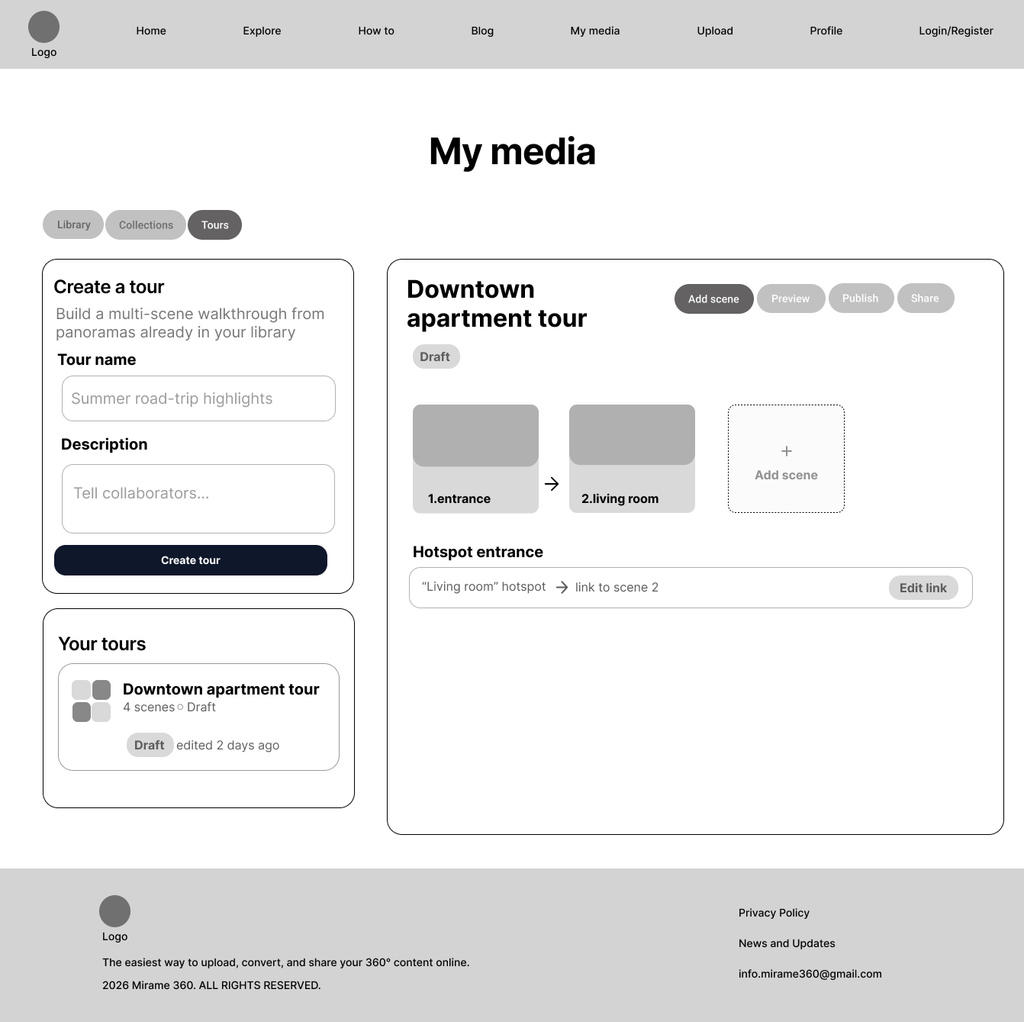
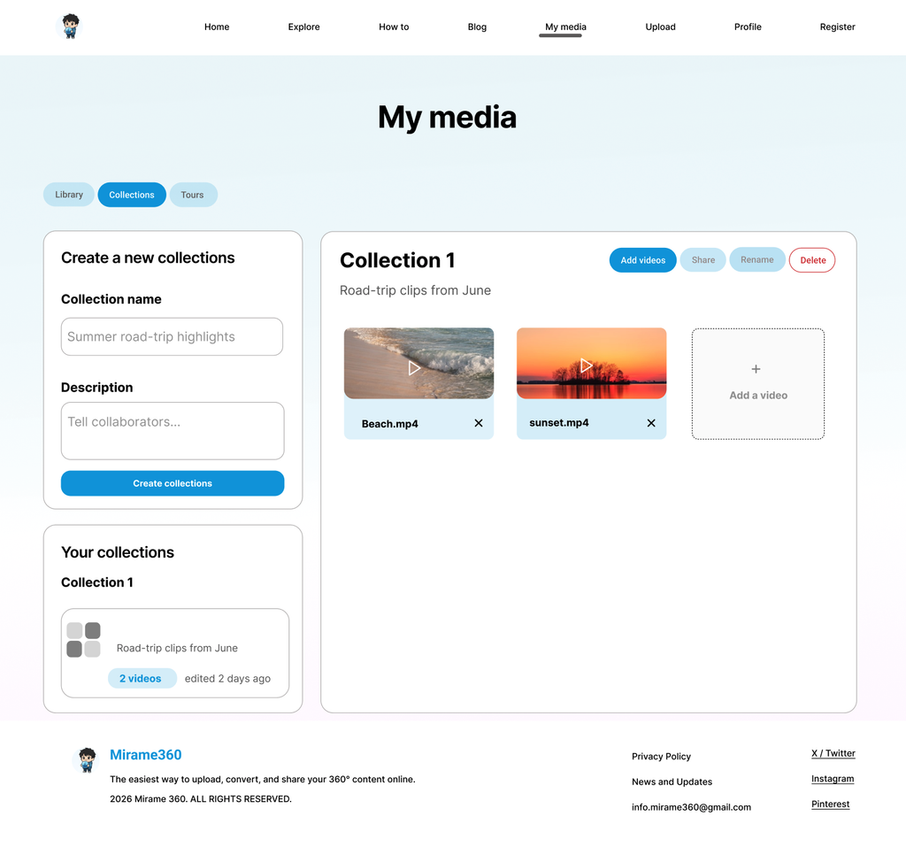
Homepage Redesign · F#7 F#8 F#9 F#10Redesigned homepage copy using benefit-oriented language, progressive disclosure for technical content, and a scroll-based narrative structure guiding Emma from curiosity to conversion.Explore Page Redesign · F#6Transformed the Explore page into an acquisition touchpoint — replacing anonymous labels with real creator usernames and adding a conversion CTA at the bottom for inspired visitors.Advanced Tab Redesign · F#5Moved the irreversible delete action from the top to the bottom of the page, isolating it in a clearly marked Danger Zone — preventing accidental deletion without removing the functionality.Media Library · F#2Replaced technical status labels with plain-language badges and differentiated video titles by location — making the library immediately scannable for non-technical users.
Usability tests
Test setup
Once the wireframes were complete, I conducted an unmoderated remote usability test with 5 participants matching the Emma persona — non-technical users unfamiliar with 360° media platforms. Participants were recruited from my personal network and tested asynchronously via Maze, using a Figma prototype and a structured set of 3 tasks. I chose an unmoderated remote format as a lean alternative to moderated sessions — a deliberate methodological choice given the project’s time constraints and the low-traffic nature of the product, which made A/B testing unfeasible. Each task was designed to validate a specific set of audit findings, ensuring that every design decision was tested against real user behaviour rather than assumptions.
“Hi! Thank you so much for helping me out. I’m a UX designer and I’m testing a prototype — not you. There are no right or wrong answers. I just need your honest reaction.
The prototype is not fully clickable, so some buttons may not work — just tell me what you would do if they did.
It should take about 10 minutes. When you’re done with each task, send me a voice note or a text with your answers.
Ready? Here’s the link.”
👀 Task 1 — First impression
“Open the link and look at the first screen for about 5 seconds. Then tell me: what do you think this site does? Who do you think it’s for? Is there anything you didn’t understand straight away?”
▶️ Task 2 — Upload a video
“Imagine you’ve just come back from a trip to Rome and filmed a 360° video on your phone. You’d like to upload it to this site. Navigate the prototype and try to find how to do it. Then tell me: were you able to find where to upload the video? Was there anything that confused you during the process? Was there anything you expected to see but didn’t find?”
🔒 Task 3 — Video privacy
“Imagine your video is already uploaded and ready. You’d like to send it only to your sister — you don’t want everyone to see it. Navigate the prototype and find out how to make sure your video is private.”
Testing the wireframes with real users revealed six friction points — some confirming hypotheses from the audit, others entirely new. Each finding was brought back to the stakeholder, who approved two design iterations and declined two others due to technical constraints. Both outcomes are documented here, because a mature design process includes not just what changed, but why some changes didn’t make it.
Key Findings
Finding A — Explore cards not interactive Severity 3/5
Participants expected to click on panorama cards but the prototype did not respond. The cards implied interactivity without delivering it.
Finding B — Barrier before first use Severity 5/5
“Why do I need to create an account before I’ve even tried the service?” — The mandatory registration flow before any interaction was identified as a likely drop-off point by multiple participants.
Finding C — Processing page missing from prototype flow Severity 4/5
Participants jumped directly to the Media Library without seeing the processing screen — a prototype linking issue that also revealed how disorienting the jump felt without context.
Finding D — No way back from Media Details Severity 4/5
Both non-technical participants lost their orientation inside Media Details and navigated back to Home to restart. Breadcrumbs were added as a direct response.
Finding E — Advanced tab positioned too early Severity 3/5
Non-expert users stopped exploring tabs once they hit “Advanced” — missing the sharing and privacy controls that followed it. Tab order was revised accordingly.
Finding F — “For developers” label not noticed Severity 4/5
Participants did not see the divider label and assumed they were expected to understand the iframe code. The label alone was insufficient without visual separation.
Design iterations following the test
Following the test, I brought all six findings back to the stakeholder. Two iterations were approved and implemented directly in the final mockups. Two others were declined due to technical constraints — both are documented as future recommendations.
Implemented ✅
- Breadcrumbs added to Media Details — resolving Finding D
- Advanced tab moved to last position — resolving Finding E
Declined by stakeholder ❌
- Lazy Registration — server cannot handle unlimited concurrent uploads from unauthenticated users
- Accordion for the developer zone — outside current development scope
Documented as future recommendations 💡
- Findings A, C, and F — noted for the next design iteration
Mockups
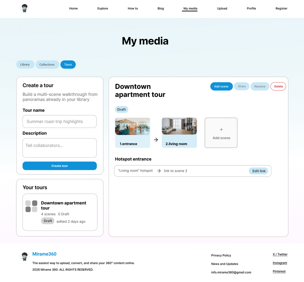
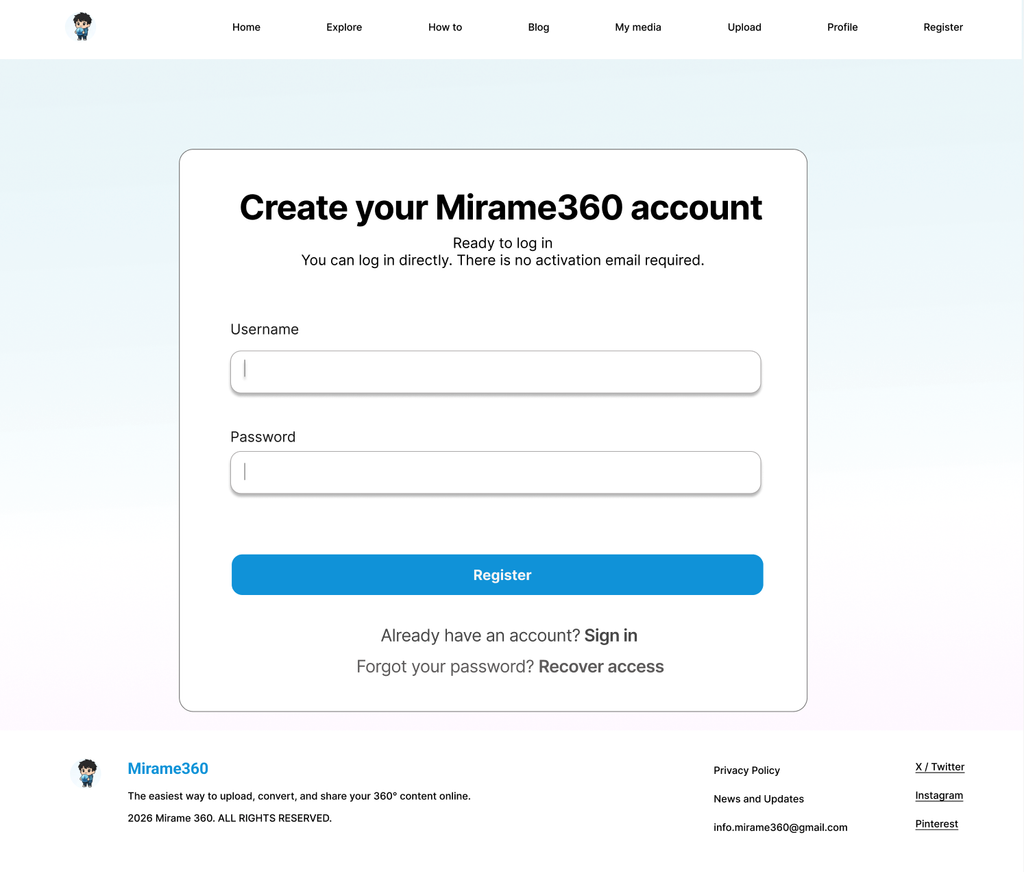
With the wireframes validated and the usability test findings addressed, I moved into high-fidelity design. Rather than building a full mockup pass, I selected three key screens to bring to colour — the ones that best communicate the design decisions made throughout the process and serve as visual anchors for the case study.
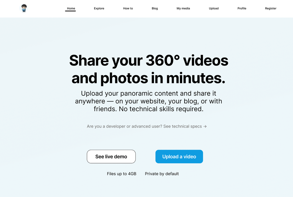
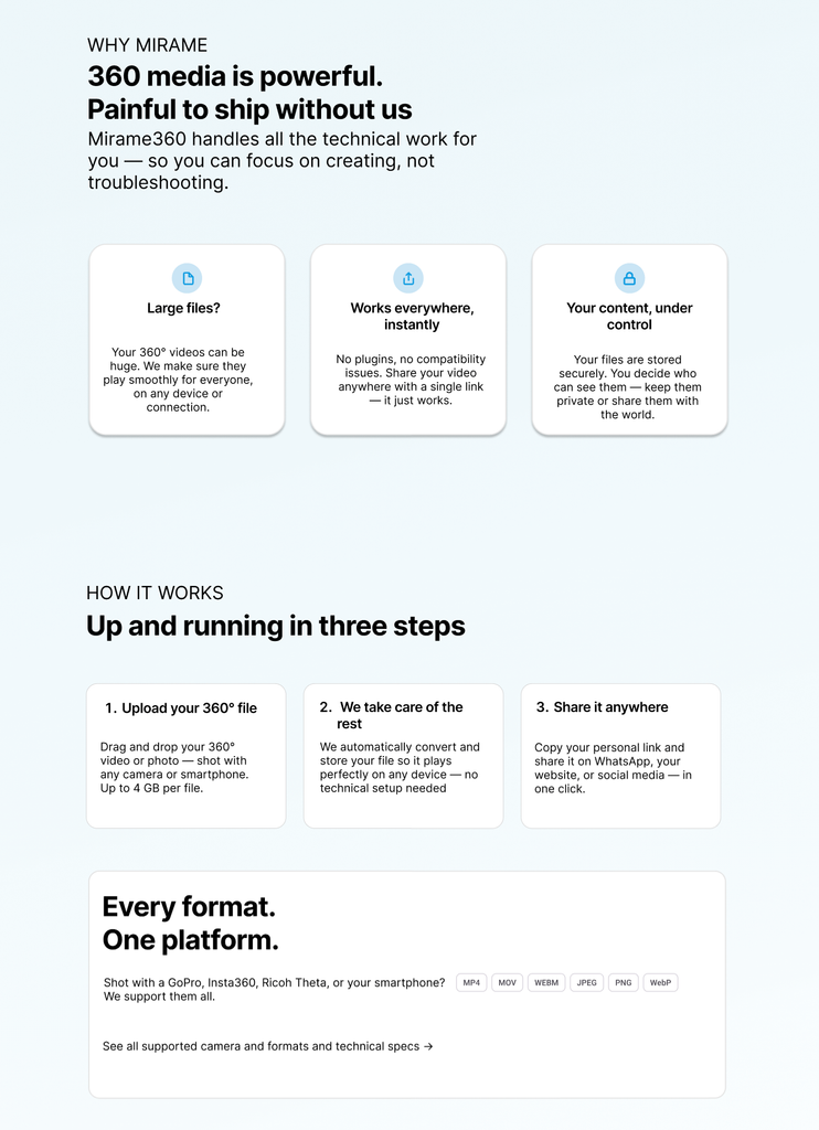
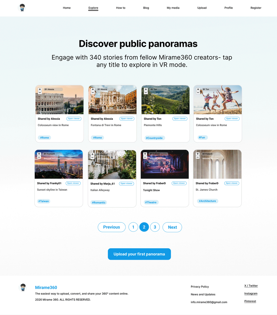
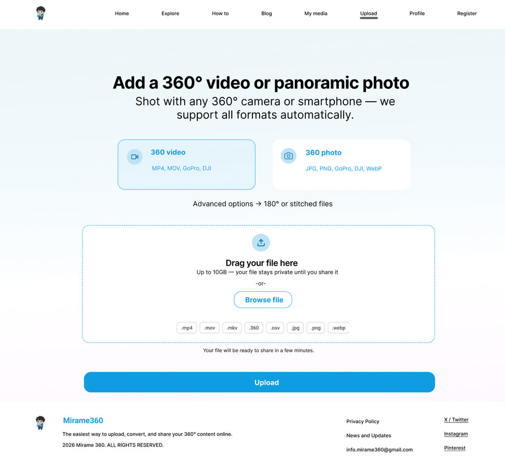
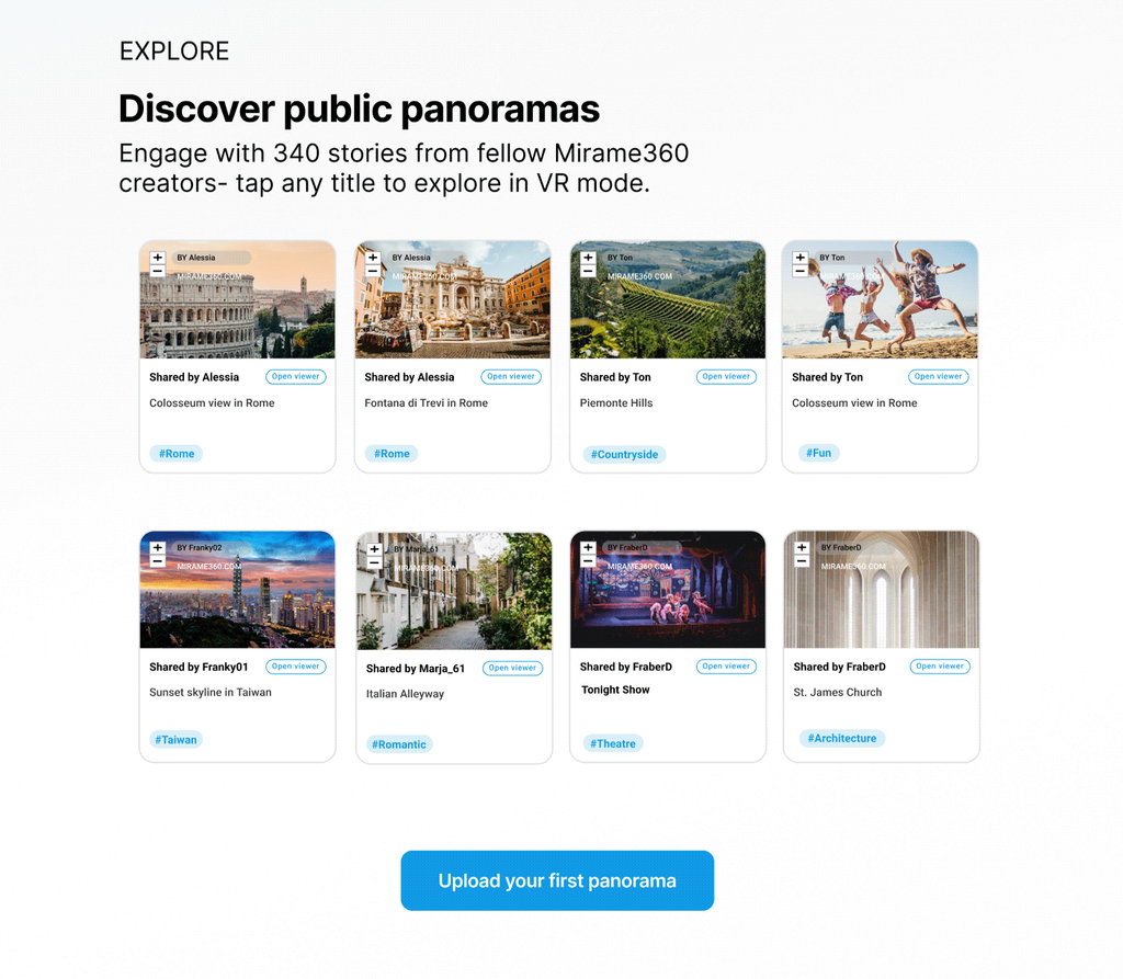
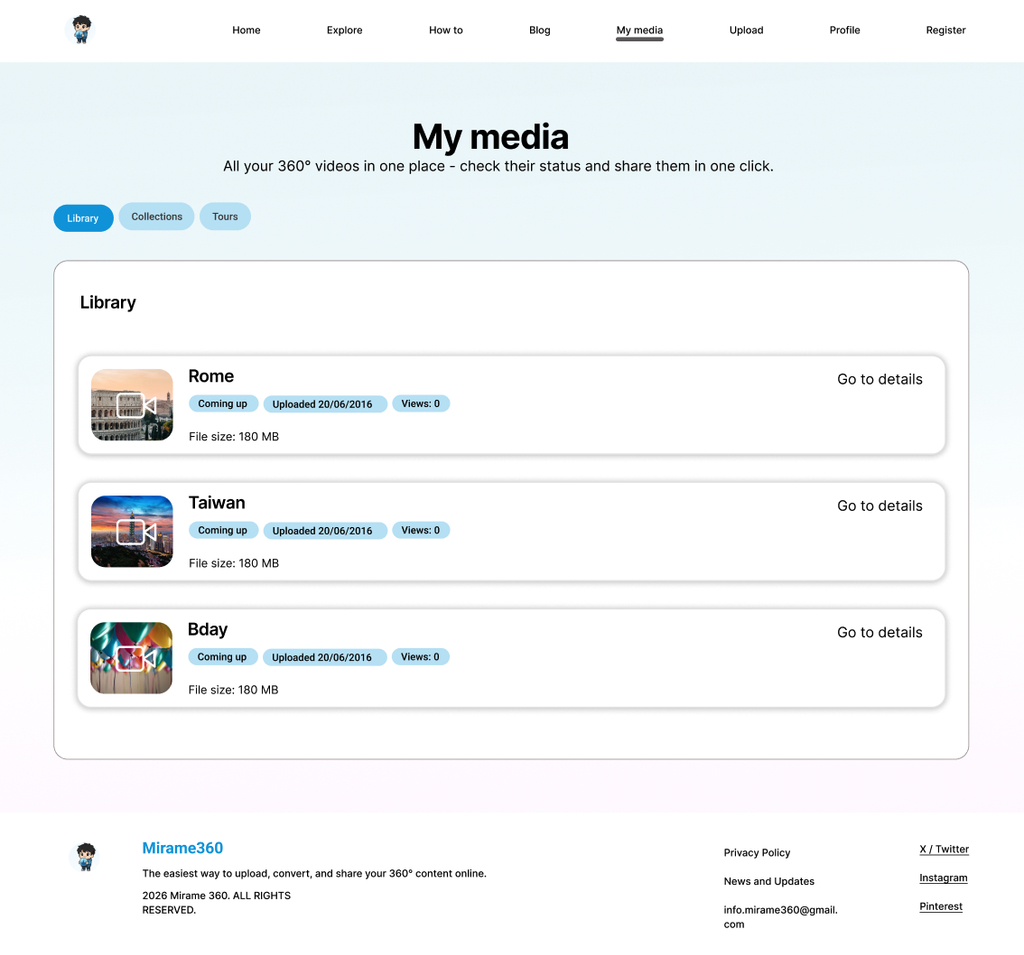
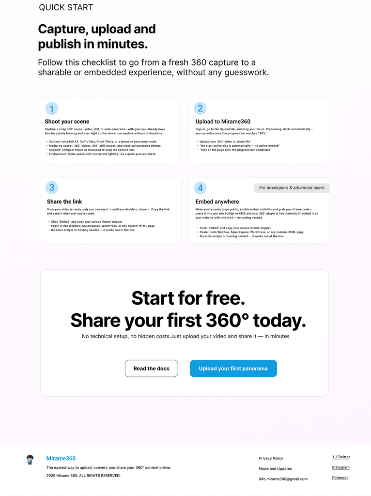
Interactive prototype
Before & After — Key Design Decisions
These three comparisons capture the most significant design shifts made throughout the project. Each before reflects a specific audit finding or usability test result; each after shows the targeted solution applied in the final mockup. The changes are not cosmetic — every decision is traceable back to a research insight or a real user behaviour observed during testing.
Before
After
Before
After
Before
After
Before
After
This was a real freelance engagement on a live product. I delivered wireframes, a clickable prototype, and a design handoff document – the stakeholder then implemented the recommendations independently. The live product at mirame360.com reflects his development decisions and may differ from my proposed designs.
What this project delivered
This project resulted in a complete UX audit of a live SaaS product, three rounds of design iteration, and a validated set of wireframes and high-fidelity mockups handed off to the developer-stakeholder. The redesign addressed 10 heuristic findings and 6 usability test results across 8 screens – from homepage copy to information architecture decisions inside the media management flow. The audit and usability test also surfaced additional opportunities for improvement – including Lazy Registration, more granular navigation feedback, and a dedicated developer landing page – that fell outside the immediate scope defined by the stakeholder and are documented here as future recommendations for the next design iteration.
What I learned
Working on a real product with a real stakeholder taught me that good design is not just about finding the right solution – it is about understanding which solutions are actually viable. When the stakeholder declined Lazy Registration and the Accordion component due to technical constraints, I documented both decisions and reframed them as future recommendations rather than failures. That negotiation, and the ability to present it transparently, felt like the most professional moment of the entire process.
Using AI as a design mentor throughout this project pushed me to think more rigorously, not less. Every AI-assisted step – from heuristic synthesis to copy rewriting – required me to evaluate, challenge, and adapt the output before it became part of the design. The AI accelerated the process; the decisions remained mine.
Finally, this project confirmed that research and design are not sequential phases – they are a conversation. Every wireframe decision sent me back to the audit findings, and every usability test result reshaped what I thought I already knew.
Thank you for watching!
Show your appreciation if you like the design!
Let’s design something special!

Got a project in mind or want to talk about UX?
I’d love to hear from you.