As a Voice of Customer Representative at PayPal, I assisted customers with their inquiries about the company’s digital products. During some calls I noticed that customers flagged a recurrent problem with one of the PayPal webpages: the document uploading page. The page presented several usability issues causing an increase in the Contact Rate for the Customer Service Team. Driven by the desire to improve the customer experience when navigating the PayPal website and app, and to help my team productivity, I initiated a UX Design project focused on improving the UI of the Documents Uploading page for both desktop and mobile. This way I contributed to enhance the user journey for one of the most critical procedures for the banking industry’s safety: the KYC (Know Your Customer) process.
The Product
The Documents Uploading page enables customers to upload personal or business identification files as part of PayPal’s KYC procedures. It represents a critical step in PayPal’s services, as missing identification can lead to a PayPal account being blocked.
The Problem
PayPal customers have issues navigating the Document Uploading Page because the system doesn’t inform them whether the file has been successfully uploaded or not, and it doesn’t show the upload progress.

Understanding
the user
- User research
- Data Analysis
- Personas
- Problem statements
- User journey maps
- Affinity Map
What is the Document Uploading Page
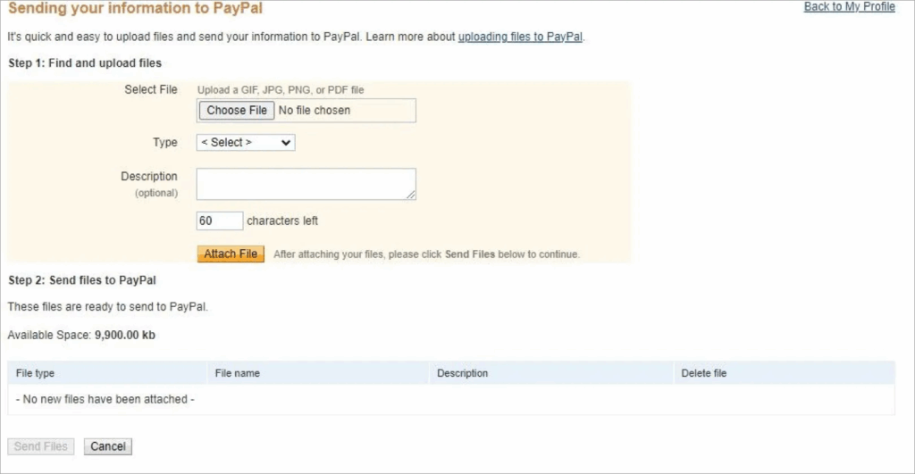
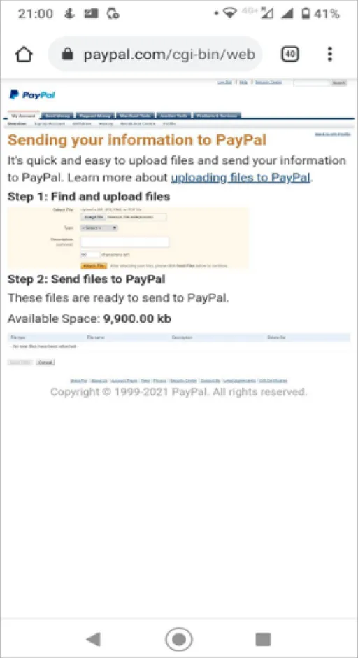
PayPal’s customers can send documents through their account by accessing an upload page provided by teammates during phone or chat contact. This page is used when sending files through the Resolution Centre is not possible due to bugs, account closures, or the need for additional information. The upload page is accessible via an external link known as Quick Link (QL), which our team uses to refer to this specific page.
The current UI presents several usability issues:
- The page’s content follows a design system that differs from the one currently adopted by PayPal for its other webpages and app.
- The uploading form asks irrelevant questions, such as ‘Document type’ or ‘Description,’ which are unnecessary since CS agents can easily identify the uploaded files.
- The “Attach File” and “Send Files” buttons are closely related in the uploading process but are placed far apart, causing confusion for users who often miss the “Send Files” button located at the bottom of the page.
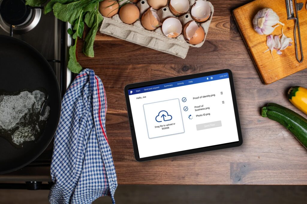
- The mobile design for the app is not responsive, as it simply replicates the desktop layout even when accessed from a smartphone. This makes the text less legible and prevents users from utilizing their phone’s camera to upload files.
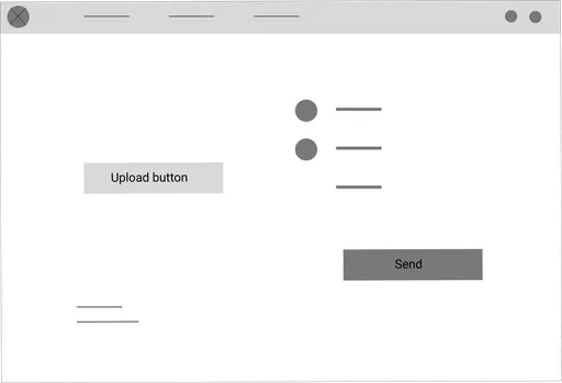
Previous Version – Document Upload (Desktop)
Previous Version – Document Upload (Mobile)
User Research
Summary
I investigated the problem by conducting surveys among PayPal customers and coworkers during one week in order to understand users’ and company’s needs. The user group identified through research included adult customers who usually use PayPal to make recurrent online payments via app or desktop.
This user group revealed that the main issue encountered while uploading online documents was the extremely confusing and cluttered user interface. This disoriented customers, making it unclear where and how to upload the file. Moreover, the page wasn’t responsible for mobile devices lowering the legibility of the content displayed.
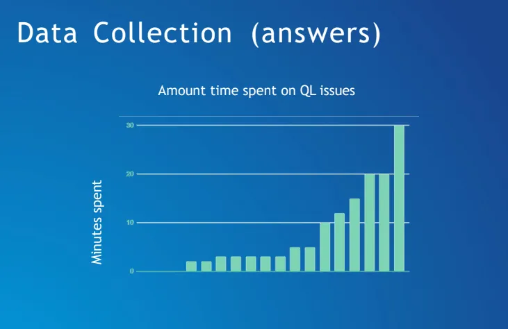
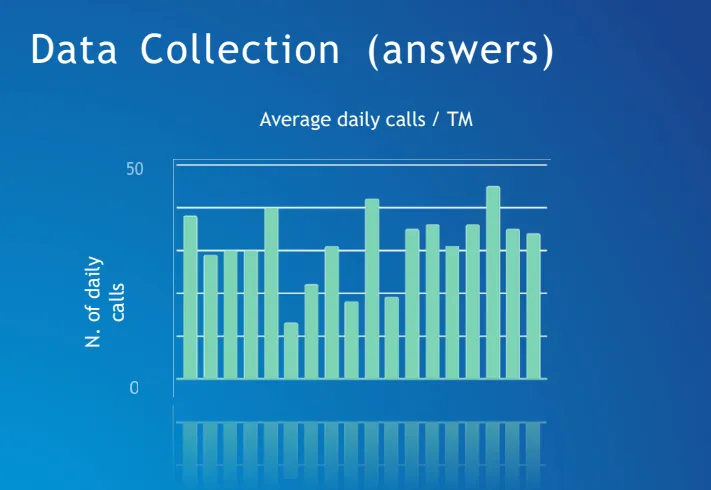
The questionnaire I designed and distributed among coworkers aimed to evaluate the impact the amount of calls on Quick Link has on our daily work. Through quantitative and qualitative questions I wanted to investigate:
- The amount of time spent on assisting clients with the QL
- The most used devices by clients
- The specific type of issue experienced
User Research: Data Analysis (Company)
Daily Team
260 mins
Weakly Team
21 hrs
Annual Team
1000 hrs
The Data Analysis revealed the quantity of time wasted by the team because of the inefficiency of the Documents Uploading Page. Indeed, the page generated a remarkable number of customers contacts each week. It emerged that it was like 1 teammate for 5 months works just on assisting customers with QL issues.
User Pain Points
Time
Customers who have difficulty using the QL are forced to call customer service and hold on to get help to remove limitation on their accounts.
Process
A not intuitive uploading flow makes customers frustrated and more prone to abandon the process without completing with the risk to definitely block the account.
Product
The QL presents several usability issues (like what to enter in the text filed ‘File type’) that make it hard for customers to navigate without customer service help.
Trust
A design that looks chaotic and ugly will make the users feel unsafe. The high quality of UI is crucial for banking apps where the customers needs to give out personal information or where there is money involved.
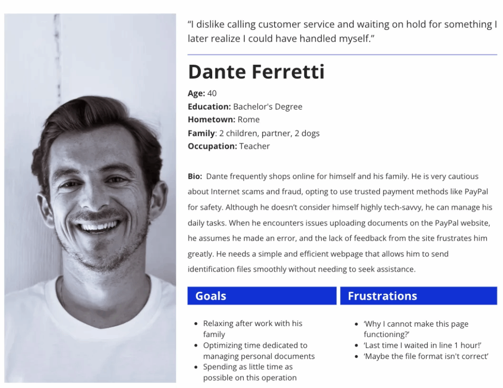
Persona
User Journey Map
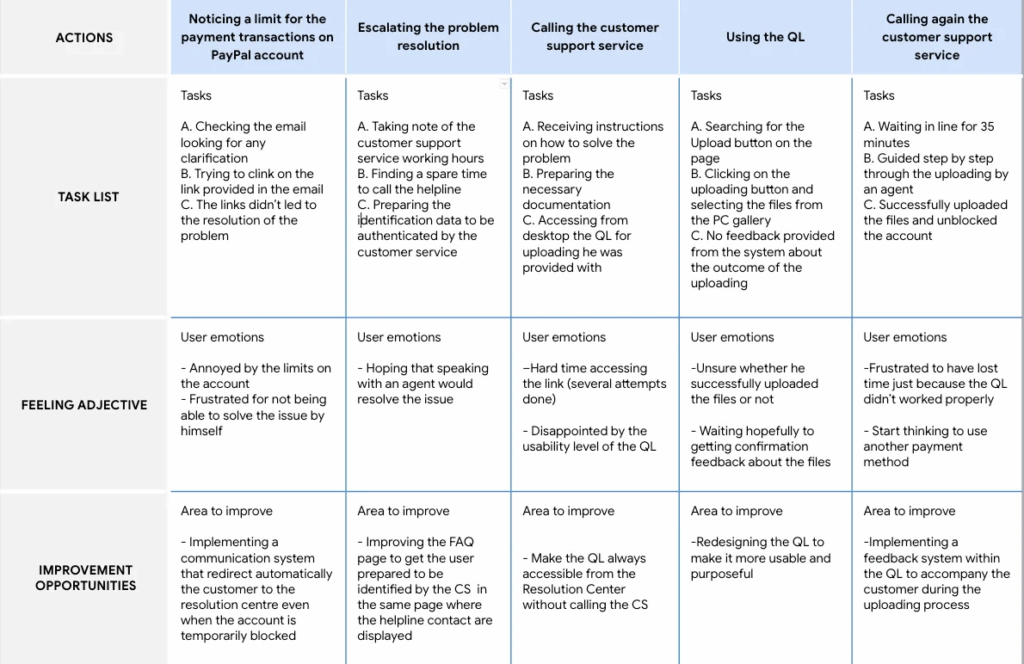
Dante’s User Maps showed what path a user would follow to upload a document on the PayPal webpage or app
Goal: Easily and quickly upload files from desktop or mobile and receive a confirmation of the outcome promptly, allowing to resume full use of the PayPal services without calling the CS.

Starting the Design
- Paper wireframes
- Digital wireframes
- Low-fidelity prototype
- Usability studies
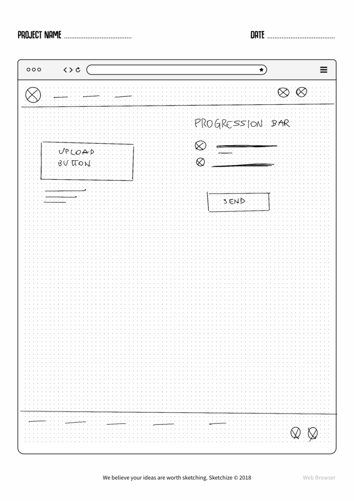
Paper Wareframes
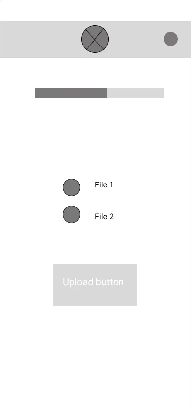
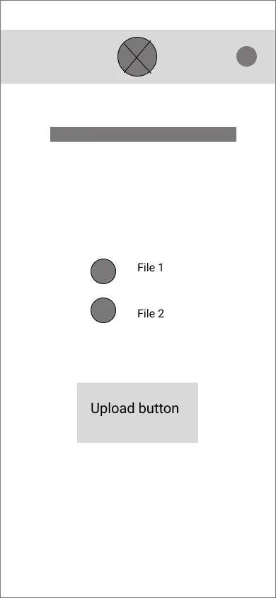
Drawings representing the uploading flow on the webpage and on the app helped include easily users’ pain points in the following digital wireframes. Sketches emphasise the smoothness of the process by including a more prominent Uploading buttons and progression feedback.

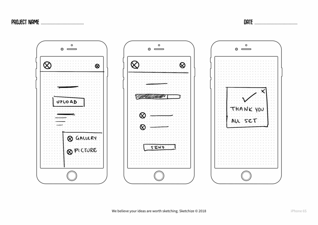
Digital Wireframes

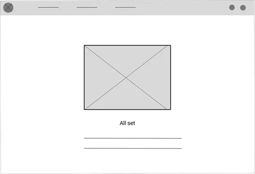
Low-Fidelity Prototype
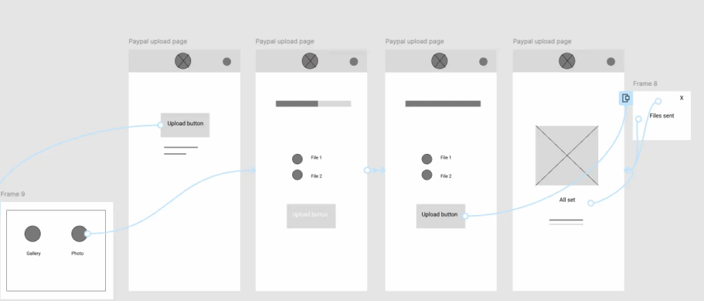
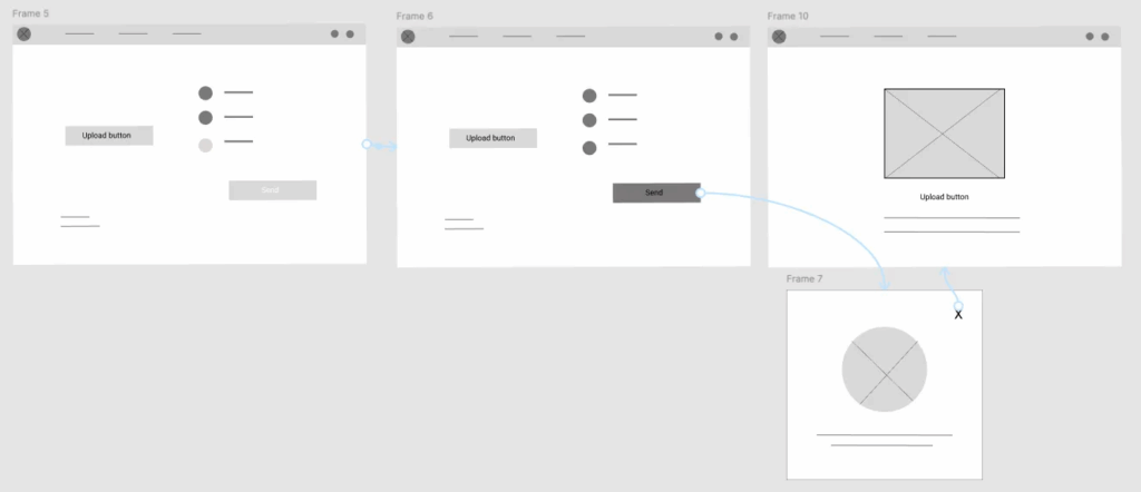
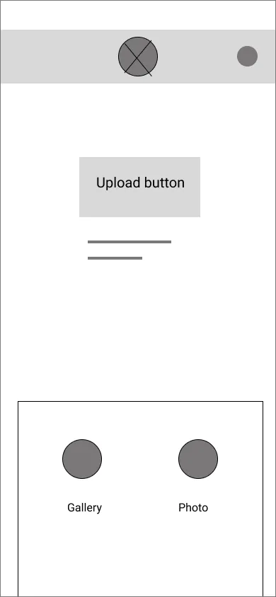
Using the completed set of digital wireframes, I created a low-fidelity prototype. It shows the document uploading flow a user will follow on mobile and desktop. In the order, the steps of he flow are the following:
- Clicking on the upload button
- Choosing to upload the whether from the gallery or by taking a picture
- Displayed the file uploading process
- Click on Send
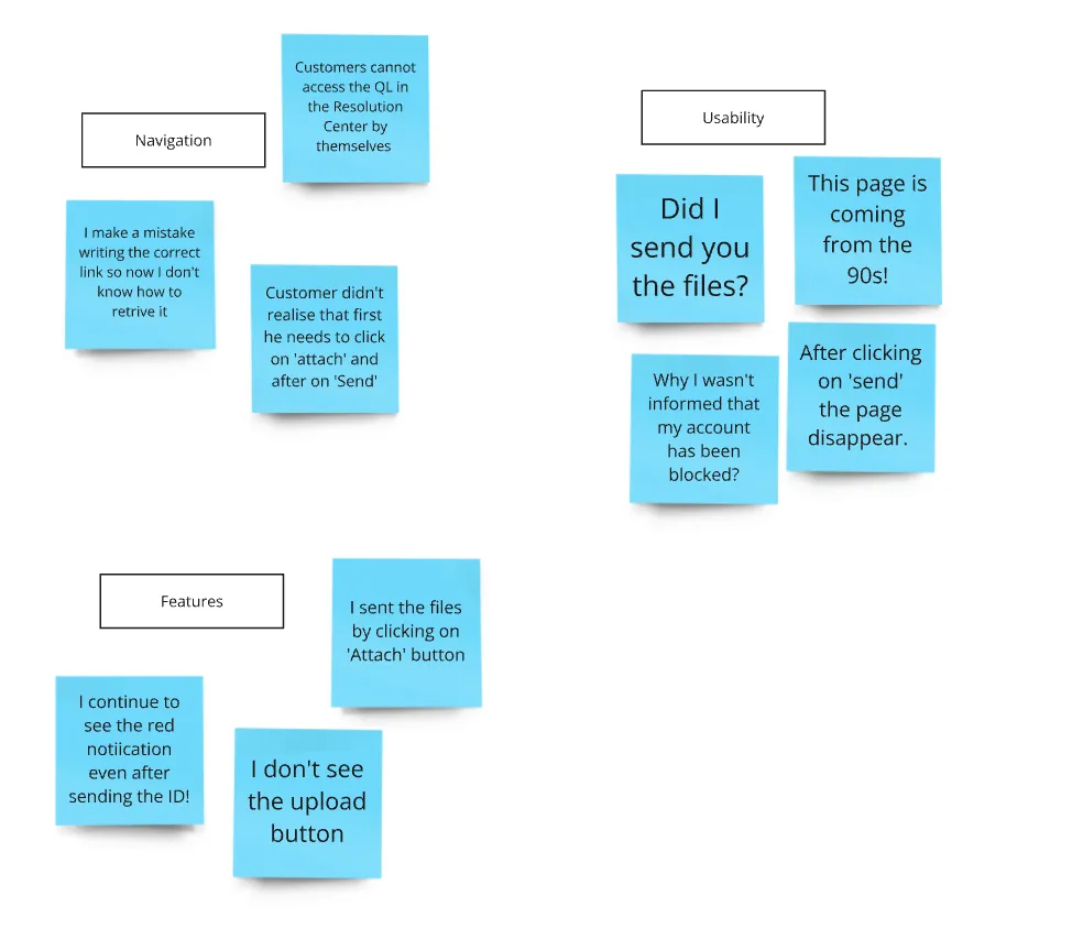
Usability Affinity Map
I conducted a moderated usability studies on the lo-fi prototype with 6 PayPal customers. I collected all the feedback and observations received and organised them into an affinity map. Then, based on their content, I grouped the main feedback into 3 themes of functionality: Navigation, Usability and Features.
Each theme represents an area of the Uploading page that causes confusion and frustration among users, leading to an increased workflow for CS.
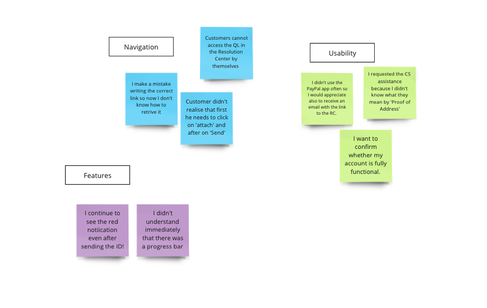
Usability Study
For each feedback cluster, I pinpointed the most critical findings. I then distilled these into actionable insights and implications, which guided my UX research decisions. Finally, I prioritized each insight based on its relevance to my research objectives and the severity of users’ pain points.
Findings
1
Users want to access the QL directly from the Resolution Center without calling CS
2
Users require clearer, real-time feedback on the progress of their uploads
3
Users are unfamiliar with the terms “Proof of Address” and “Proof of Identity”
.
Insights
1- P0
Design a path the user can smoothly follow to get the notification and solve the limitation
2-P1
The progress bar and icons in the uploading page must clearly convey their meaning
3-P3
A concise explanation of terms should be provided exactly when users need it
.

Refining the design
- Mockups
- High-fidelity prototype
- Accessibility
Mockups: Insights
1-P0
Users need a clear path to receive notifications and resolve limitations independently. Therefore, I designed a user flow for both the app and website to guide users from receiving the limitation notification to achieving full resolution without assistance.
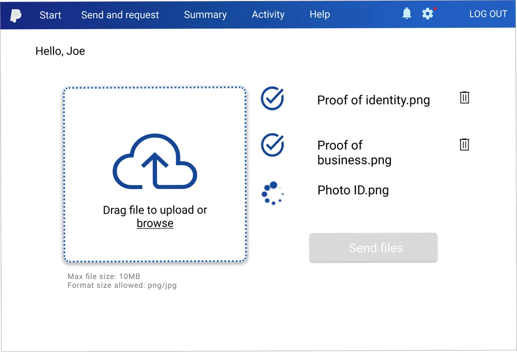
1-P1
I included a visible progress indicator or confirmation message can help reassure users and improve their overall experience by keeping them informed throughout the process.
3-P2
I added a question mark next to each required document to provide users with additional clarification about what is needed.
Before
After
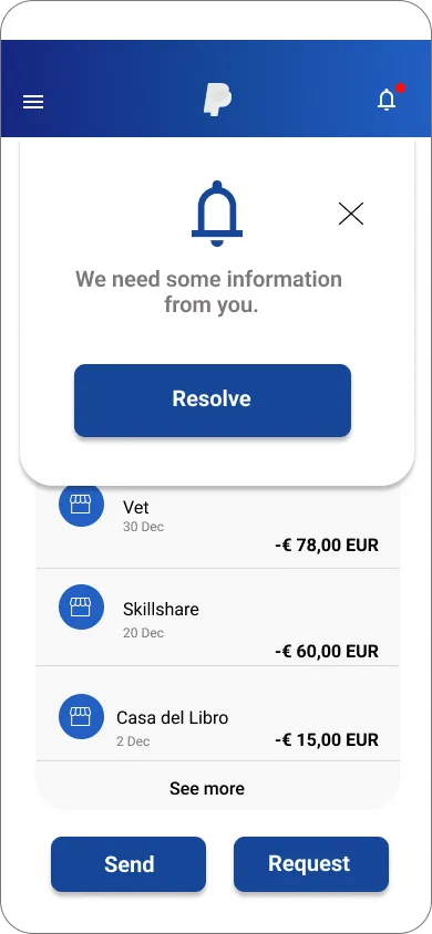

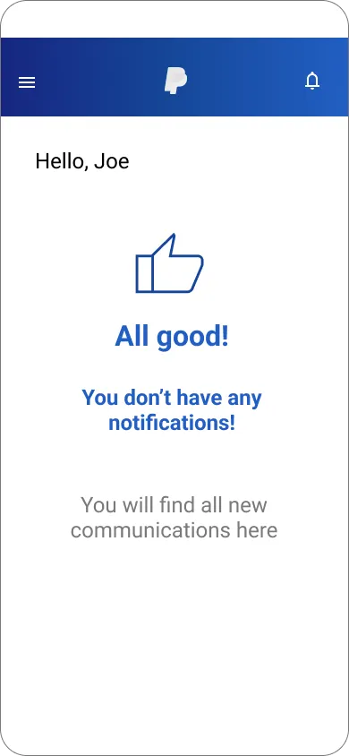
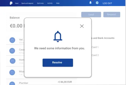
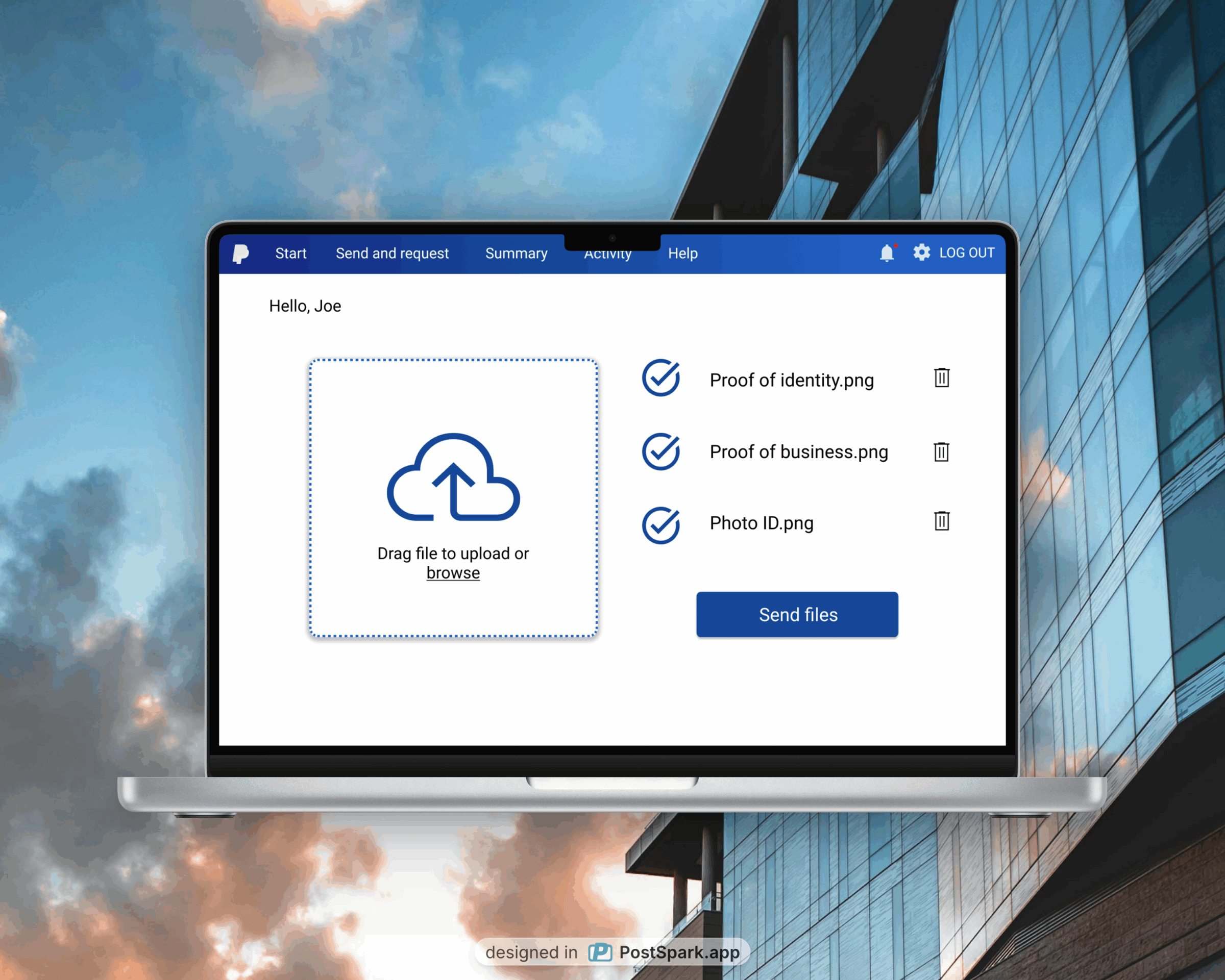
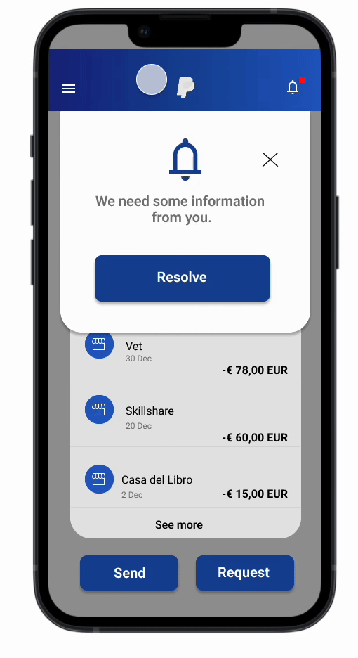
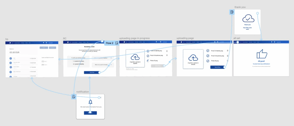
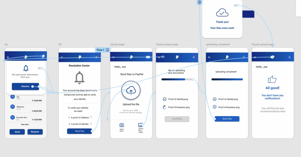
In the mockups, I completely redesigned the uploading flow starting from when the user is notified of an account limitation upon accessing the PayPal homepage. One of the main pain points for PayPal customers was the difficulty in finding the Document Uploading page on their own, often due to bugs or account limitations. In my proposal, when the customer clicks on the bell notification badge, a dialog message appears, informing them of the required action and guiding them through the uploading process without needing customer support, even if the account is currently limited.
Below you can see an interactive prototype of the redesigned flow.
New Flow Prototype
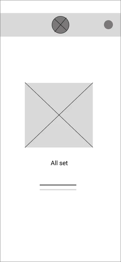
High-Fidelity Prototype
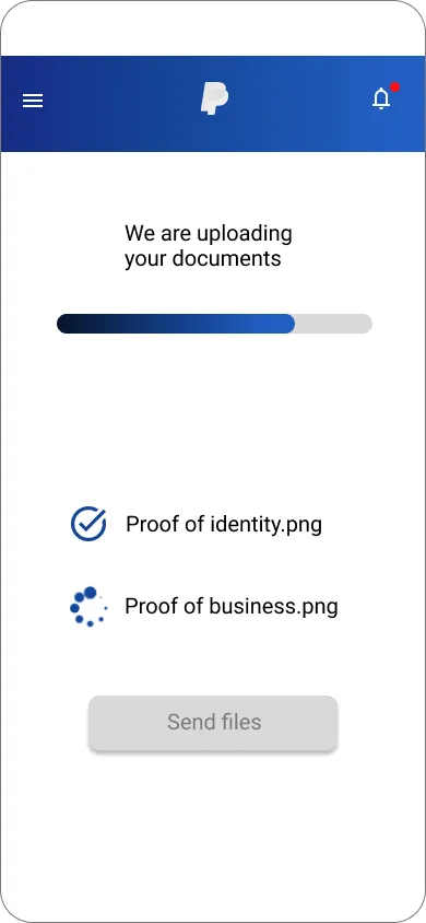
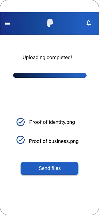
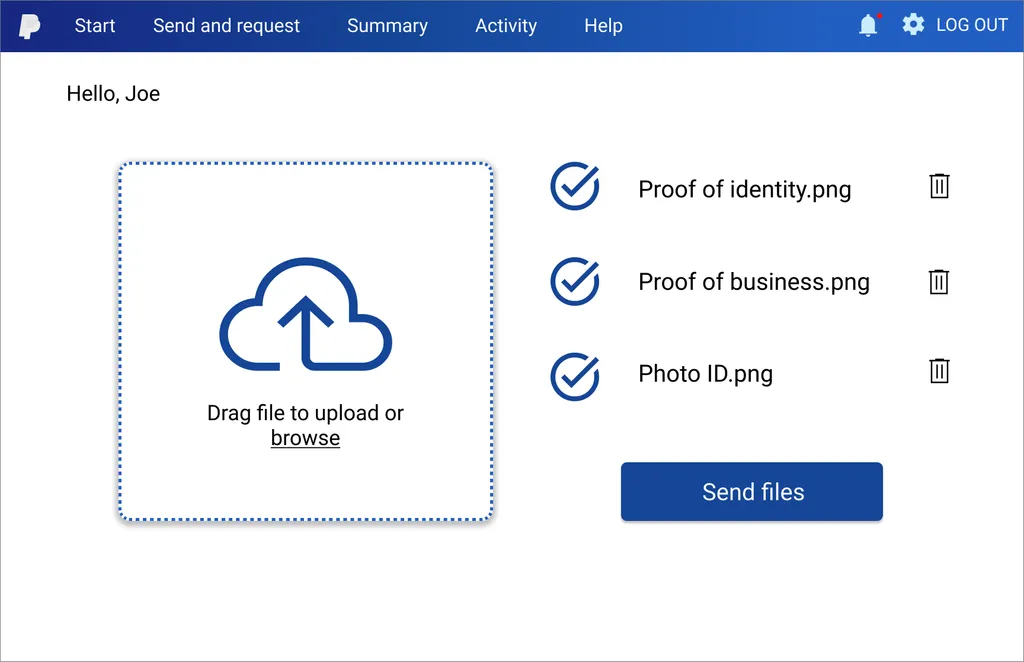
The goal of the design is to create an usable page that can constantly guide and inform the customer about the progression of the file uploading.
The final high-fidelity includes he following features and navigation aspects:
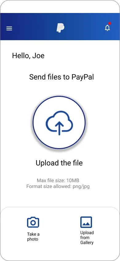
- The Document Uploading page is accessible from the Resolution Centre independently by the user
- Additional information about the document requirements is available on the same page as the notification. This allows the user to prepare everything beforehand without needing to look for clarification elsewhere on the site
- In the uploading page the dedicated icon at the left of the text change based on the status of the uploading process making the user aware of the correct advancement of the procedure
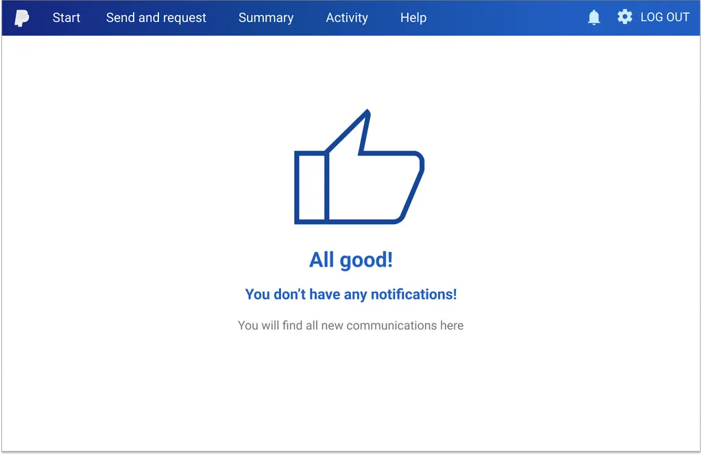
- If the operation successes a ‘Thank you’ message appears informing the user that the account limitation have been removed. On the other hand, the same happens if the process fails explaining the reasons and how to over the issue.
Accessibility Considerations
1
Provided a clear buttons labelling so that the user can be sure of what to do next
2
Implemented an error tolerance system to minimise the likelihood of mistakes and ensure continuous feedback
3
Used an hierarchical design that focuses priority through color, text size and position both on mobile and desktop

Going forward
Impact
The enhanced UI of the webpage and app will enable PayPal users to manage file uploads independently, reducing the need for customer support. This improvement in the customer experience will lead to an estimated decrease of 30% in Customer Recontact Rates, a higher Net Promoter Score for the company, a significant time savings for support agents thanks to an estimated 20% reduction in the average calls arrival rate over the next 12 months.
One quote from the usability test:
One quote from the usability test:
“
‘’The new user interface for the file upload webpage is absolutely fantastic! Navigating through the steps is now effortless, and the clear instructions and intuitive design make uploading files a breeze. This update is a huge win, making what used to be a frustrating task now feel seamless and satisfying. I couldn’t be more impressed!’’
What I learned
While redesigning the webpage and app, I realized that Customer Support agents are an invaluable resource for identifying users’ pain points and should be more involved in UX/UI design projects. Engaging with real users of the PayPal website and app provided a unique perspective that helped develop UX design solutions that genuinely address existing usability issues.
Next steps
1
Conduct another round of usability studies to validate whether the pain points users experienced have been effectively addressed
2
Designing an effective error system creating a user-friendly experience that helps prevent errors and provides clear guidance for recovery when mistakes occur
3
Improve the accessibility of the app to make it more inclusive with a focus on navigation especially for not tech-savvy PayPal users