Role
UX Writer
Tools
Figma
Service
UI+UX Writing
Time
April 2025- June 2025
Project Overview
This project is a self-initiated UX writing case study. My main goal was to focus on the copy and how it can support users during key interactions within an app.
While the core of the project is UX writing, I also designed a simple interface to give context and coherence to the texts I created. The purpose was to simulate a realistic user experience where words and visuals work together to guide and support the user. I chose the theme of a yoga app because it offers multiple touchpoints—onboarding, forms, system messages, dialogs, notifications—where thoughtful copy can truly make a difference. My focus was on making the user journey as smooth and intuitive as possible by writing copy that is clear, calm, and helpful.
This exercise explores how rewriting interface copy—even in a hypothetical app—can reduce friction, build trust, and create a more seamless overall experience. The yoga app theme was entirely my choice and served as a meaningful context for practicing UX writing across various interaction types.
Onboarding and empty states
As a UX writer, I focused on making the empty state experience informative and user-friendly, ensuring that users are never left confused or unsure about what to do next. When no classes have been booked yet, the copy guides the user clearly and gently through the next steps.
Here’s how the microcopy supports the user in this screen:
⭑ Clarity: The subheading explains exactly what the user can do next, avoiding any ambiguity or confusion.
⭑ Guidance: Instructions are seamlessly integrated into the message, helping the user understand how to proceed within the app.
⭑ Motivational tone: The language is encouraging and reassuring, in line with the calming and supportive nature of a yoga app.
⭑ Action-oriented CTA: The “Reserve your next class” button uses a clear and inviting verb, making it easy for the user to take immediate action.
⭑ Continuity: The copy ensures a smooth user journey even in the absence of content, turning a potentially frustrating moment into a helpful one.
This approach to UX writing not only reduces friction, but also helps build trust and keep users engaged throughout their experience with the app.
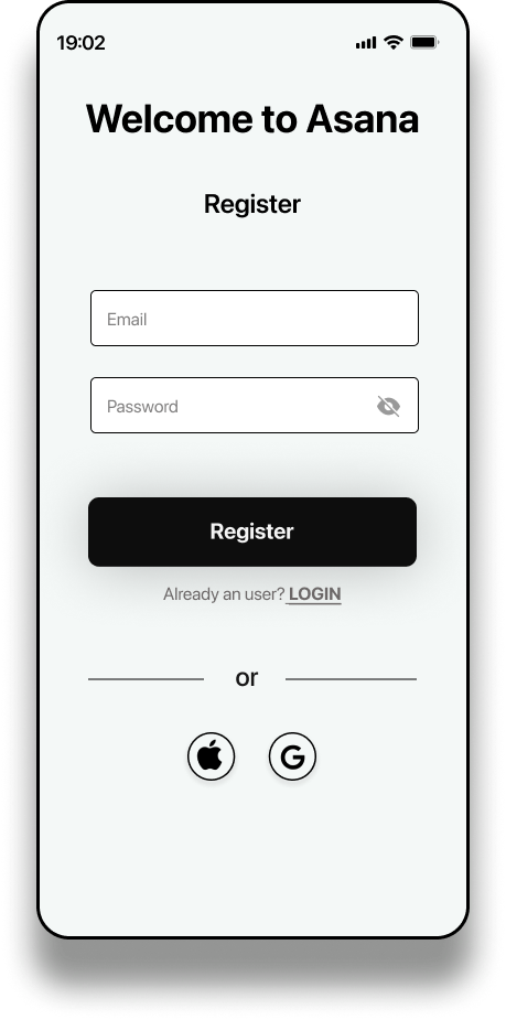
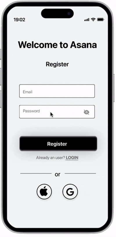
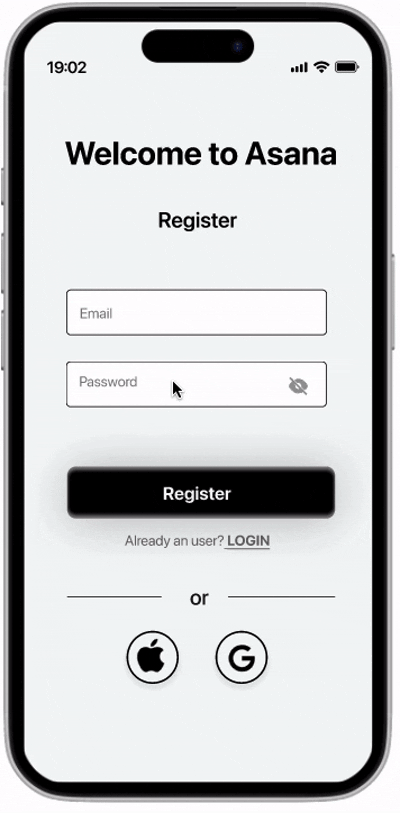
Form and microcopy
I focused on improving the clarity and accessibility of the registration and login flow. My goal was to reduce friction and help users complete key tasks with confidence.
⭑ Concise tooltips
These choices make the experience more inclusive and user-friendly, ensuring users understand issues and can act immediately.
⭑ Simplified language: I used the term “Register” instead of “Sign Up” to avoid confusion, especially for non-native English speakers, improving clarity and usability.
⭑ Faster onboarding: Included the option to register via social media, allowing users a quicker and more convenient entry point.
⭑ Real-time password feedback: The system checks password criteria as the user types, preventing errors and reducing frustration.
⭑ Accessible error messaging: Error states are communicated through a combination of: Red text, Clear visual symbols (❌ and ✅), High-contrast fonts
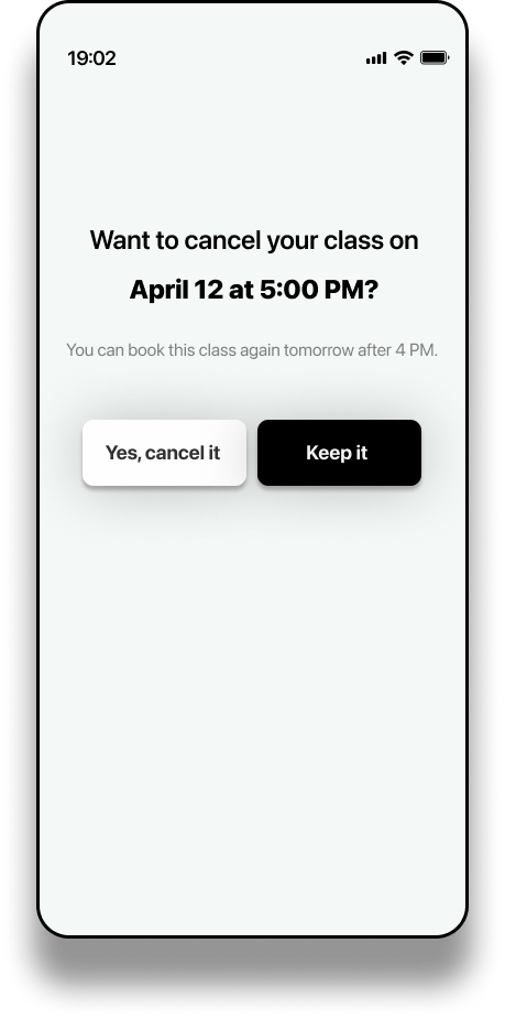
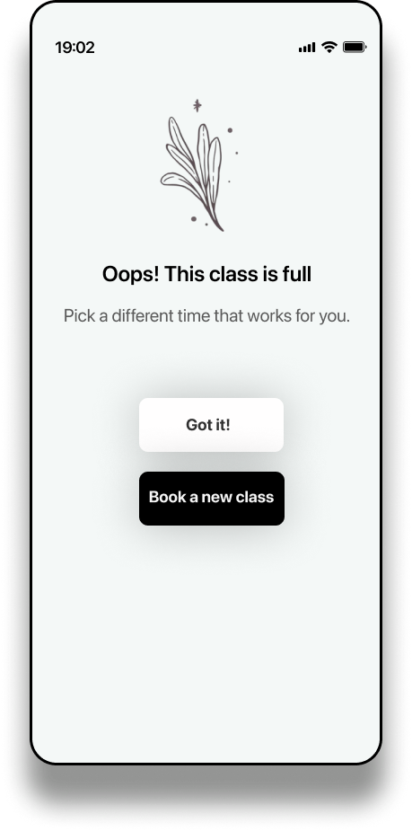
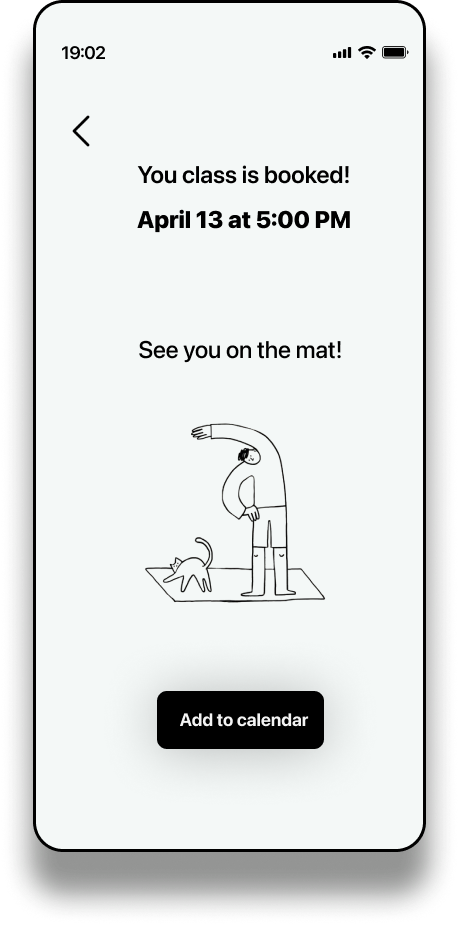
Dialog, error, and success messages
To make each interaction intuitive and stress-free, I applied UX writing principles that guide the user through the booking and cancellation process with clarity and reassurance. Typography, tone, and visual hierarchy work together to support smooth decision-making at every step.
⭑ Clear visual hierarchy: Typography differentiates key information (like dates and actions) using font weight, size, and spacing, making content easy to scan.
⭑ Primary CTA emphasis: The main action is styled in black, immediately drawing the eye and encouraging confident action-taking.
⭑ Reduced friction: Disruptive or less desirable actions (like cancelling) are visually de-emphasized, helping users make thoughtful decisions without feeling pressured.
⭑ Conversational tone: Friendly and human-centered microcopy (“See you on the mat!”) reassures users and builds trust.
⭑ Timely guidance: Each screen provides immediate instructions or next steps, avoiding dead ends or confusion.
Buttons and links
I applied UX writing best practices to make the app’s interface more intuitive and user-friendly. By choosing clear, concise, and supportive language, I helped users understand what to do at each step without confusion or hesitation. The improved copy supports smoother navigation, builds trust, and contributes to a more enjoyable overall experience—especially in moments where guidance and clarity are essential.
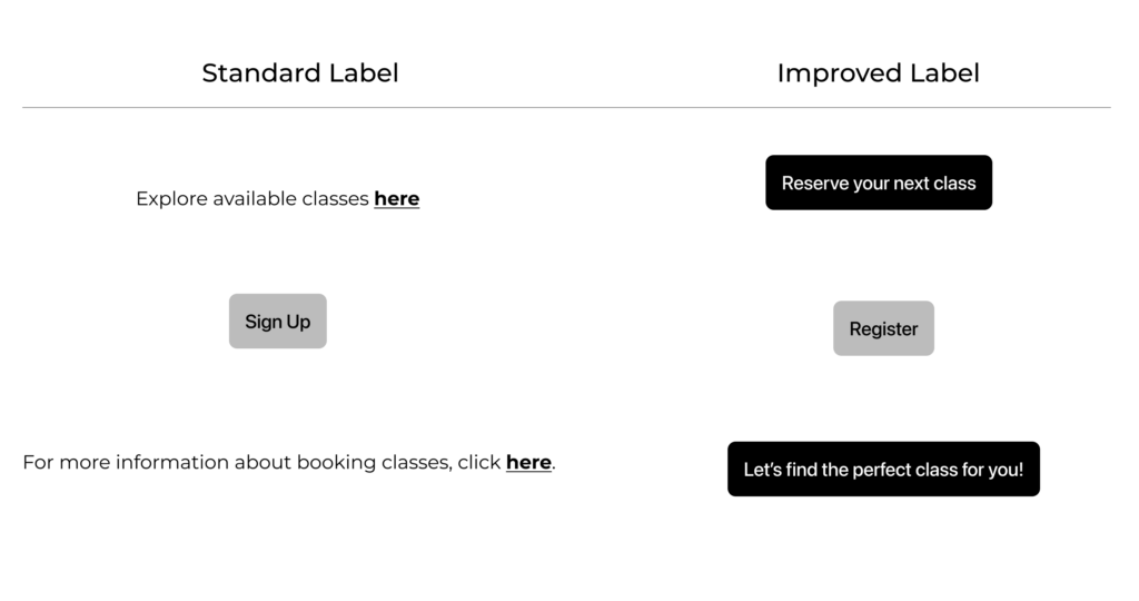
| Original Label | Improved Label | User Benefits |
|---|---|---|
| Explore available classes here | Reserve your class | -Action-oriented: encourages immediate engagement -Clear goal: focuses on the next step -Promotes continuity |
| Sign Up | Register | -More intuitive for non-native speakers -Formal and trustworthy tone -Reduces confusion with “Sign In” |
| For more information about booking clas, click here | Let’s find the perfect class for you! | -Conversational and supportive tone -Personalization enhances emotional connection -Encourages exploration naturally |
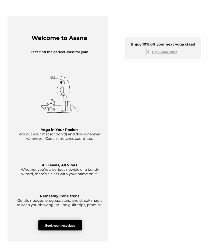
Welcome email and push notifications
The welcome email and push notification were carefully written to guide users through the app’s benefits using clear, actionable language. Every word is intentional, aiming to support the user journey from the very start.
⭑ Optimizes user flow: UX writing here acts as a guide, reducing hesitation and making it easier for users to take meaningful steps inside the app.
⭑ Reduces cognitive load: The welcome email uses concise, benefit-driven language to help users immediately understand the app’s value—without overwhelming them.
⭑ Encourages action: The CTA is placed where users expect it, making the next step feel intuitive and frictionless.
⭑ Boosts clarity and confidence: The push notification uses direct, friendly copy to explain the discount and prompt action with no guesswork.
⭑ Speaks the user’s language: The tone is helpful and human, making users feel supported, not sold to.
Get in touch!
Thank you for watching!